


Banca Transilvania.
Rebranding of Romania's most loved bank.
Banca Transilvania.
Rebranding of Romania's most loved bank.
Banca Transilvania.
Rebranding of Romania's most loved bank.
Banca Transilvania.
Rebranding of Romania's most loved bank.
Banca Transilvania.
Rebranding of Romania's most loved bank.
Banca Transilvania, aka BT, is not only the first major Romanian bank founded with private capital, but also the most trusted and loved financial brand in the country.
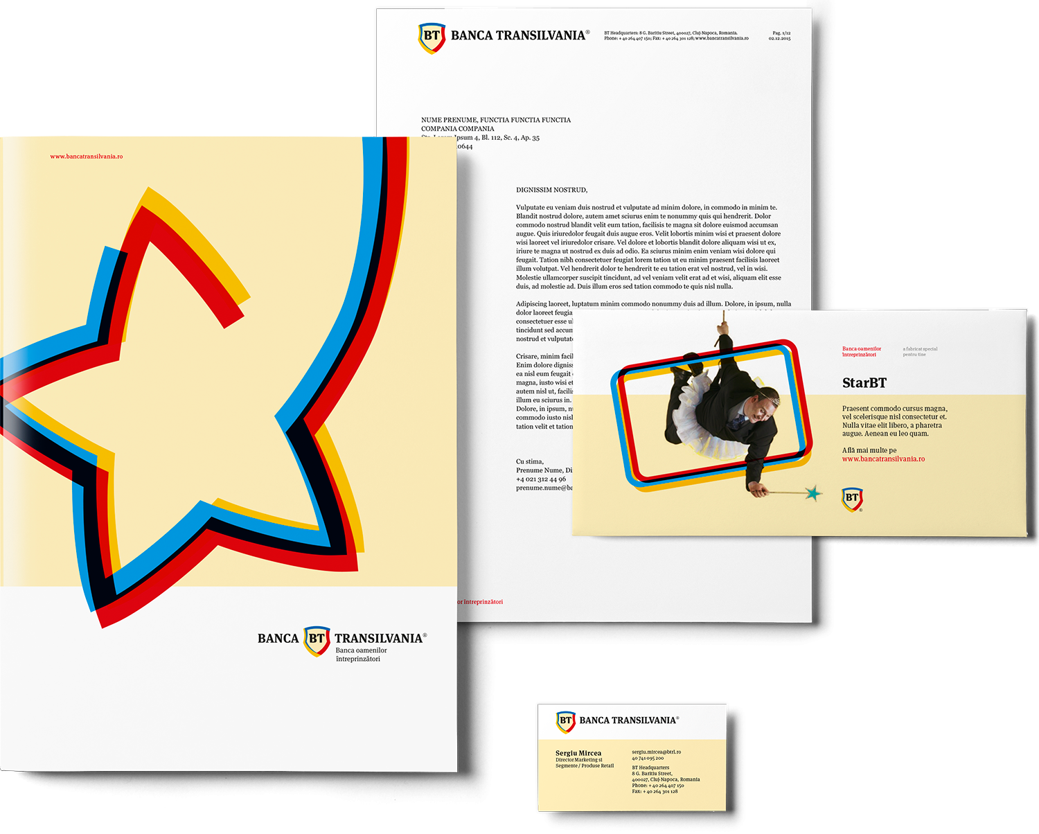
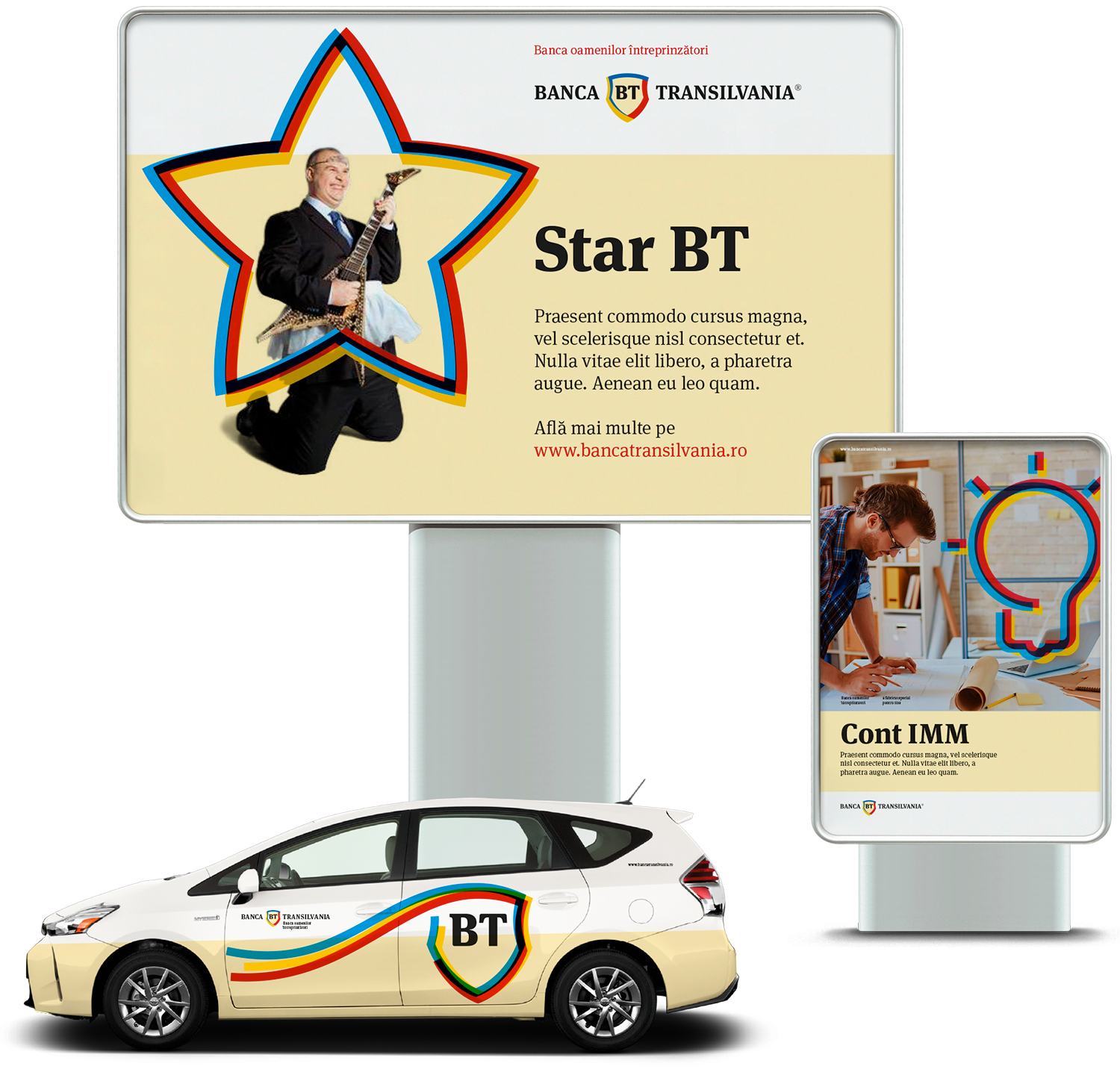
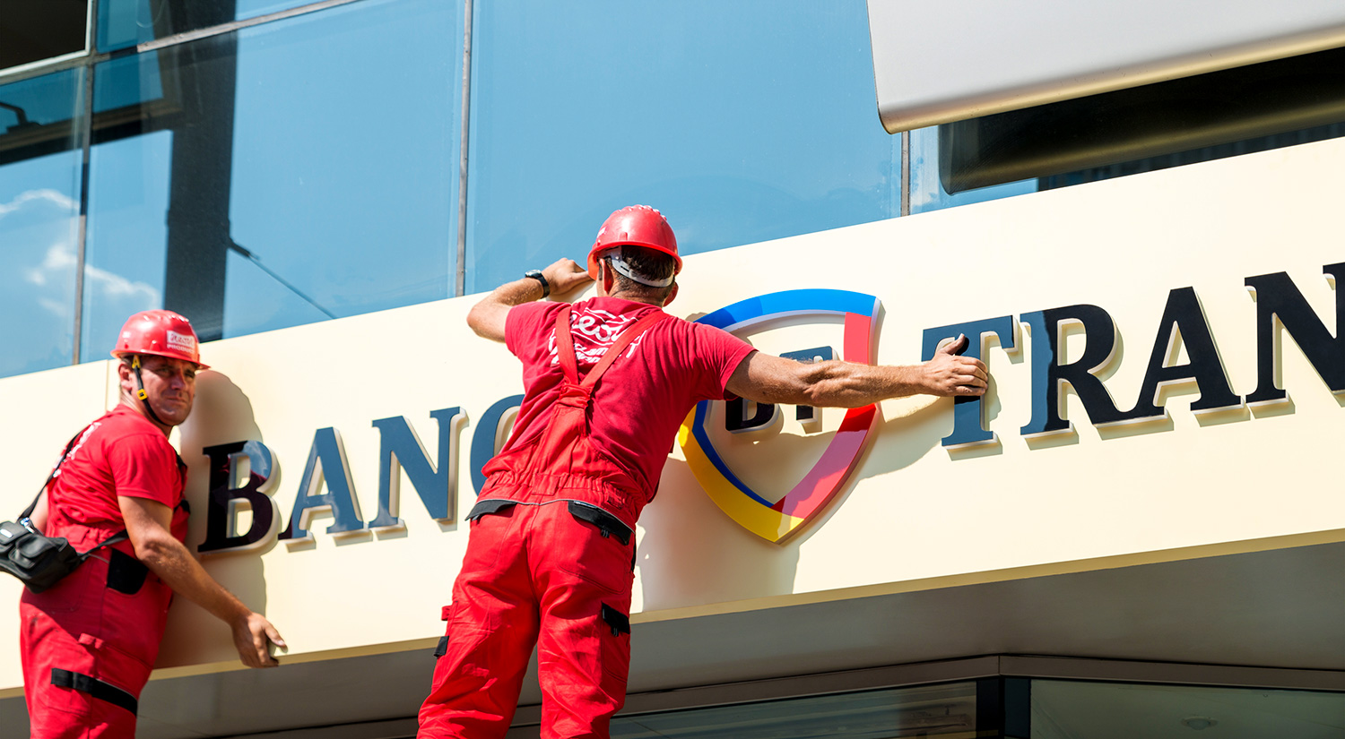
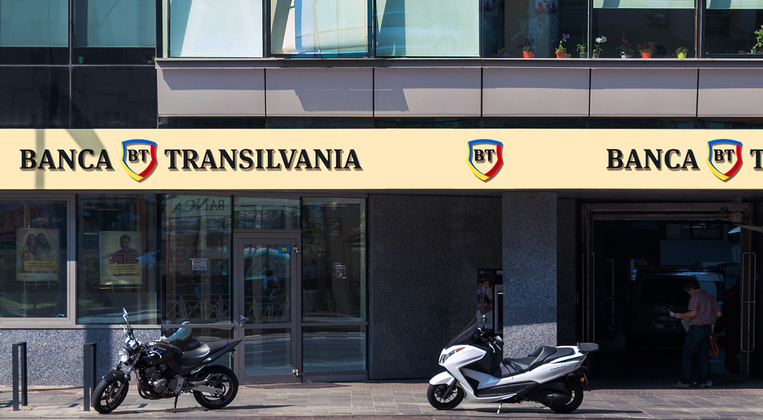
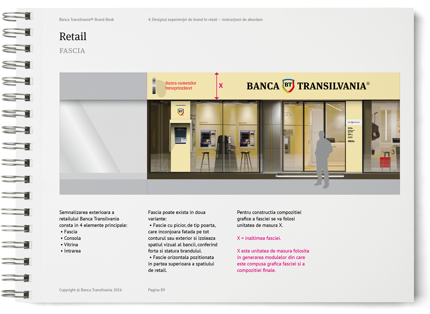
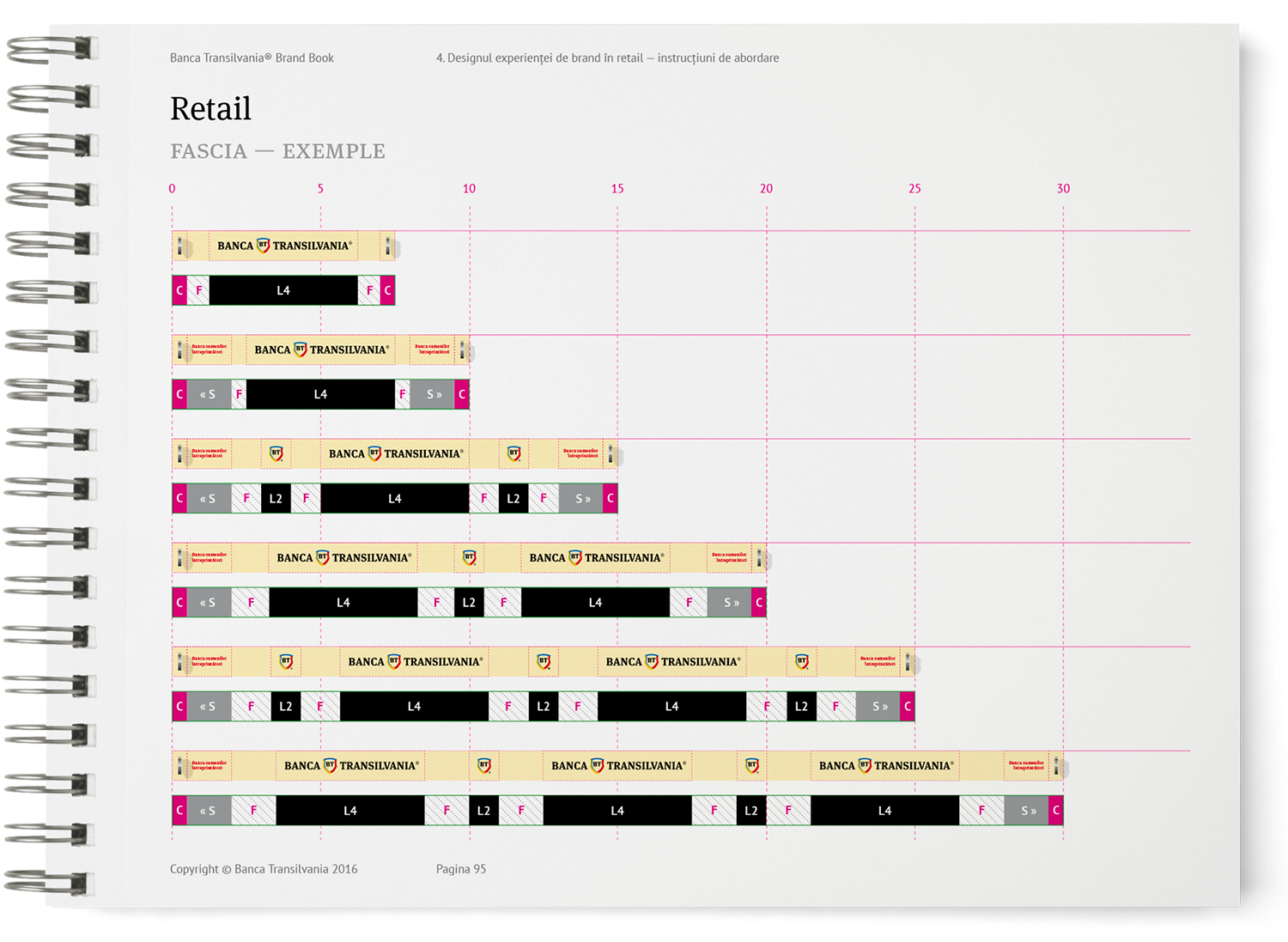
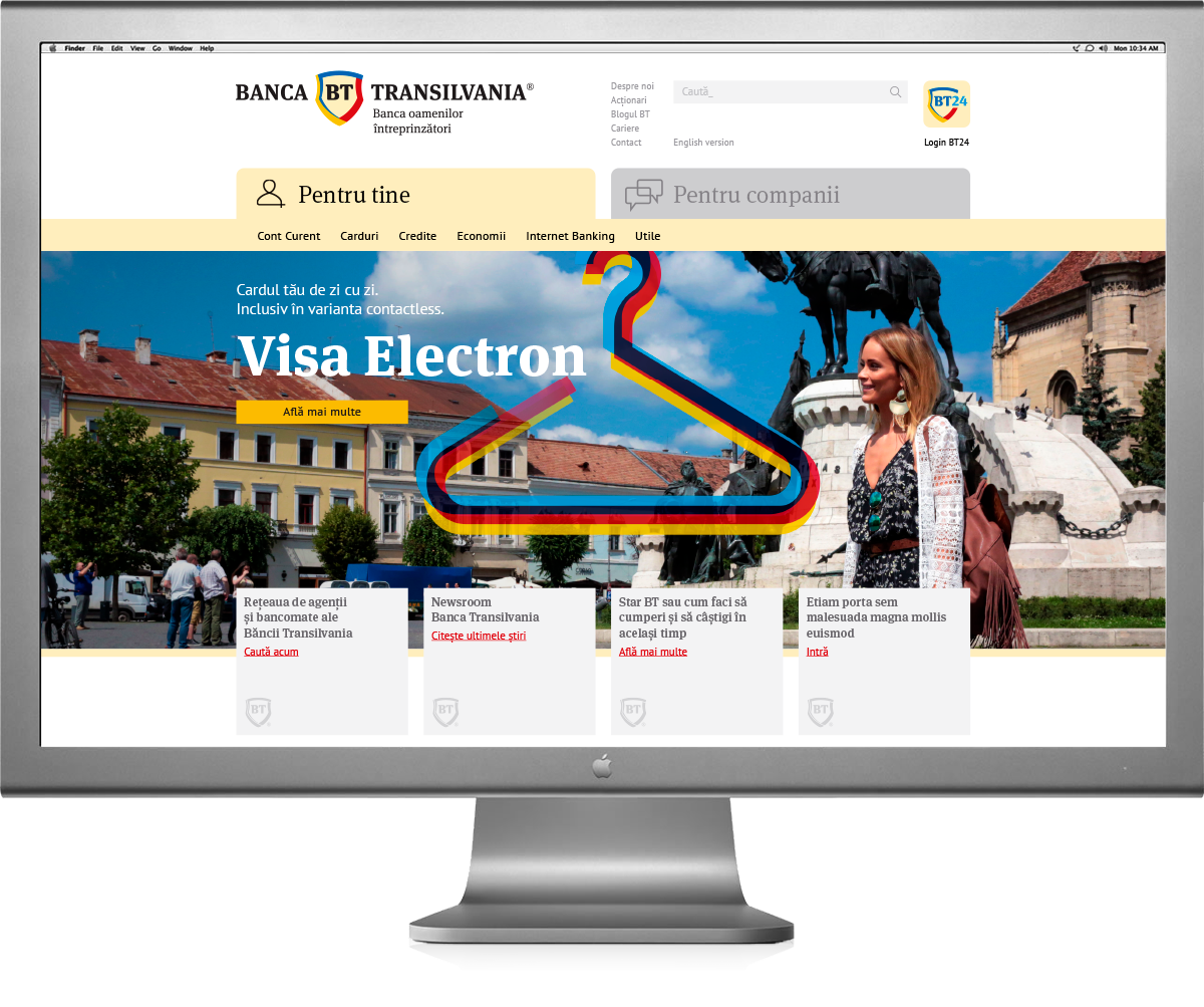
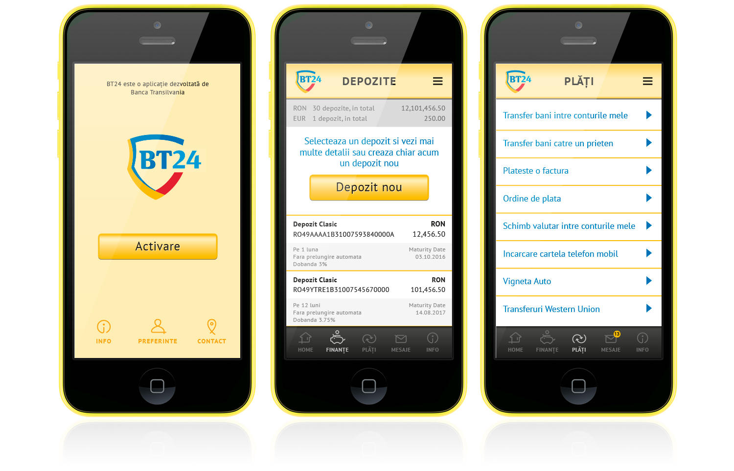
In 2016, BT set out to increase brand visibility and mark a new stage in its evolution with a refreshed visual identity and a modern visual system, applied consistently across all brand touchpoints—from internal documents and bank forms to retail environments and brand communications.
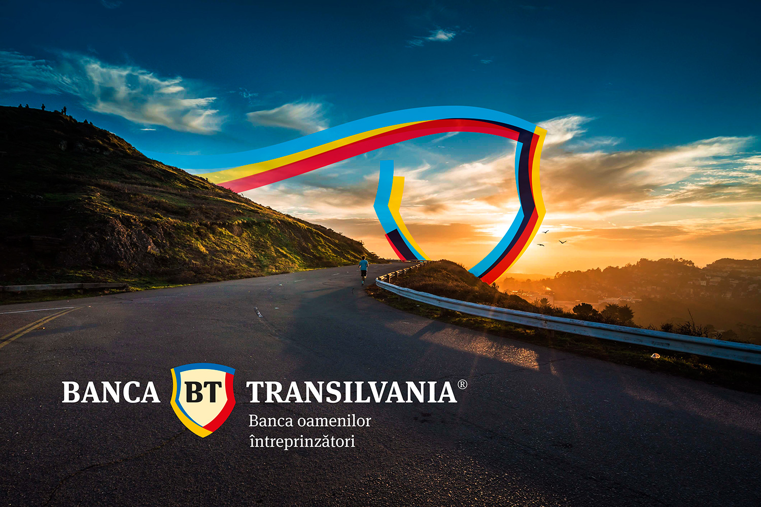
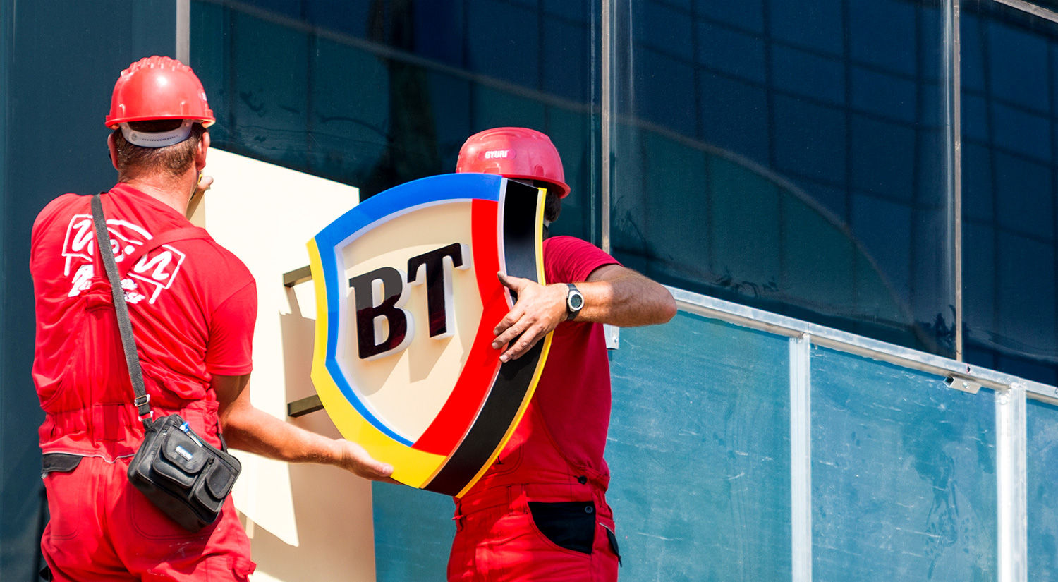
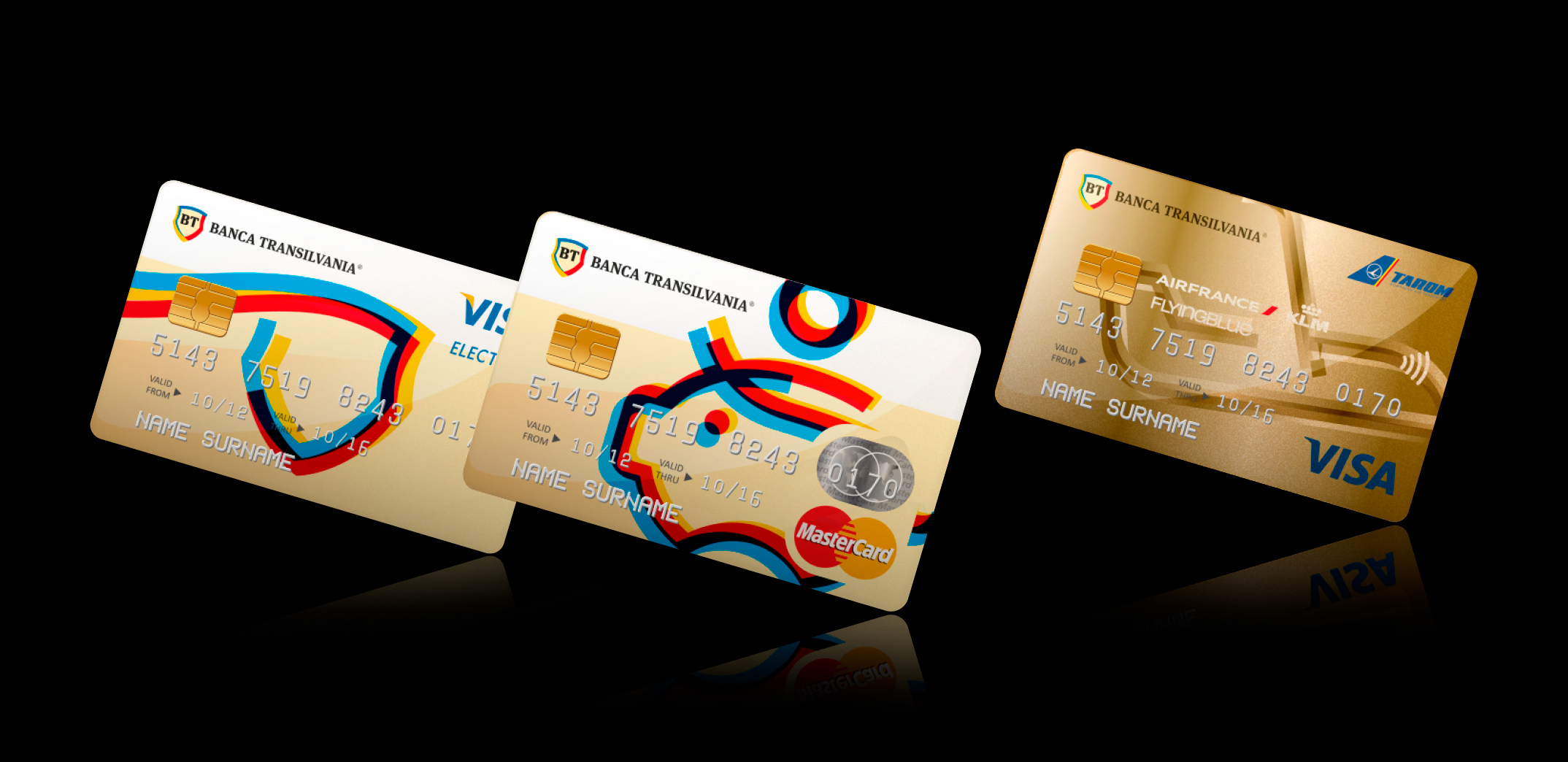
At the brand signature level, the visual solution is a reinterpretation of the old identity — the shield shape was retained, while the BT monogram was updated with a more contemporary letterform. The defining new element of the design is the integration of the national colors, which shape the outline of the shield in a dynamic composition. This marks the first time in post-communist Romania that a major private company has embedded the national flag colors into its identity, turning its origin into a statement of pride.
The new visual territory concentrates around a brand property asset inspired by the logo itself: a translucent tricolor ribbon that takes shape as various symbols and instantly transforms them into key visuals for brand communication — a graphic motif with masive potential for memorability, authenticity and consistency.
The color palette, inspired by the national colors, honors both the bank's Romanian entrepreneurial roots and the brand promise: "The bank for entrepreneurial people."
Banca Transilvania, aka BT, is not only the first major Romanian bank founded with private capital, but also the most trusted and loved financial brand in the country.
In 2016, BT set out to increase brand visibility and mark a new stage in its evolution with a refreshed visual identity and a modern visual system, applied consistently across all brand touchpoints—from internal documents and bank forms to retail environments and brand communications.
At the brand signature level, the visual solution is a reinterpretation of the old identity — the shield shape was retained, while the BT monogram was updated with a more contemporary letterform. The defining new element of the design is the integration of the national colors, which shape the outline of the shield in a dynamic composition. This marks the first time in post-communist Romania that a major private company has embedded the national flag colors into its identity, turning its origin into a statement of pride.
The new visual territory concentrates around a brand property asset inspired by the logo itself: a translucent tricolor ribbon that takes shape as various symbols and instantly transforms them into key visuals for brand communication — a graphic motif with masive potential for memorability, authenticity and consistency.
The color palette, inspired by the national colors, honors both the bank's Romanian entrepreneurial roots and the brand promise: "The bank for entrepreneurial people."
CLIENT
Banca Transilvania Group
YEAR
2015–2016
SERVICES
Visual identity, Brand architecture, Communication design, Web design, App design, Retail design, Internal communication design
AWARDS
→ Rebrand 100 Merit Award, 2018
CREDITS
I designed these items while working full time at Brandient.
Images/photos and details are presented courtesy of Brandient.


Copyright © Ciprian Bădălan & Brandient | All rights reserved. No content of this website may be reproduced in any form without written permission from its author. All trademarks belong to their respective owners.