


Klarwin.
Fluid Perfection.
Klarwin.
Fluid Perfection.
Klarwin.
Fluid Perfection.
Klarwin.
Fluid Perfection.
Klarwin.
Fluid Perfection.
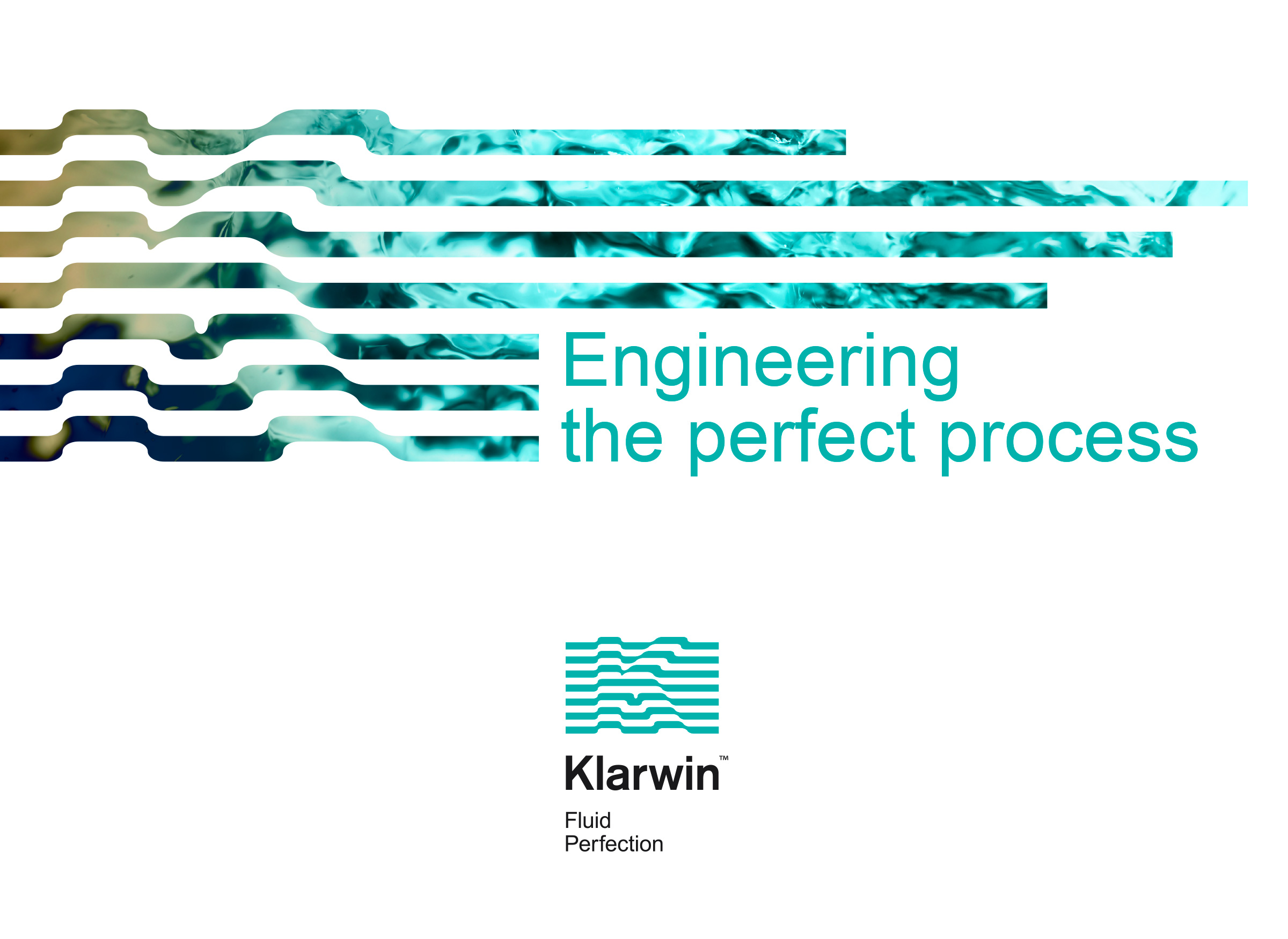
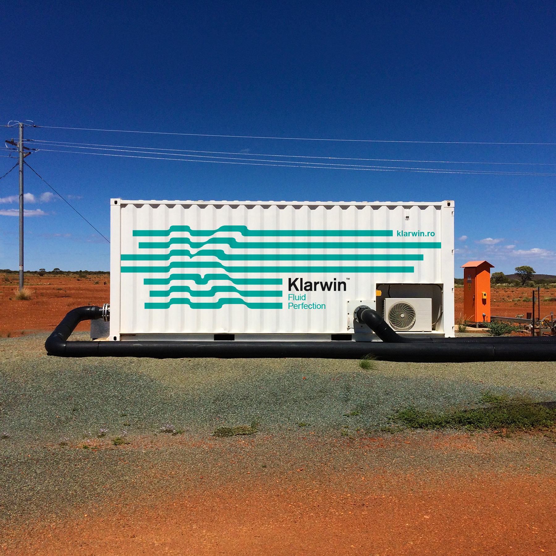
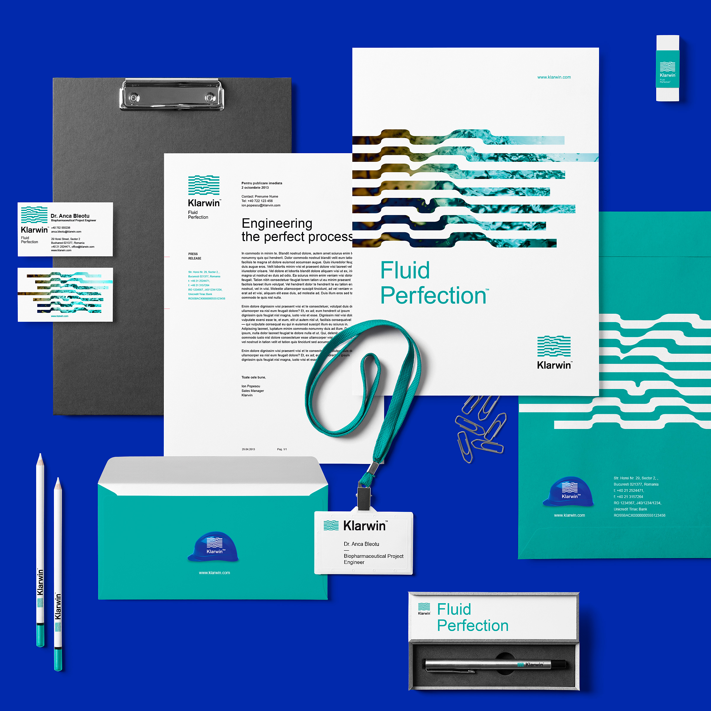
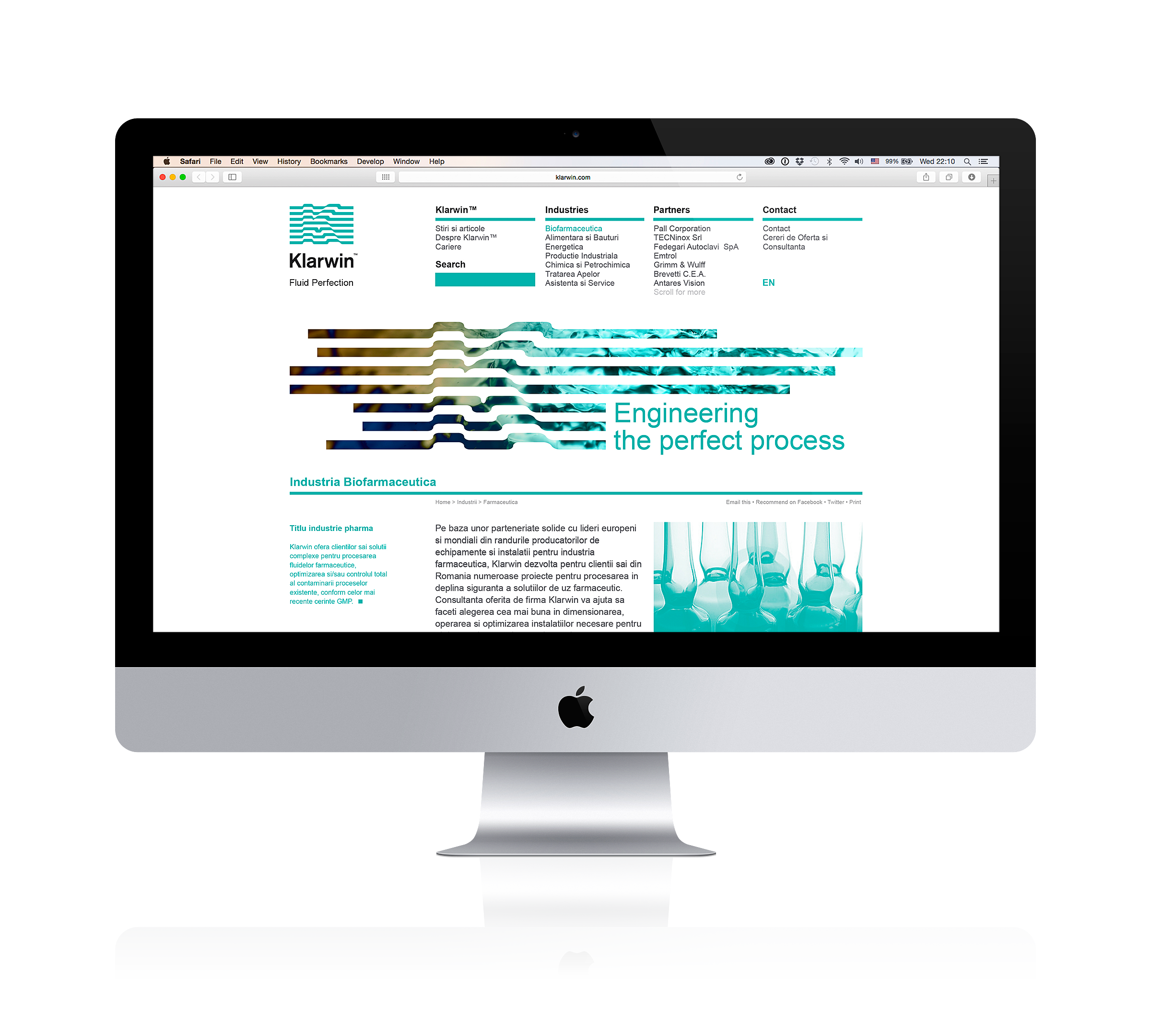
Klarwin is a leading Eastern European player in process engineering, offering multiple fluid filtration solutions in a wide range of industries: pharmaceutical, beverage, automotive, aeronautics, and so on.
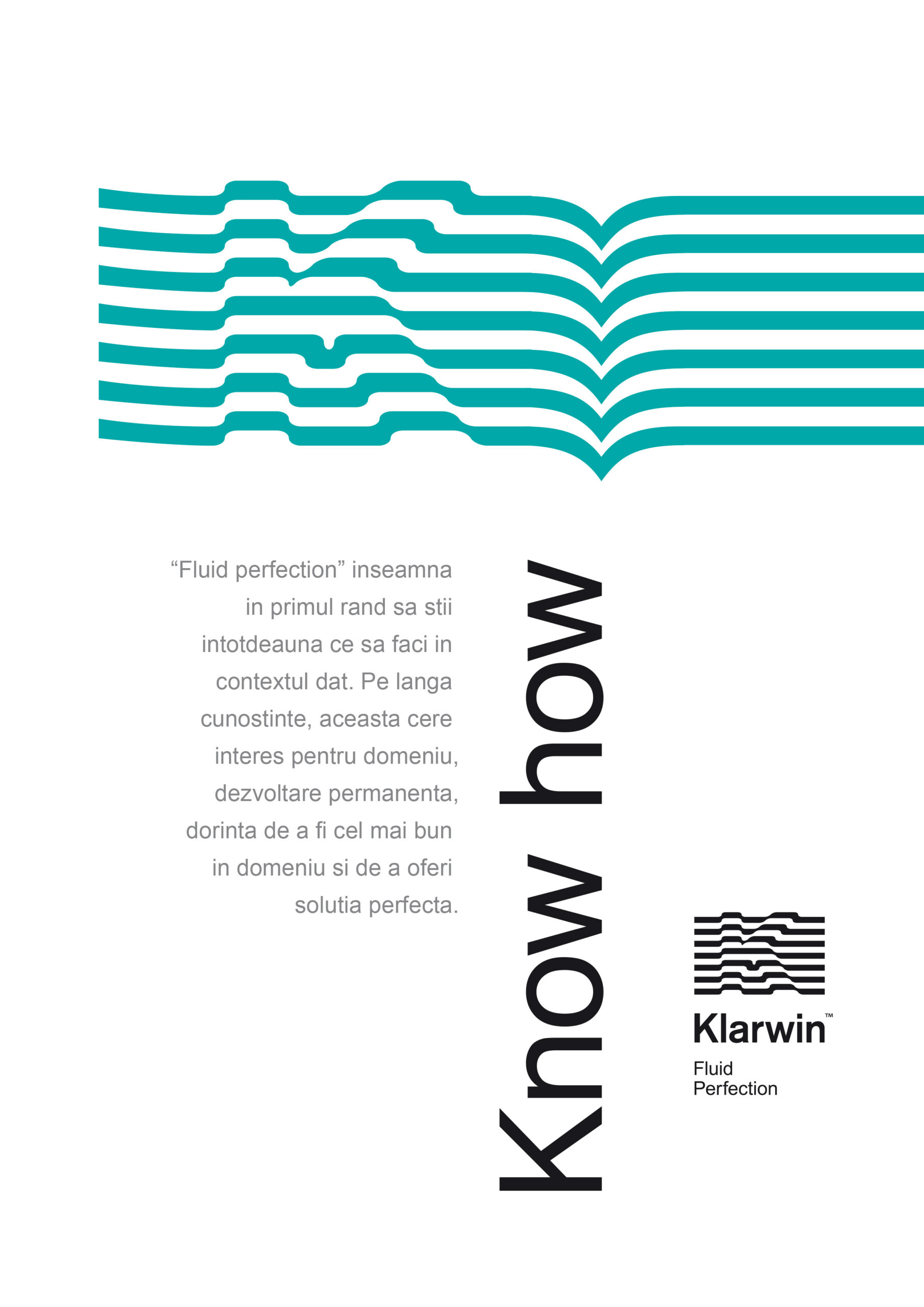
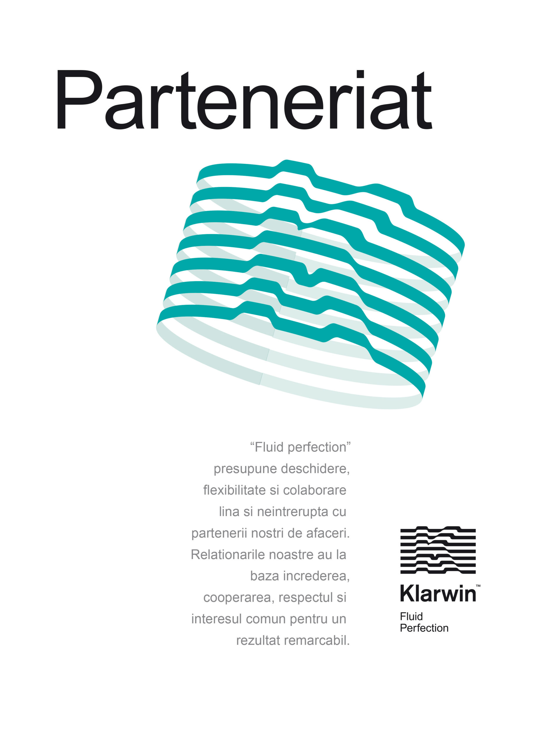
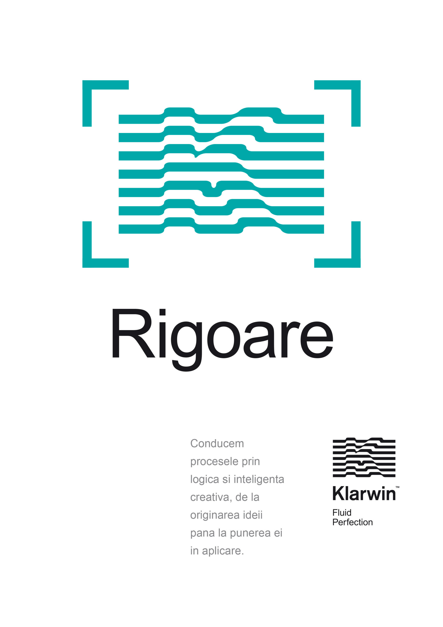
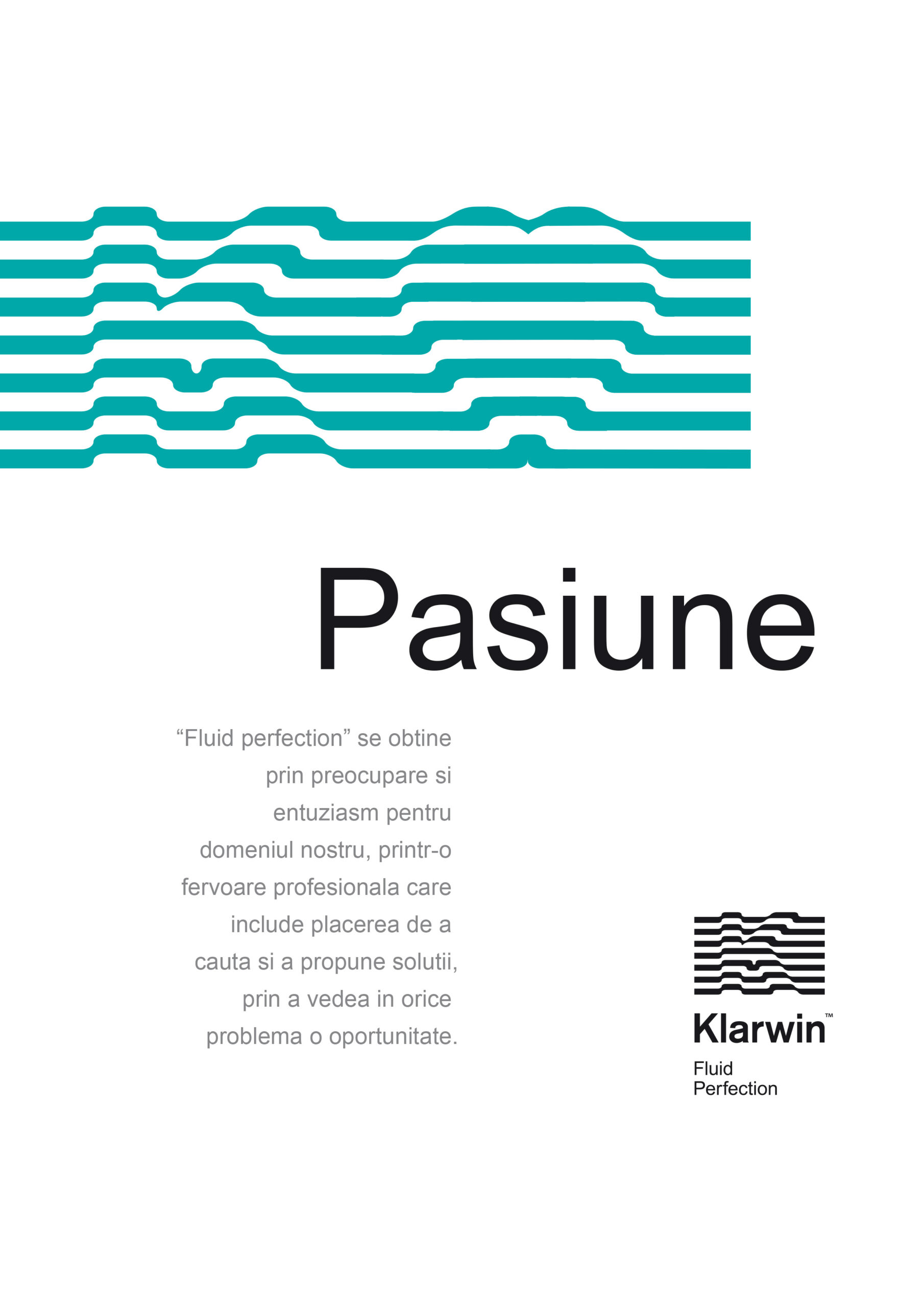
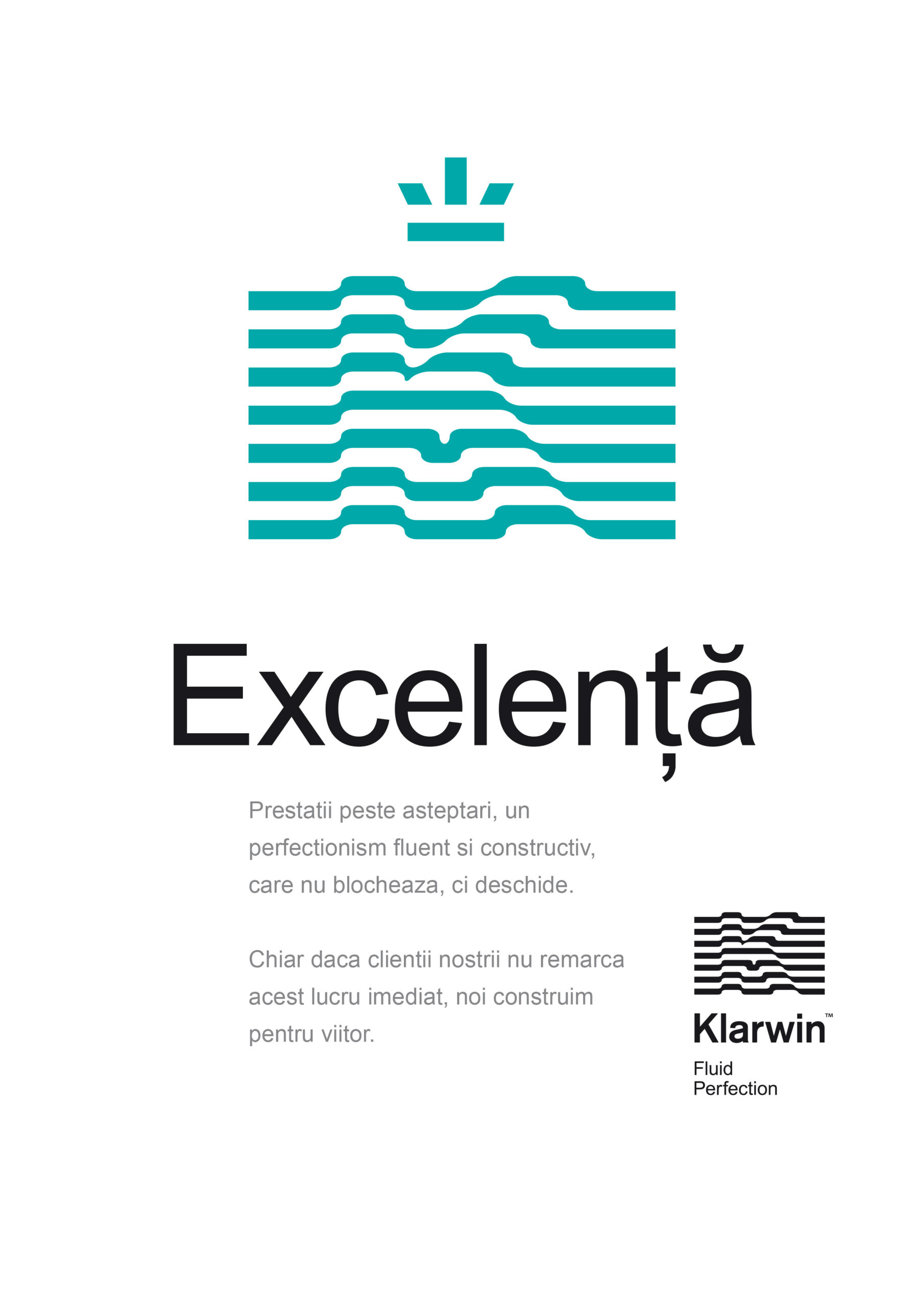
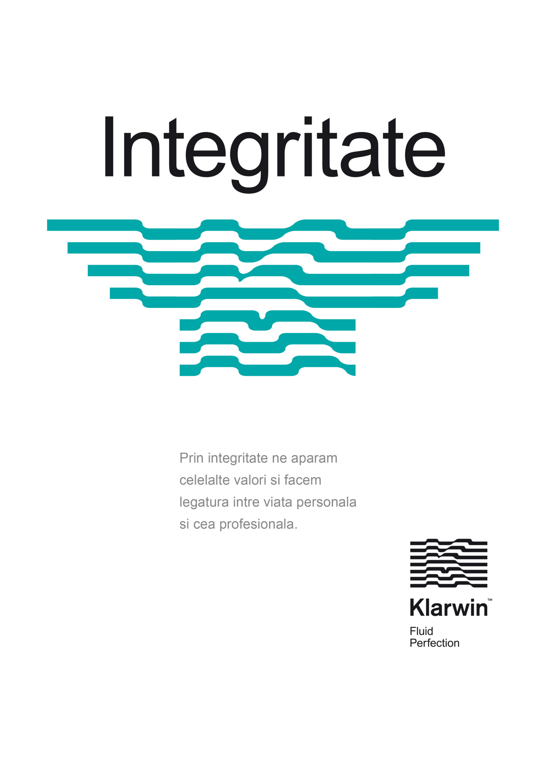
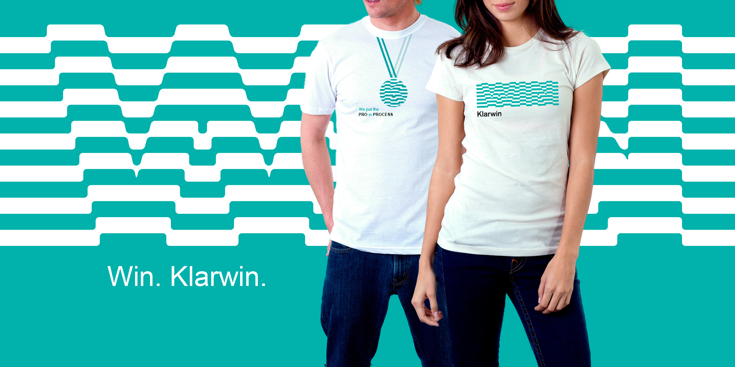
The visual solution for the brand identity consists of a monogram K illustrated as a filter in the path of liquids — the design is at the same time very rigorous, almost mathematical, and very fluid, as it faithfully illustrates the slogan "Fluid Perfection". Together with the color palette reminiscent of the cleanest waters on earth, the monogram's design style becomes the brand's brand property, becoming immediately recognizable even in the absence of the logo.
The brand imagery also contains a series of monochrome photographs treated in the brand's proprietary color, delivering the feeling of clarity and purity.
Last but not least, the perfection of the Klarwin process is also reflected in the visual territory by constructing both the corporate and communication layouts on a very rigorous grid, which once again underlines the company's seriousness and dedication in delivering the brand promise.
Klarwin is a leading Eastern European player in process engineering, offering multiple fluid filtration solutions in a wide range of industries: pharmaceutical, beverage, automotive, aeronautics, and so on.
The visual solution for the brand identity consists of a monogram K illustrated as a filter in the path of liquids — the design is at the same time very rigorous, almost mathematical, and very fluid, as it faithfully illustrates the slogan "Fluid Perfection". Together with the color palette reminiscent of the cleanest waters on earth, the monogram's design style becomes the brand's brand property, becoming immediately recognizable even in the absence of the logo.
The brand imagery also contains a series of monochrome photographs treated in the brand's proprietary color, delivering the feeling of clarity and purity.
Last but not least, the perfection of the Klarwin process is also reflected in the visual territory by constructing both the corporate and communication layouts on a very rigorous grid, which once again underlines the company's seriousness and dedication in delivering the brand promise.
CLIENT
Klarwin
YEAR
2013
SERVICES
Visual identity, Communication design, Web design, Internal communication design
BOOKS & MAGAZINES
→ LogoLounge Book 10, 2016
→ 2017 LogoLounge Trends Report
CREDITS
I designed these items while working full time at Brandient.
Images/photos and details are presented courtesy of Brandient.


Copyright © Ciprian Bădălan & Brandient | All rights reserved. No content of this website may be reproduced in any form without written permission from its author. All trademarks belong to their respective owners.