


Solaris.
Balanced and healthy.
Solaris.
Balanced and healthy.
Solaris.
Balanced and healthy.
Solaris.
Balanced and healthy.
Solaris.
Balanced and healthy.
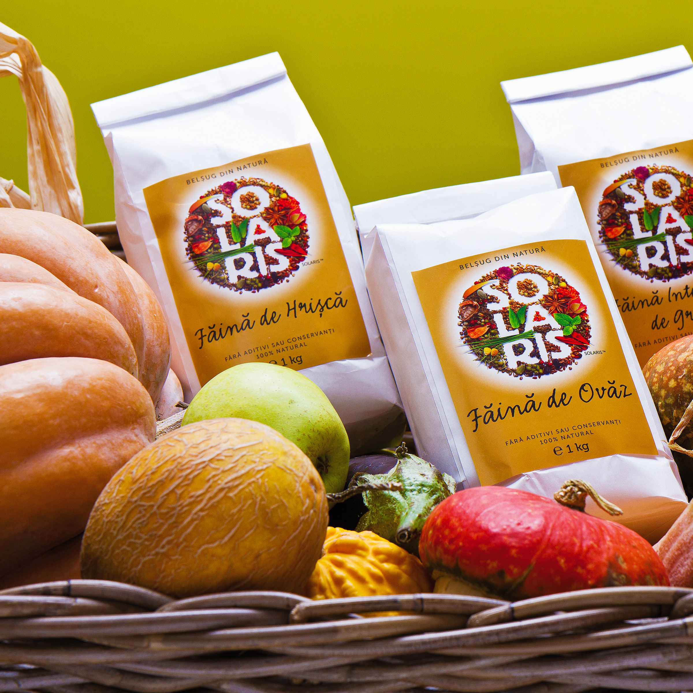
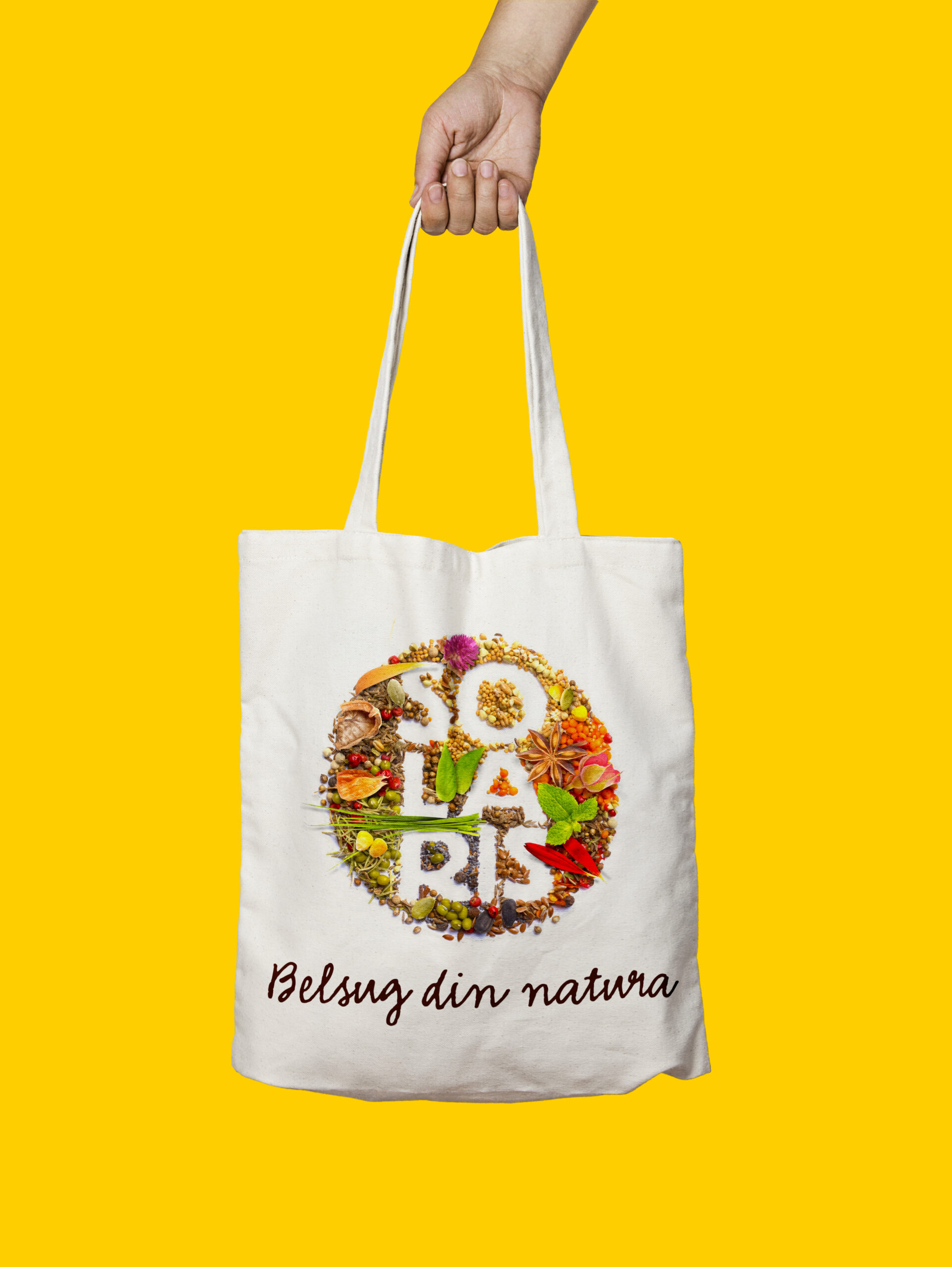
Solaris was conceived as a healthy alternative to modern food — a brand rooted in the belief that nature and simplicity should return to people’s everyday lives.
The new identity reflects the brand’s core purpose: offering a natural and wholesome alternative to unhealthy modern eating habits. To visually express this vision, the identity is built around a photograph in which hundreds of seeds, flowers, and spices gather to reveal the Solaris wordmark — a meticulously crafted composition where every grain, petal, fruit, and leaf was carefully placed by hand, with tweezers.
The packaging design naturally complements the new brand signature — a simple, effective master pack that highlights the new identity and communicates with clarity.
Fresh, natural, and distinctive, Solaris’ new identity invites consumers into a new brand experience — one that promises a healthier lifestyle aligned with the growing demand for conscious living, while also celebrating the brand’s wide product range.
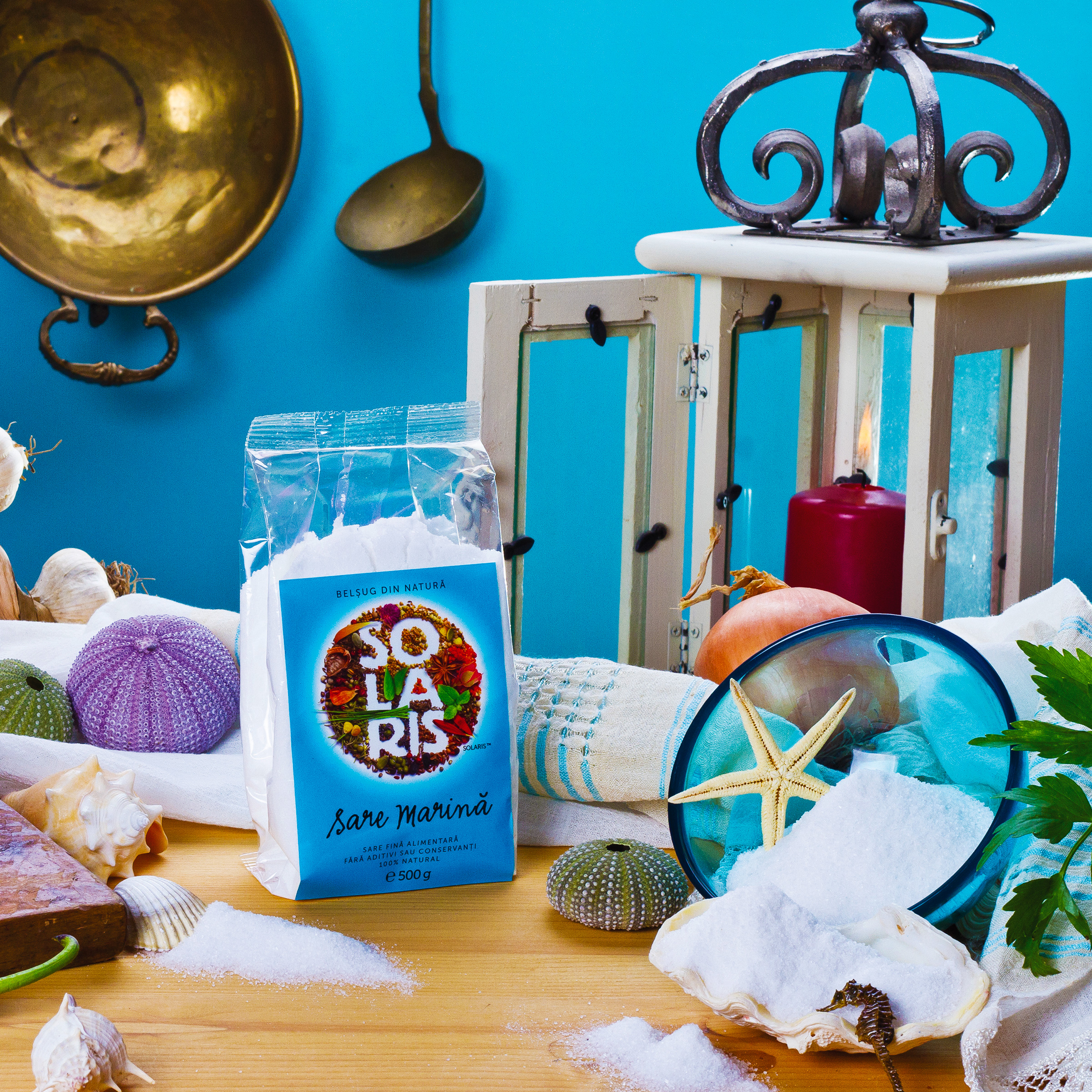
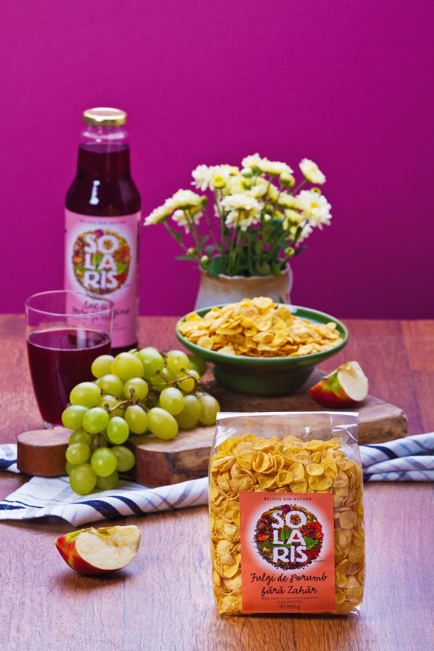
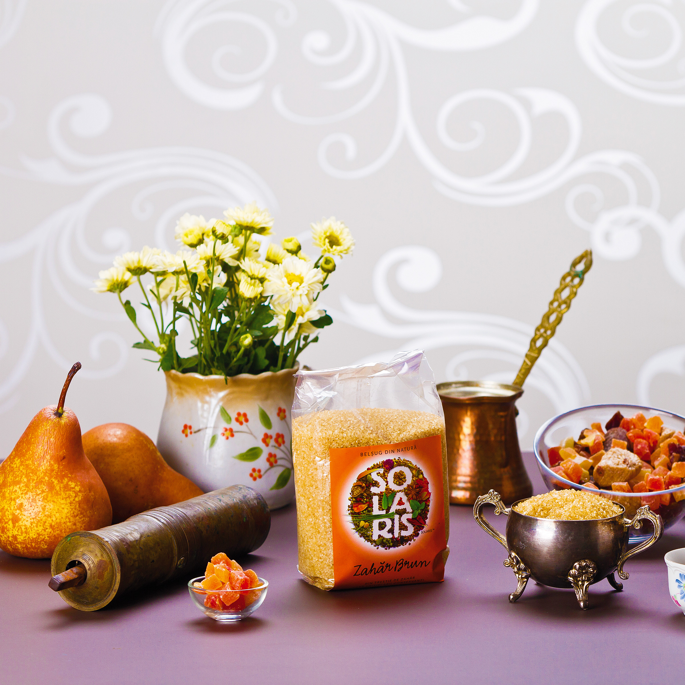
CLIENT
Solaris Plant
YEAR
2011
SERVICES
Visual identity, Packaging design
AWARDS
→ Graphis Merit Award, 2013
→ “Exceptional use of color in design” Award at Color in Design Competition organized by HOW + Print + Pantone, USA, 2012
BOOKS & MAGAZINES
→ "Creative Anarchy: How to break the rules of graphic design for creative success", Denise Bosler, 2015
→ Graphis Design Annual 2013
→ How Design Magazine — USA, 2012
→ Print Magazine — USA, 2012
CREDITS
I designed these items while working full time at Brandient.
Images/photos and details are presented courtesy of Brandient.
Logo Photography: Studio Țânțăreanu
Product Photography: Cristal Studio


Copyright © Ciprian Bădălan & Brandient | All rights reserved. No content of this website may be reproduced in any form without written permission from its author. All trademarks belong to their respective owners.