


Autonom
Autonom
Autonom
Autonom
Autonom
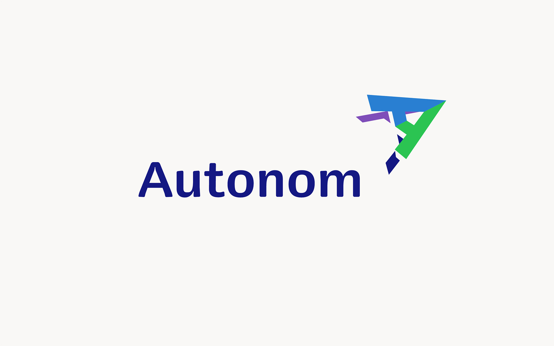
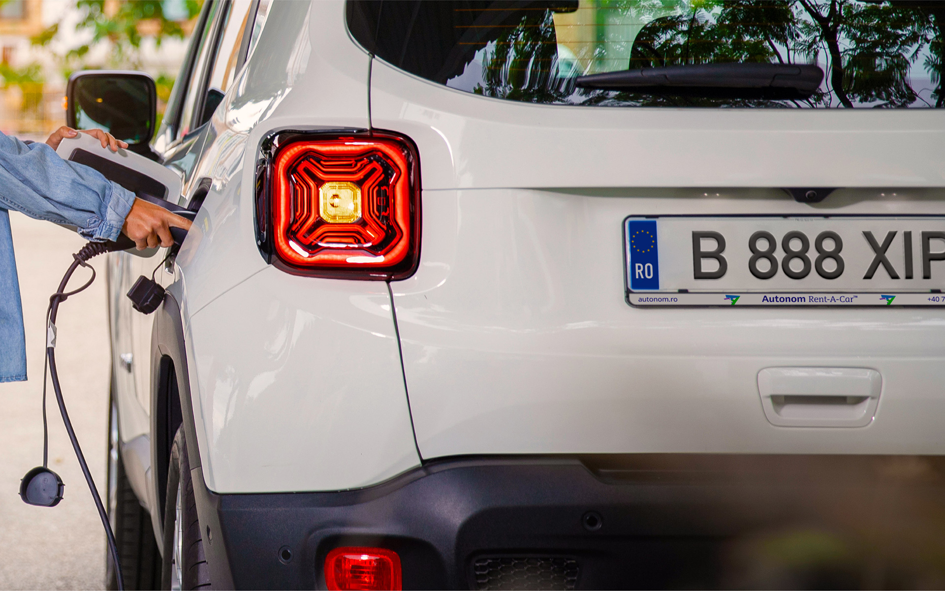
Founded nearly 20 years ago, Autonom has become Romania’s leading mobility company, offering everything from car rental and B2B leasing to fleet management and after-market solutions. After 15 years of rapid growth, in 2019 Autonom decided it was time to reorganize its brand architecture and refresh its visual identity to match its new ambitions.
The goal was clear: create a contemporary, professional design that stands out, strengthens brand recognition, and brings clarity to a diverse portfolio of services.
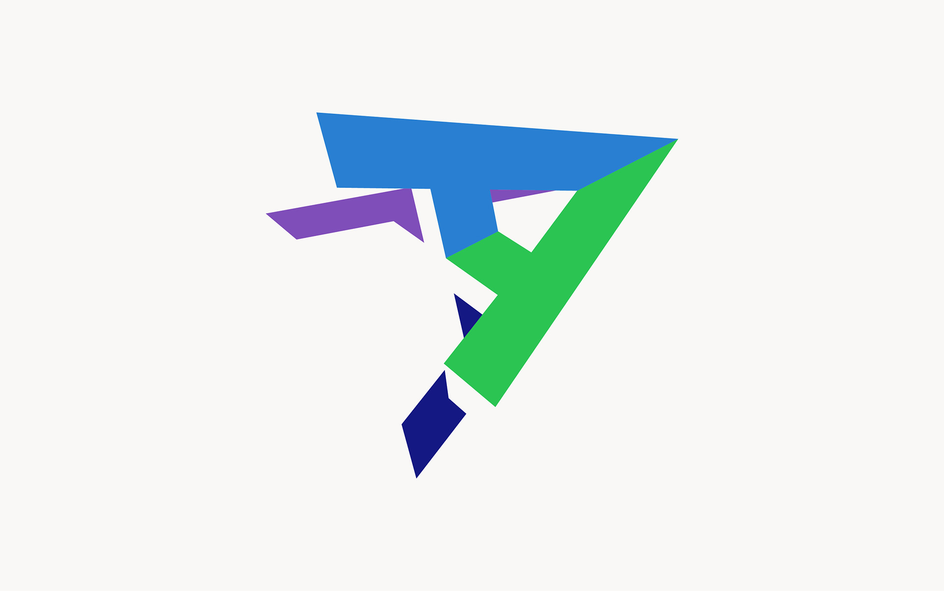
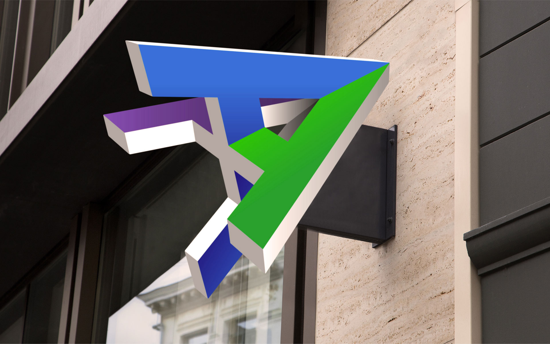
At the heart of the new identity is the brand symbol—a three-dimensional A monogram shaped like a rocket. A dynamic, upward-pointing symbol that evokes motion, thrust, and forward momentum, suggesting uplift, innovation, and the idea of acceleration. The interplay of colors and 3D geometry gives the symbol a modern, tech-savvy feel while communicating a strong brand personality.
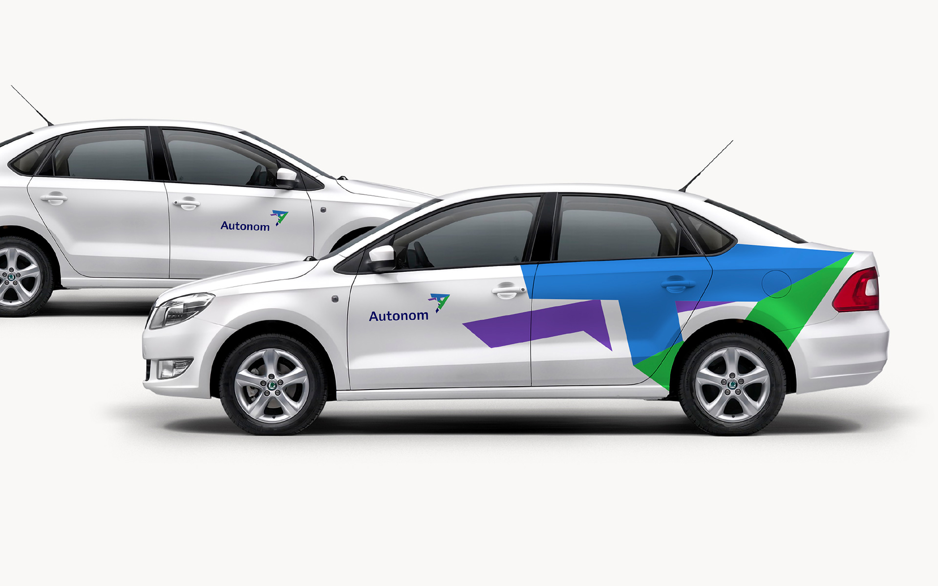
The symbol also becomes the main key visual across all brand communications, adding personality and cohesion to layouts with its oversized silhouette.
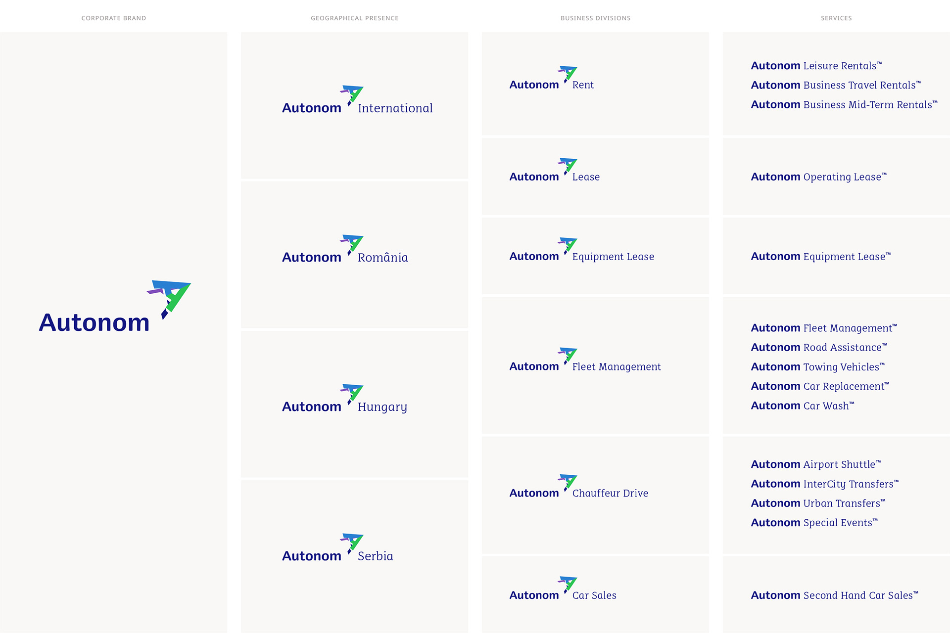
The rebranding also introduced a monolithic brand architecture, uniting all services under a single, consistent voice and giving Autonom a strong, focused presence in the market.
Founded nearly 20 years ago, Autonom has become Romania’s leading mobility company, offering everything from car rental and B2B leasing to fleet management and after-market solutions. After 15 years of rapid growth, in 2019 Autonom decided it was time to reorganize its brand architecture and refresh its visual identity to match its new ambitions.
The goal was clear: create a contemporary, professional design that stands out, strengthens brand recognition, and brings clarity to a diverse portfolio of services.
At the heart of the new identity is the brand symbol—a three-dimensional A monogram shaped like a rocket. A dynamic, upward-pointing symbol that evokes motion, thrust, and forward momentum, suggesting uplift, innovation, and the idea of acceleration. The interplay of colors and 3D geometry gives the symbol a modern, tech-savvy feel while communicating a strong brand personality.
The symbol also becomes the main key visual across all brand communications, adding personality and cohesion to layouts with its oversized silhouette.
The rebranding also introduced a monolithic brand architecture, uniting all services under a single, consistent voice and giving Autonom a strong, focused presence in the market.
CLIENT
Autonom
YEAR
2019
SERVICES
Visual Idenity design, Brand Architecture, Visual Platform, Corporate Identity Program, Digital design, Brand Guidelines
CREDITS
I designed these items while working full time at Brandient.
Images/photos and details are presented courtesy of Brandient.


Copyright © Ciprian Bădălan & Brandient | All rights reserved. No content of this website may be reproduced in any form without written permission from its author. All trademarks belong to their respective owners.