


eMAG.
Freedom every day.
eMAG.
Freedom every day.
eMAG.
Freedom every day.
eMAG.
Freedom every day.
eMAG.
Freedom every day.
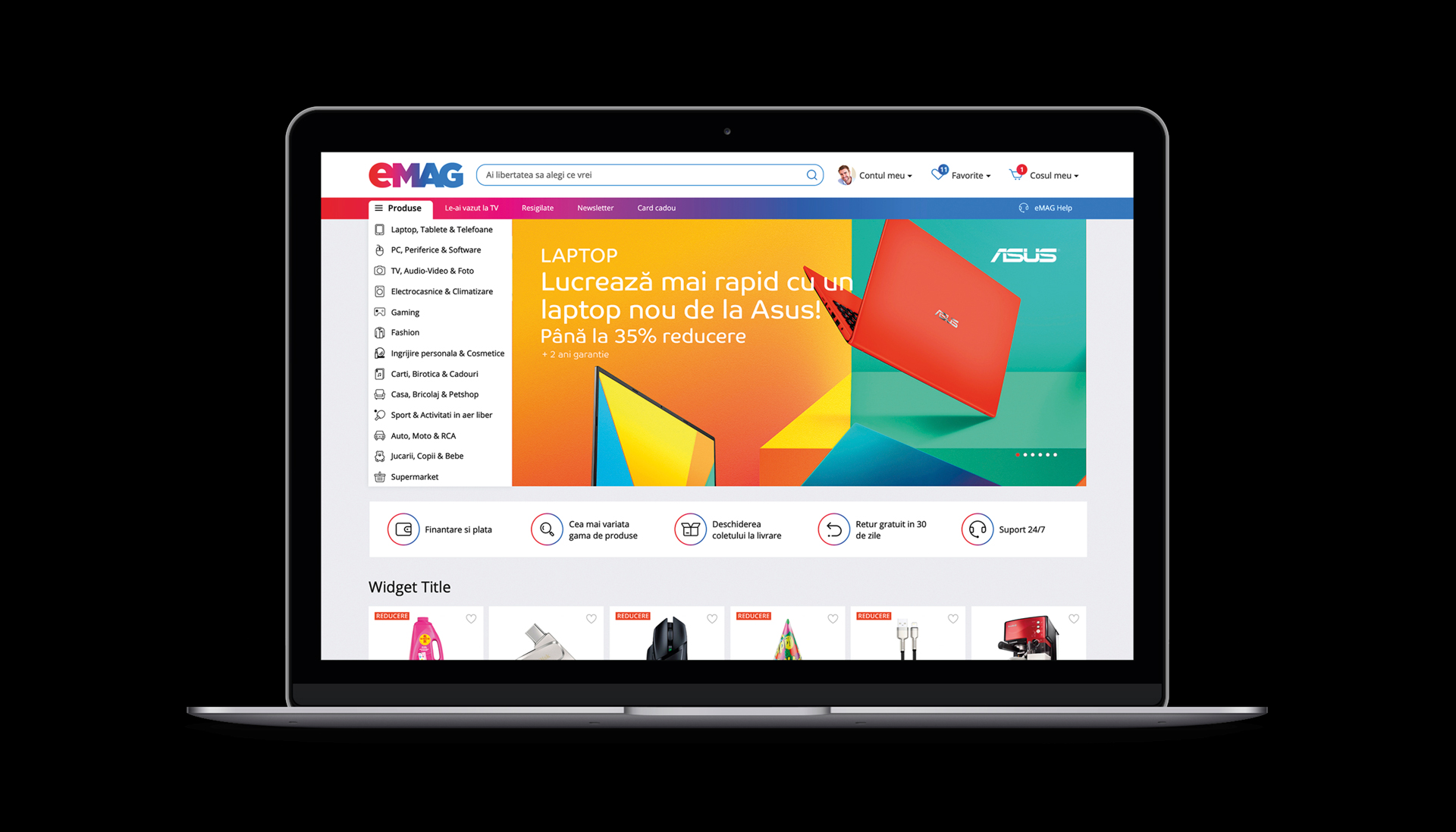
eMAG is the star brand of e-commerce in Eastern Europe. The 2019 rebranding introduces a fresh, fluid and vibrant visual identity that meets the high standards of the eMAG platform and services and positions the brand among the top digital products.
The visual solution itself is a refresh of the old identity in which, in front of a blue logo, red objects were visible. The red-blue gradient applied in the new logo now manages to reflect not only the universality of the product range, but also the state-of-the-art technology and dynamism of eMAG services.
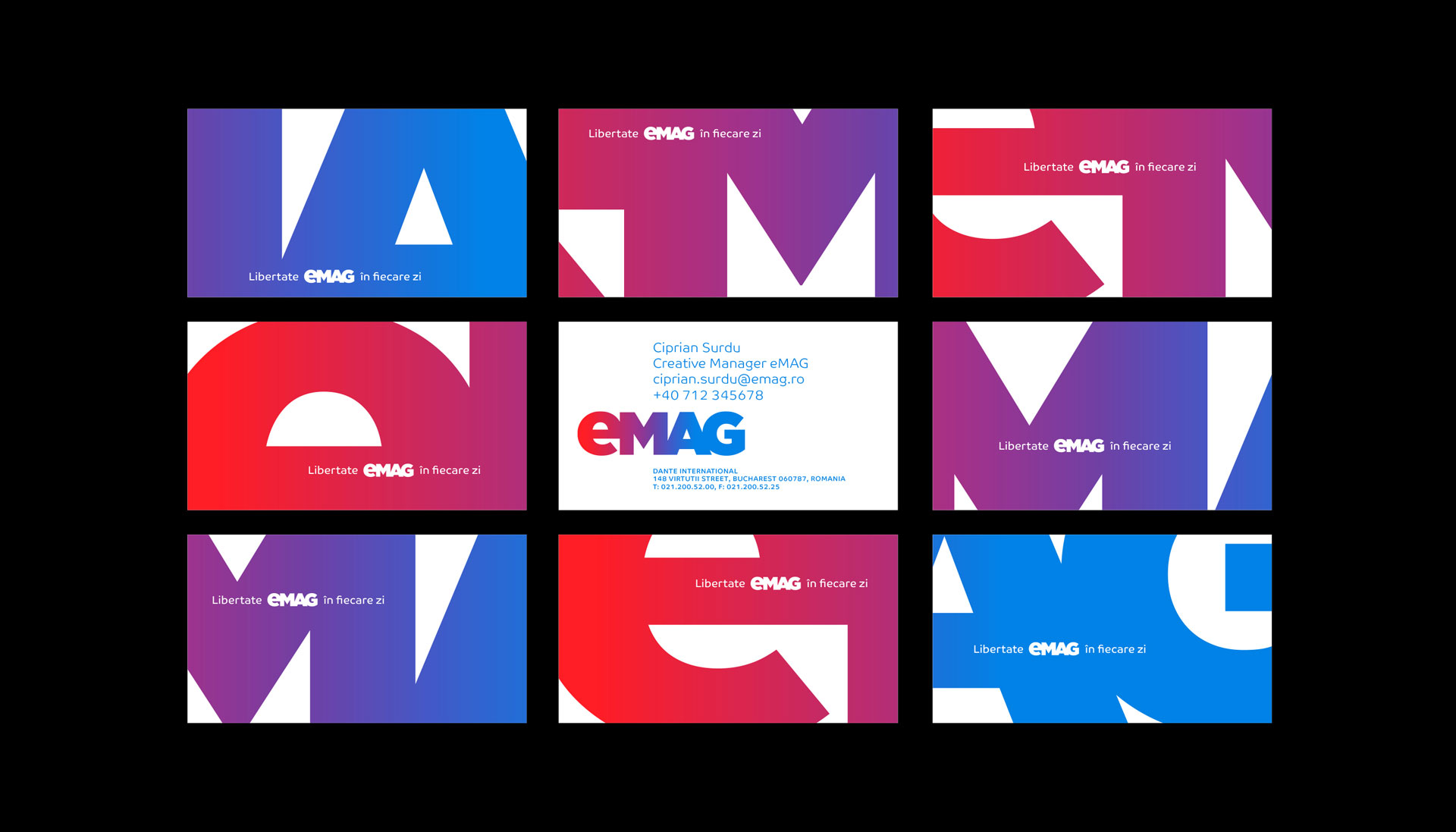
Together with the new gradient, the key visual element of corporate communication is the eMAG logo itself — applied oversized, it always appears cut out, meant to communicate a brand so large that it is difficult to contain in a single composition, but which, at the same time, is capable of embodying countless visual manifestations simultaneously.
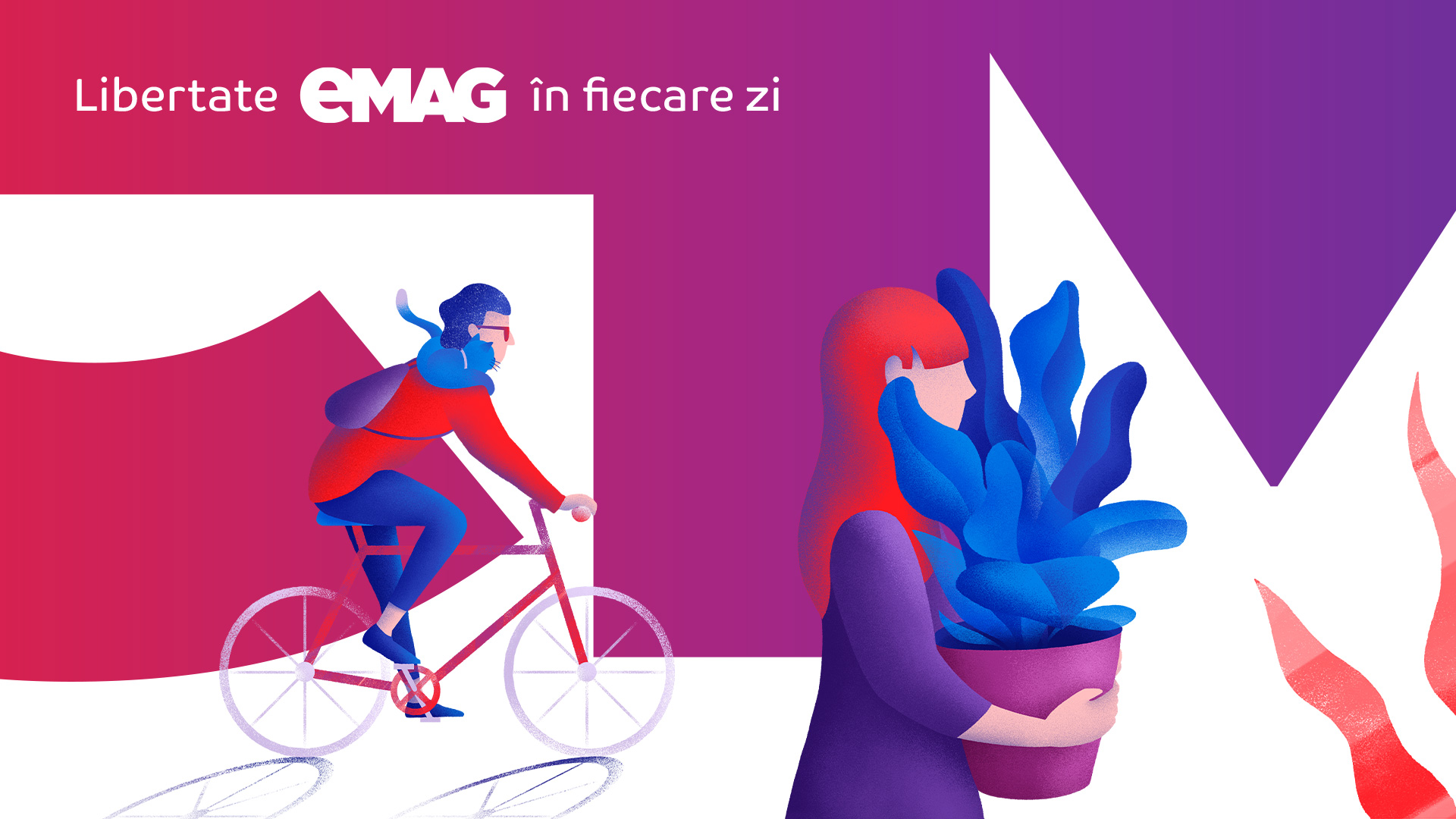
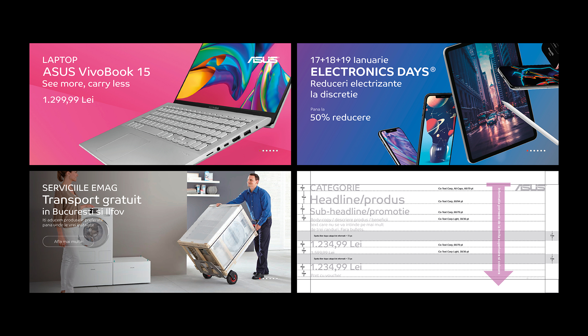
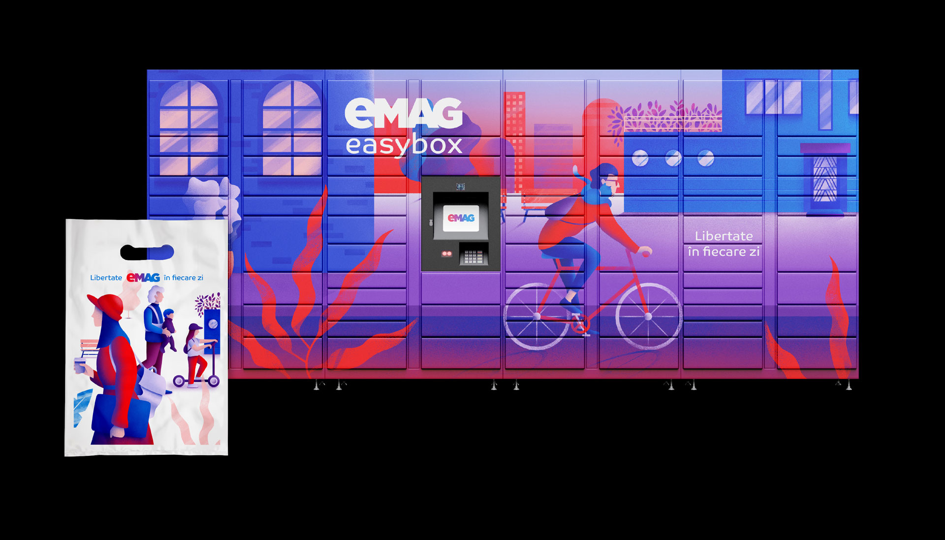
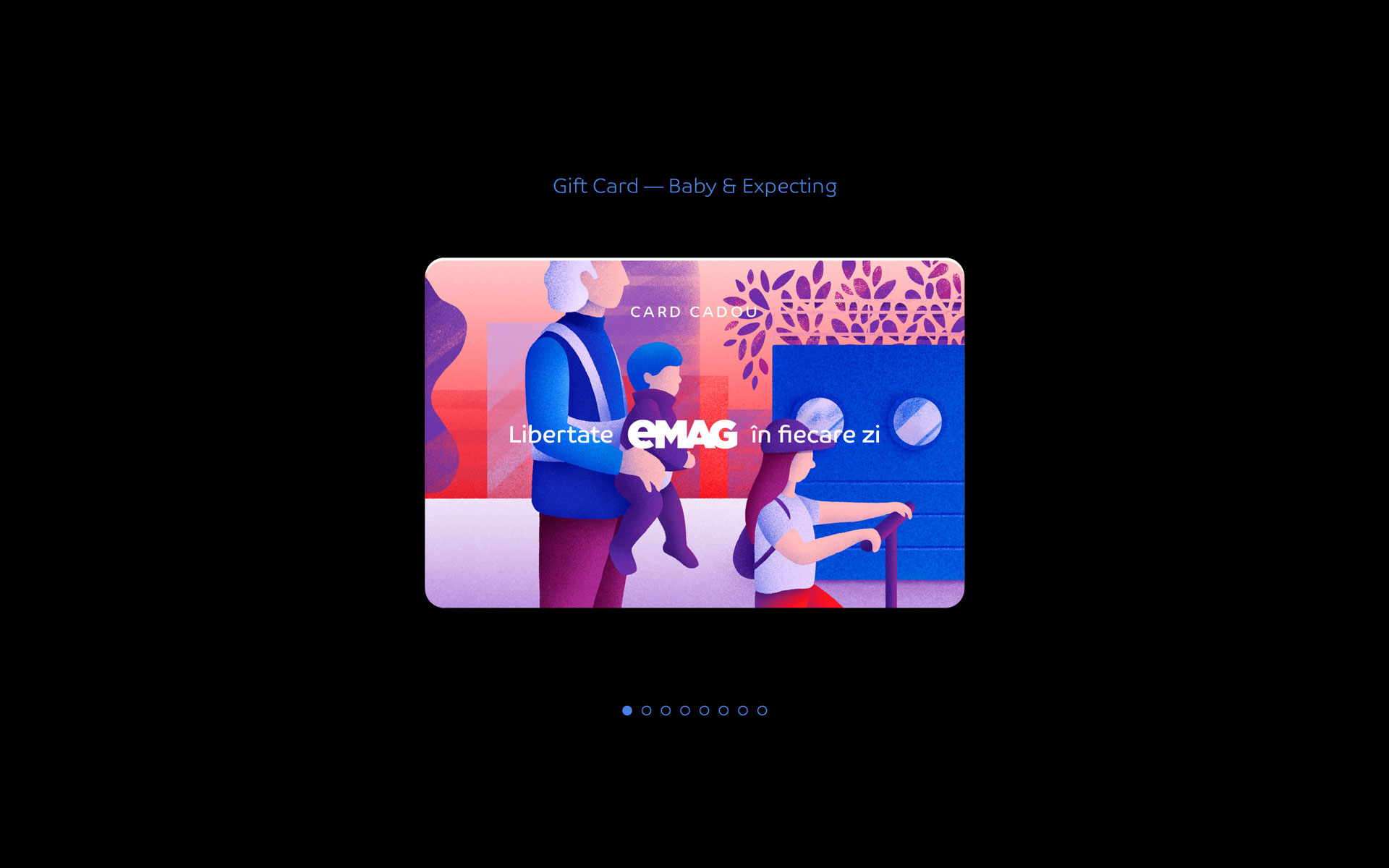
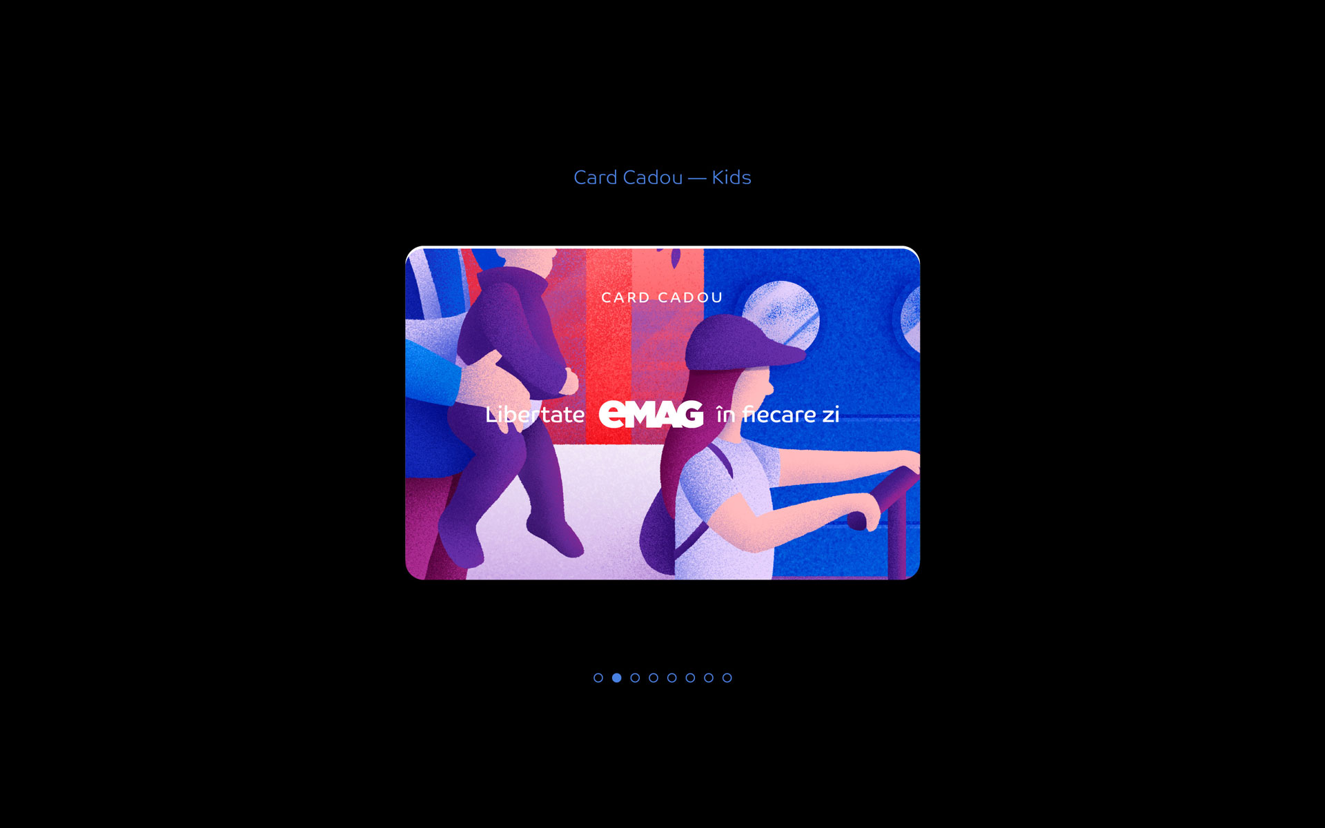
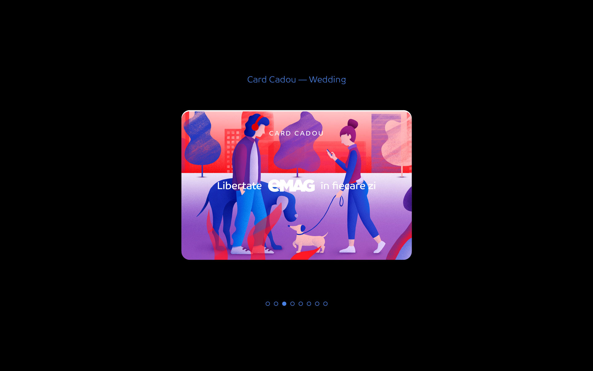
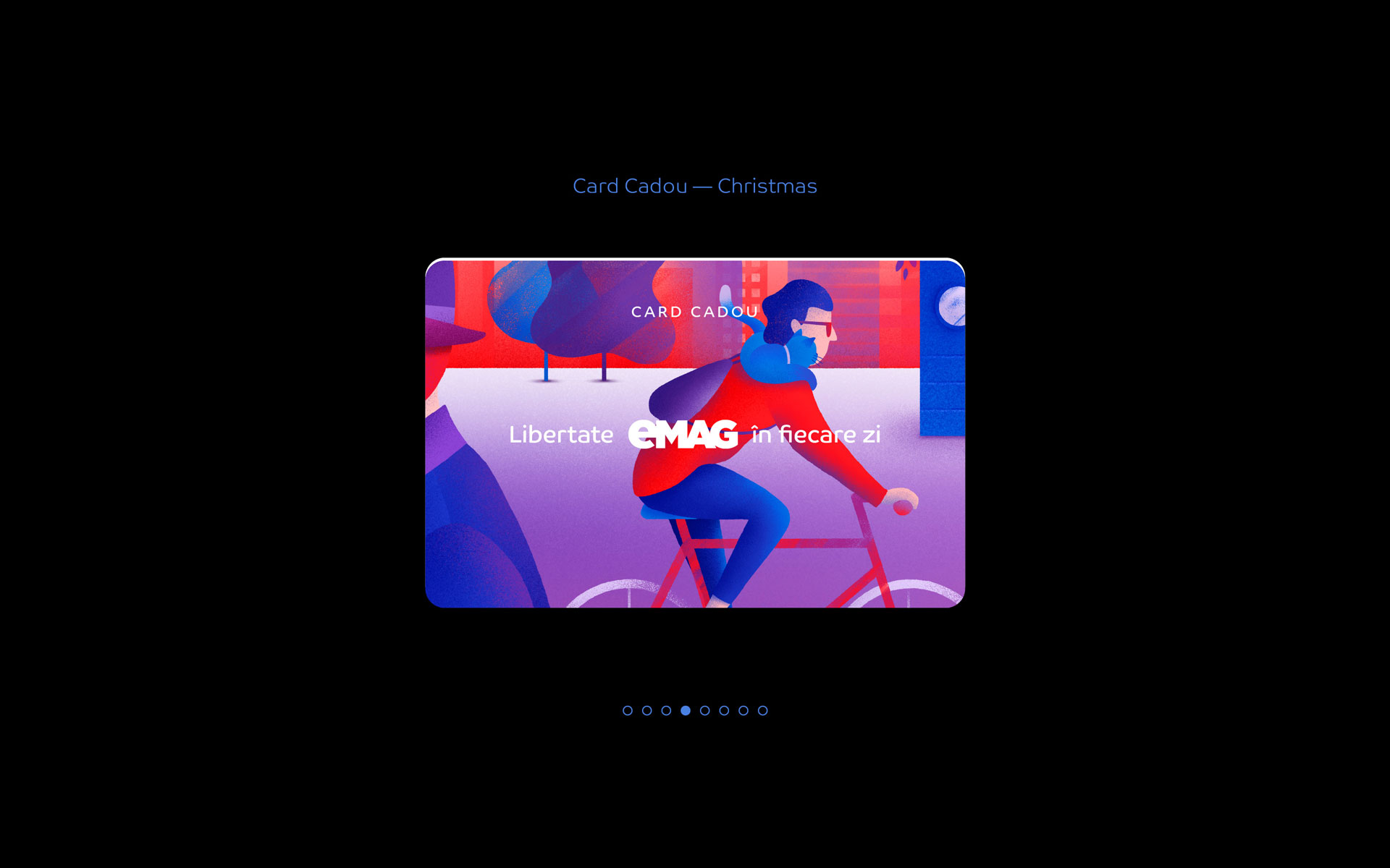
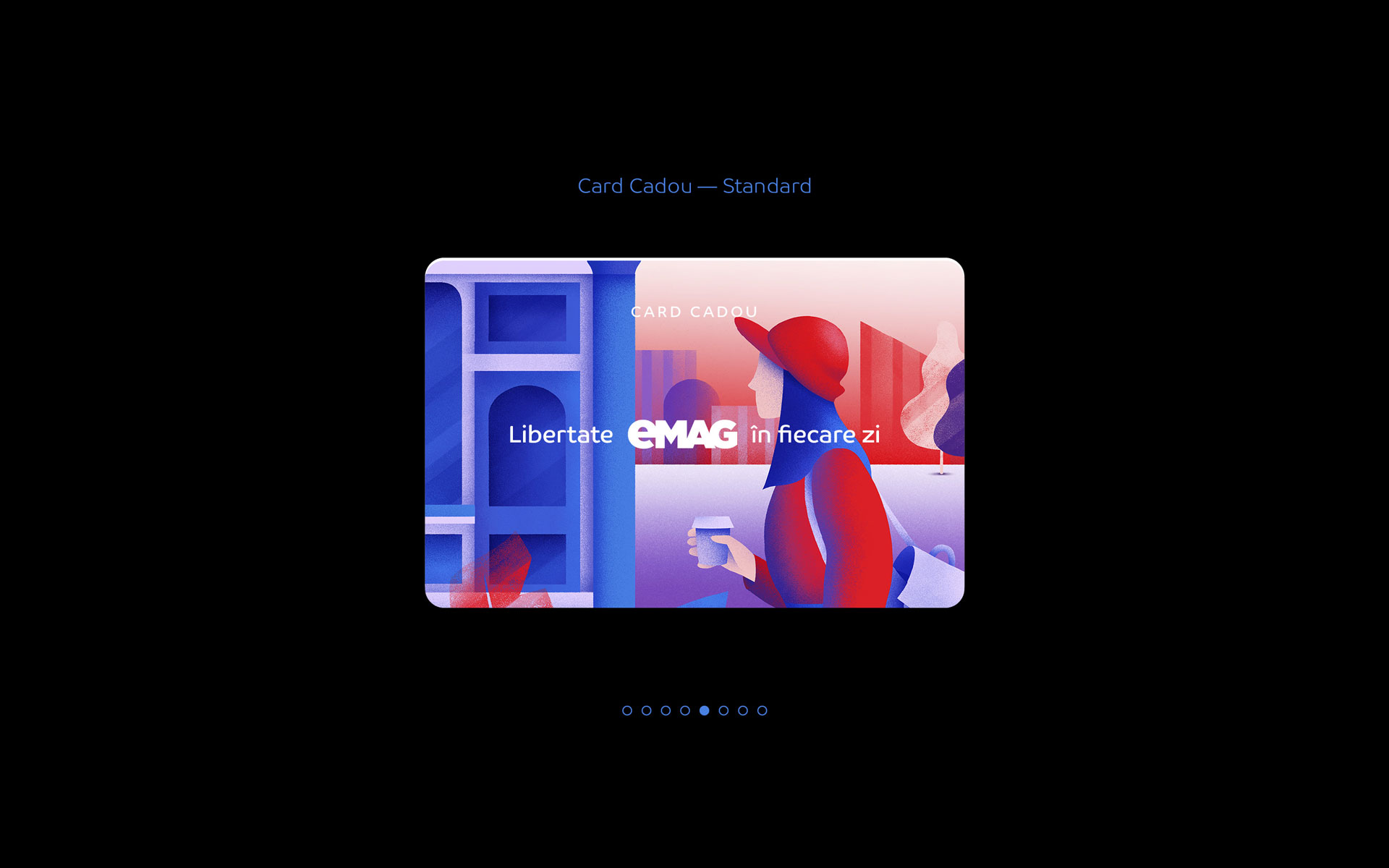
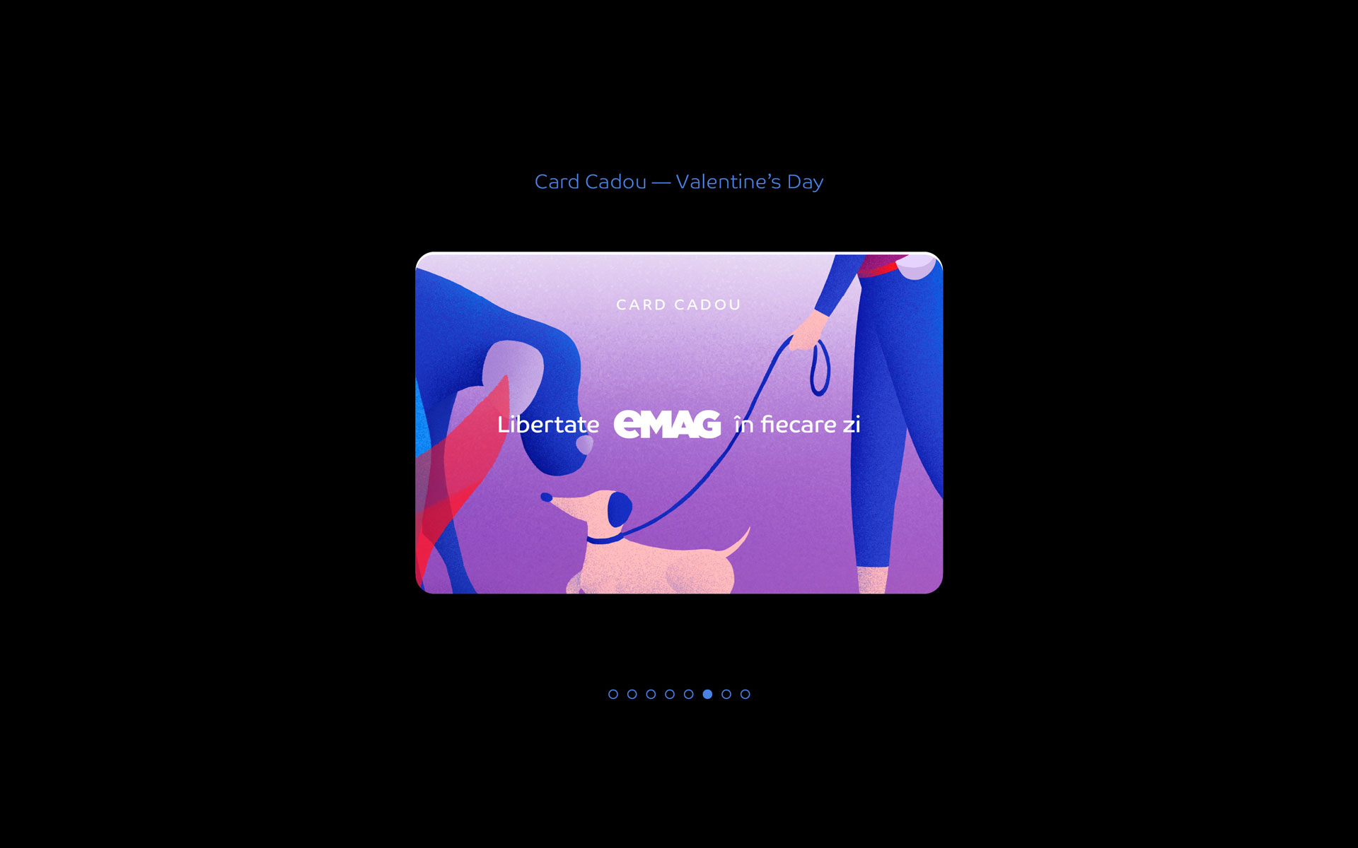
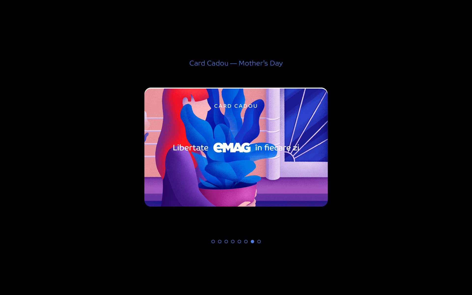
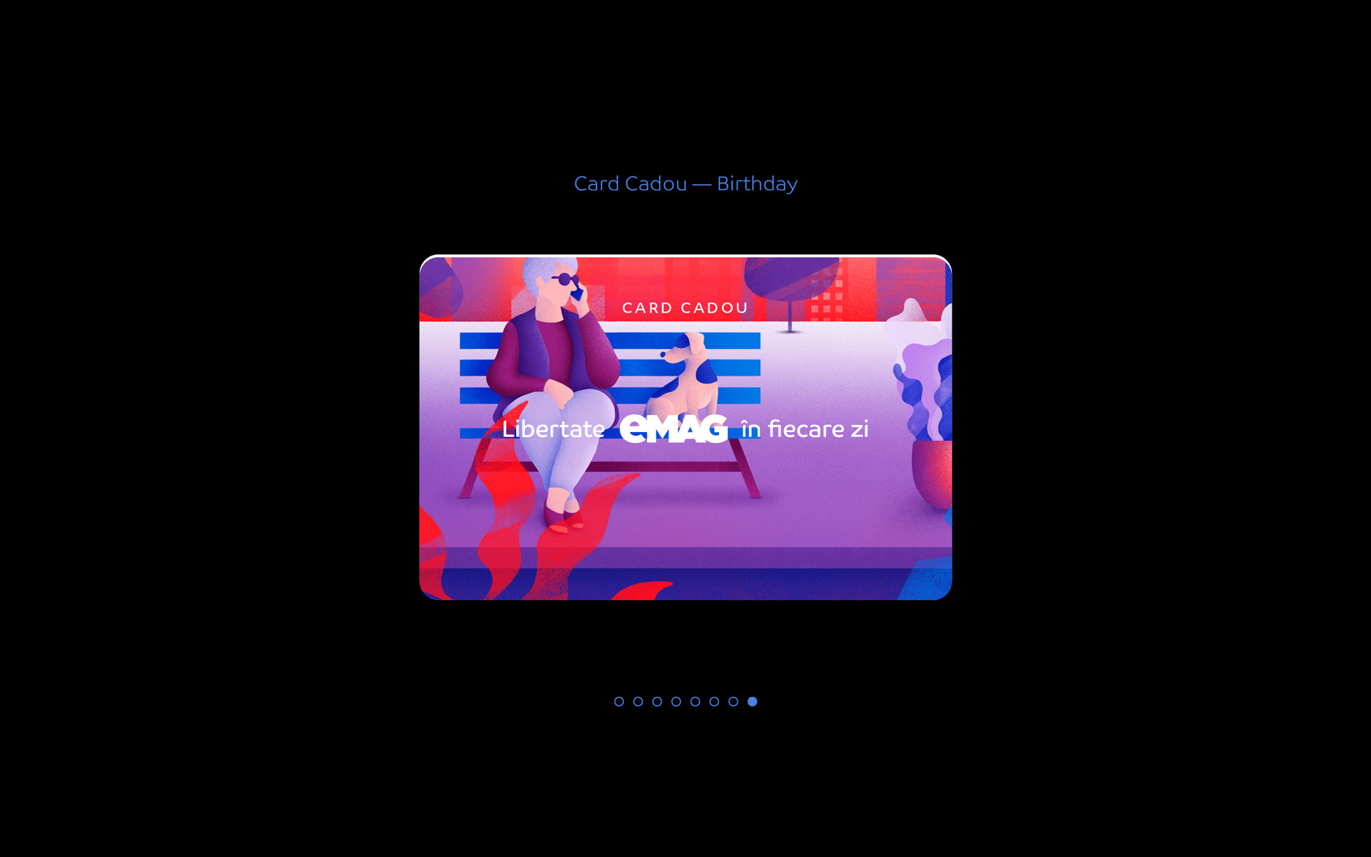
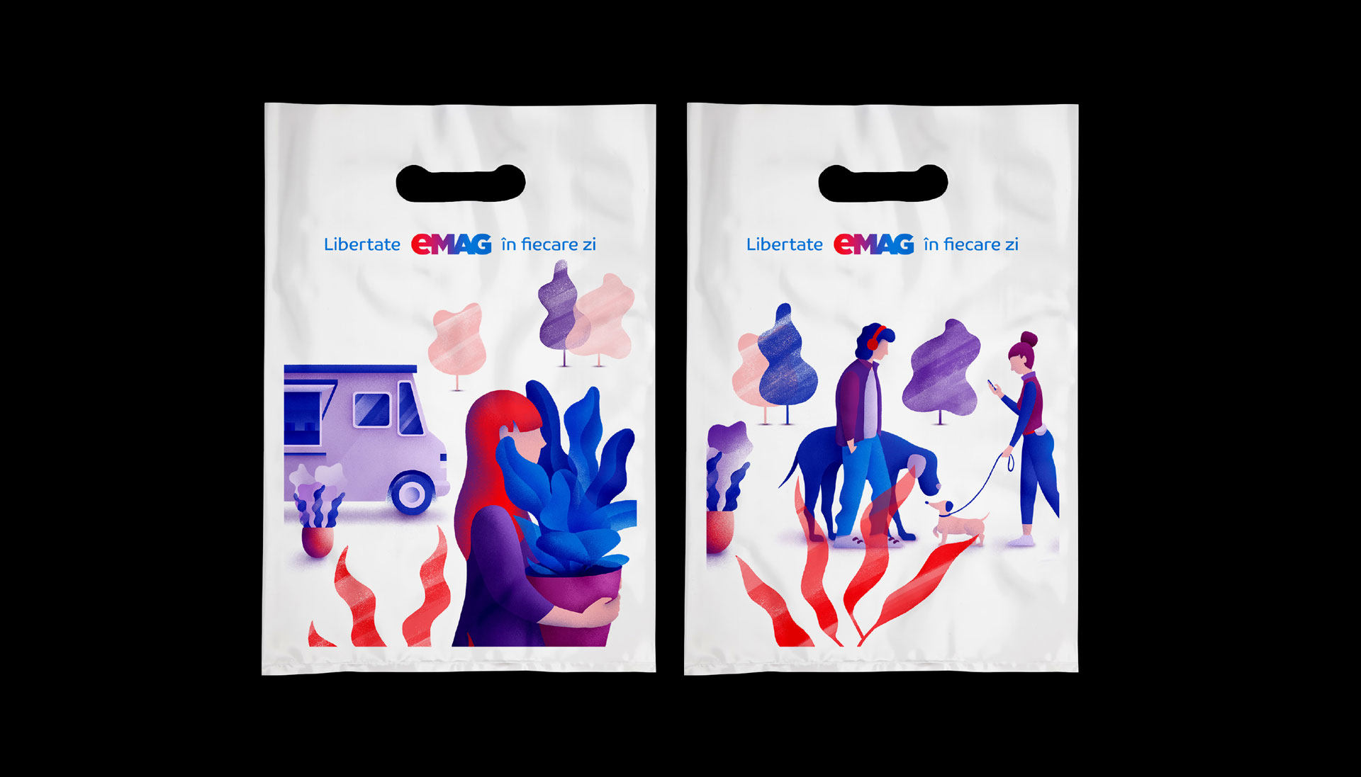
For the brand's commercial communication, especially for generic applications such as cabinets, gift cards or bags, a flexible, modular illustration system was created that respects the brand's color palette and quickly became a valuable brand property.
eMAG is the star brand of e-commerce in Eastern Europe. The 2019 rebranding introduces a fresh, fluid and vibrant visual identity that meets the high standards of the eMAG platform and services and positions the brand among the top digital products.
The visual solution itself is a refresh of the old identity in which, in front of a blue logo, red objects were visible. The red-blue gradient applied in the new logo now manages to reflect not only the universality of the product range, but also the state-of-the-art technology and dynamism of eMAG services.
Together with the new gradient, the key visual element of corporate communication is the eMAG logo itself — applied oversized, it always appears cut out, meant to communicate a brand so large that it is difficult to contain in a single composition, but which, at the same time, is capable of embodying countless visual manifestations simultaneously.
For the brand's commercial communication, especially for generic applications such as cabinets, gift cards or bags, a flexible, modular illustration system was created that respects the brand's color palette and quickly became a valuable brand property.
CLIENT
eMAG
YEAR
2019
SERVICES
Visual Identity, Web & UI Design, Corporate Brand Design, B2C Communication Design, Retail design, Packaging design, Brand Guidelines, Internal Communication Design
CREDITS
I designed these items while working full time at Brandient.
Images/photos and details are presented courtesy of Brandient.
Illustrations: Evelin Bundur


Copyright © Ciprian Bădălan & Brandient | All rights reserved. No content of this website may be reproduced in any form without written permission from its author. All trademarks belong to their respective owners.