


Solaris rebranding and master pack redesign,
2025
Solaris rebranding and master pack redesign, 2025
Solaris rebranding and master pack redesign, 2025
Solaris rebranding and master pack redesign, 2025
Solaris rebranding and master pack redesign, 2025
Solaris is the leading Romanian brand when it comes to picking a healthy alternative to modern food — a brand focused on the joy of healthy, conscious living.
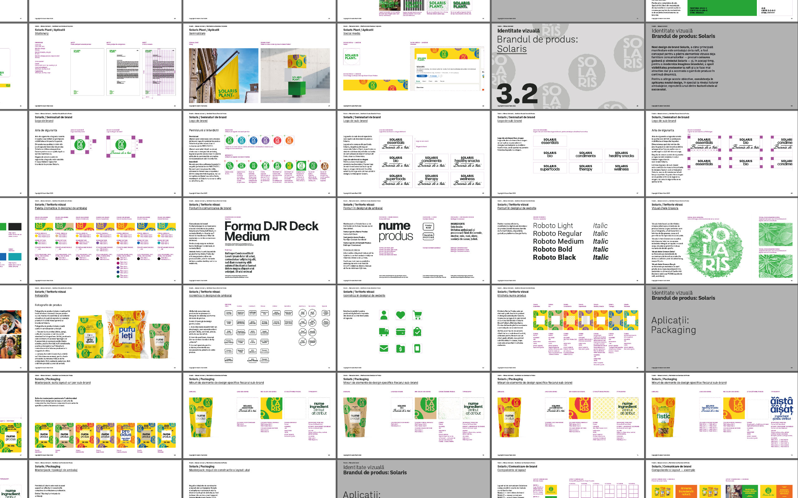
After almost 15 years of constant growth from about 30 products to over 600 today, Solaris Plant decided it was time to clarify its brand and portfolio architecture through a fresh visual approach and a "swiss-army-knife" master-pack designed to promote and support it for the years to come.
What is very interesting to observe in this case is how much a brand can transform itself using the already existing visual identity and graphic territory.
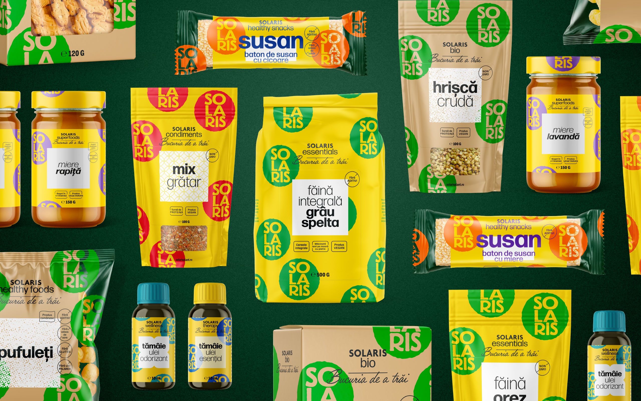
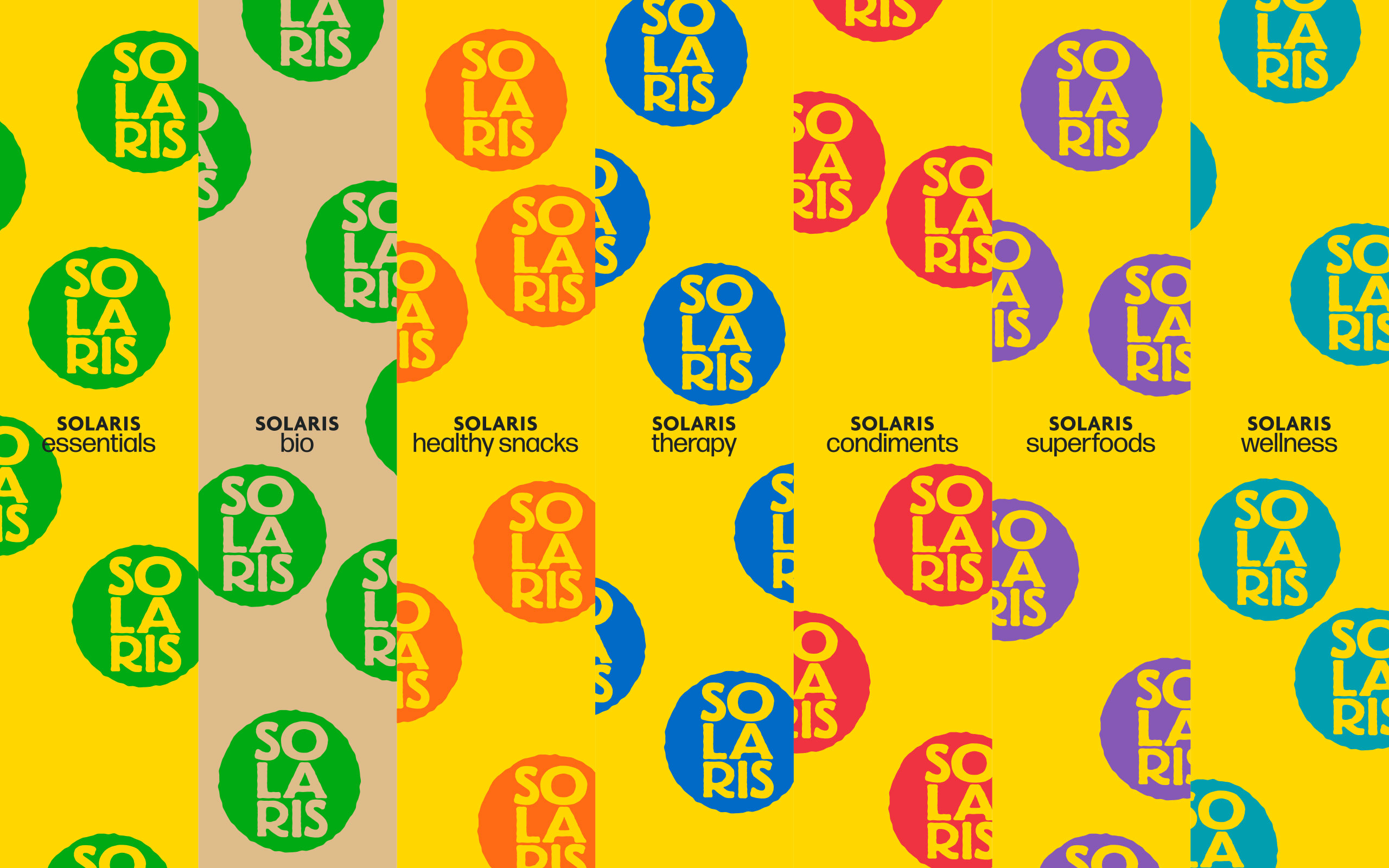
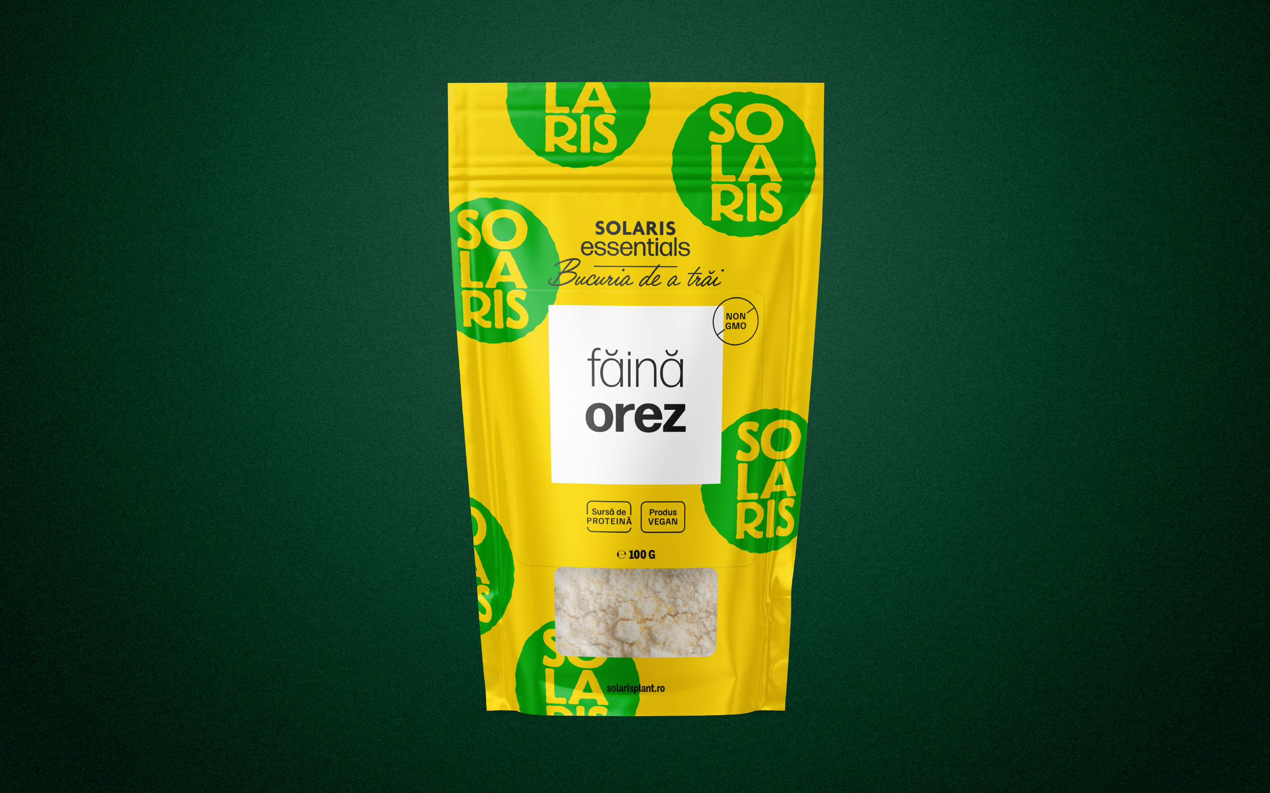
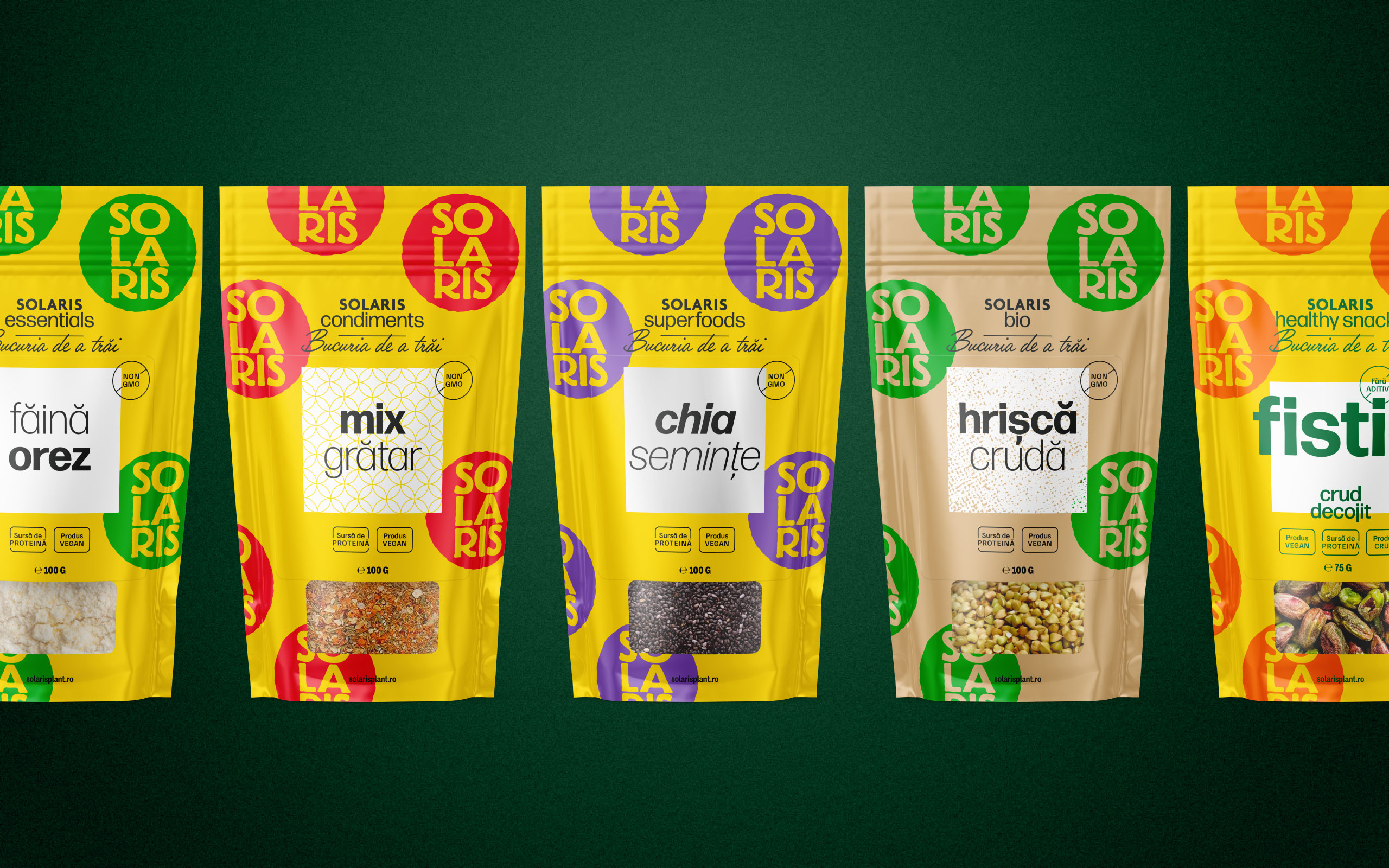
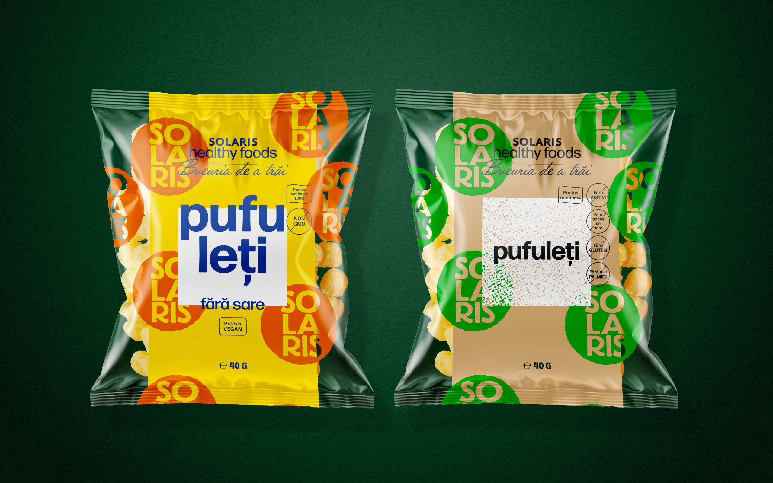
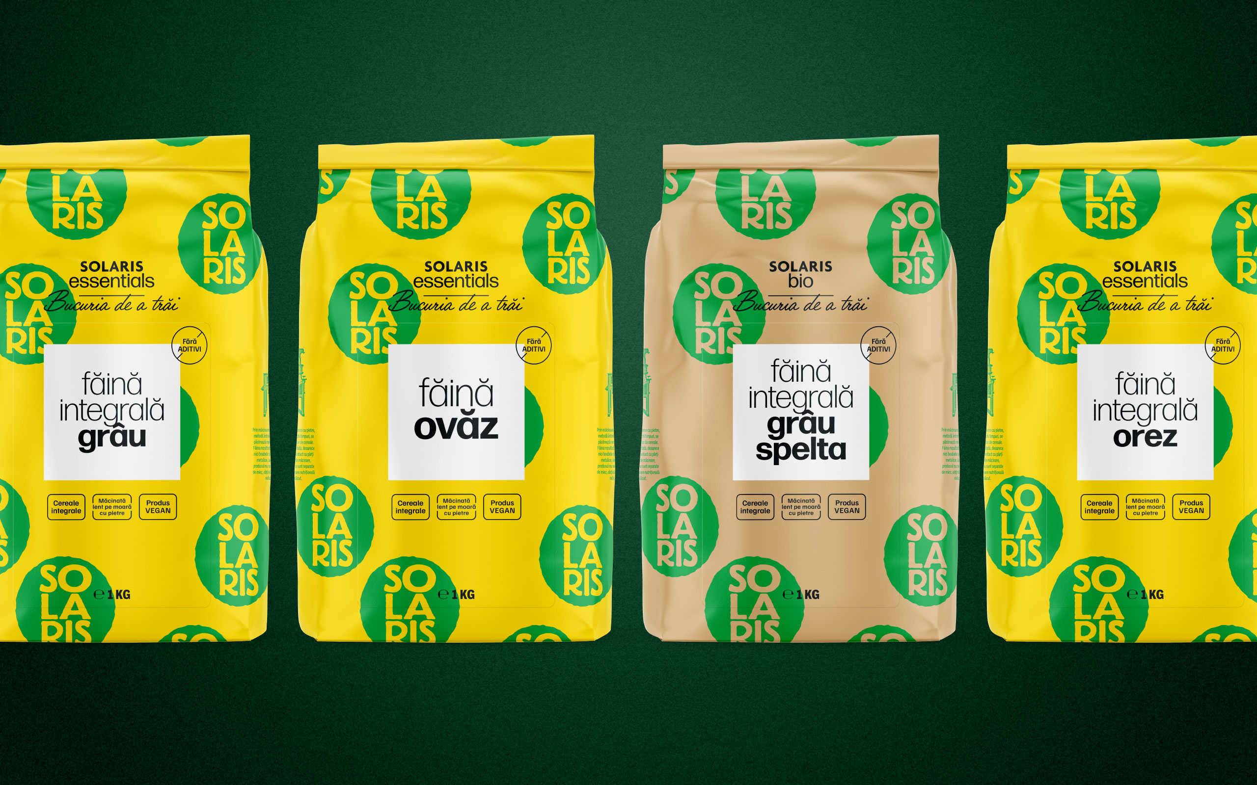
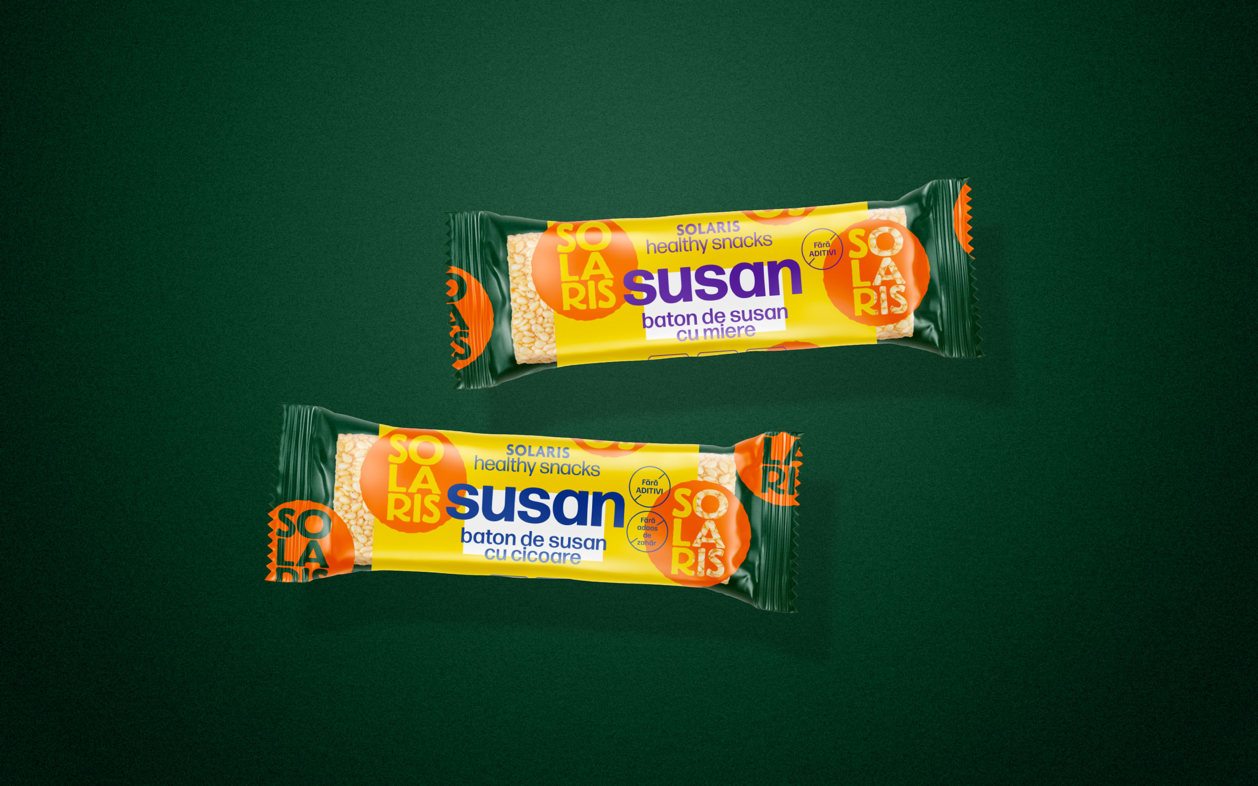
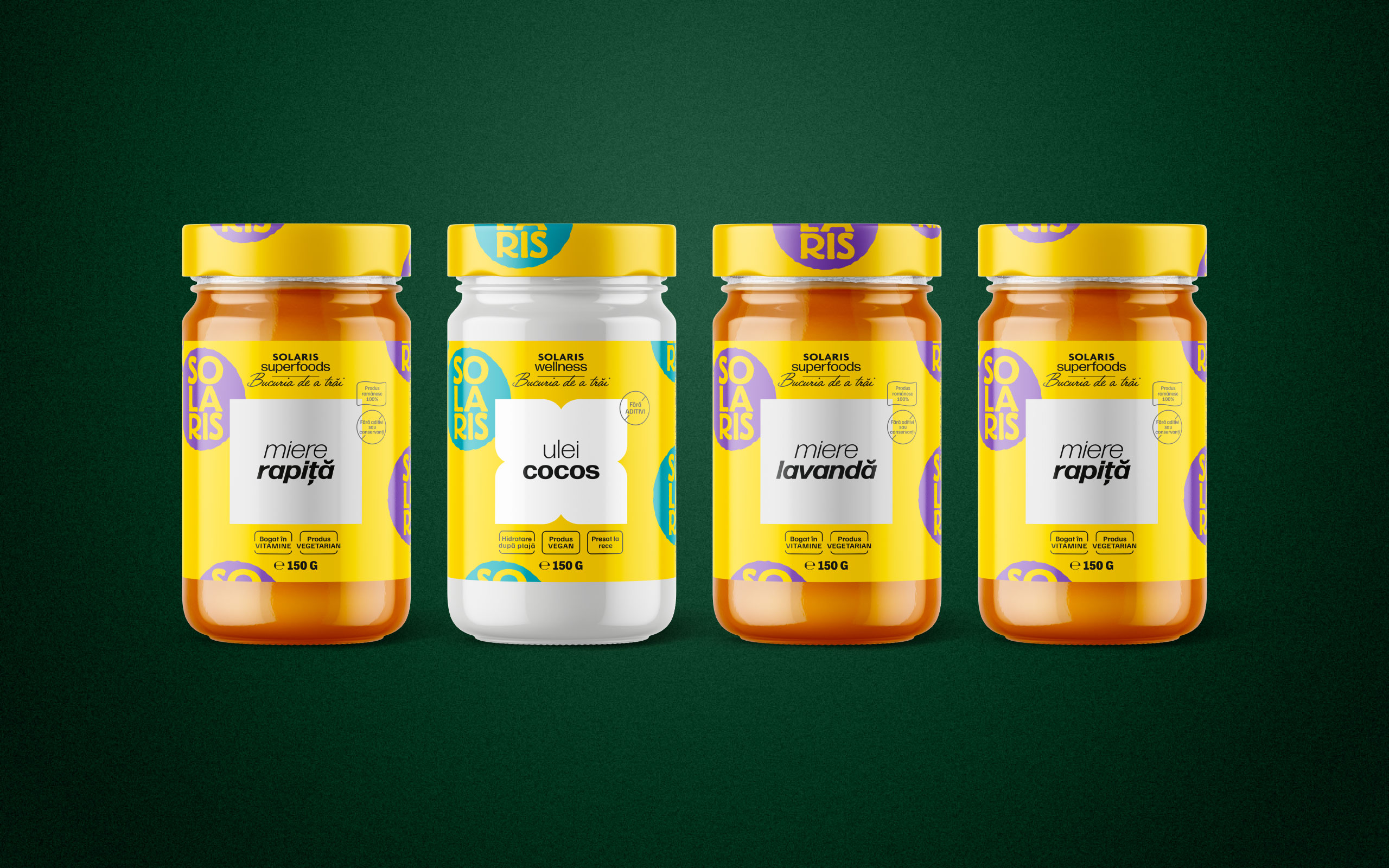
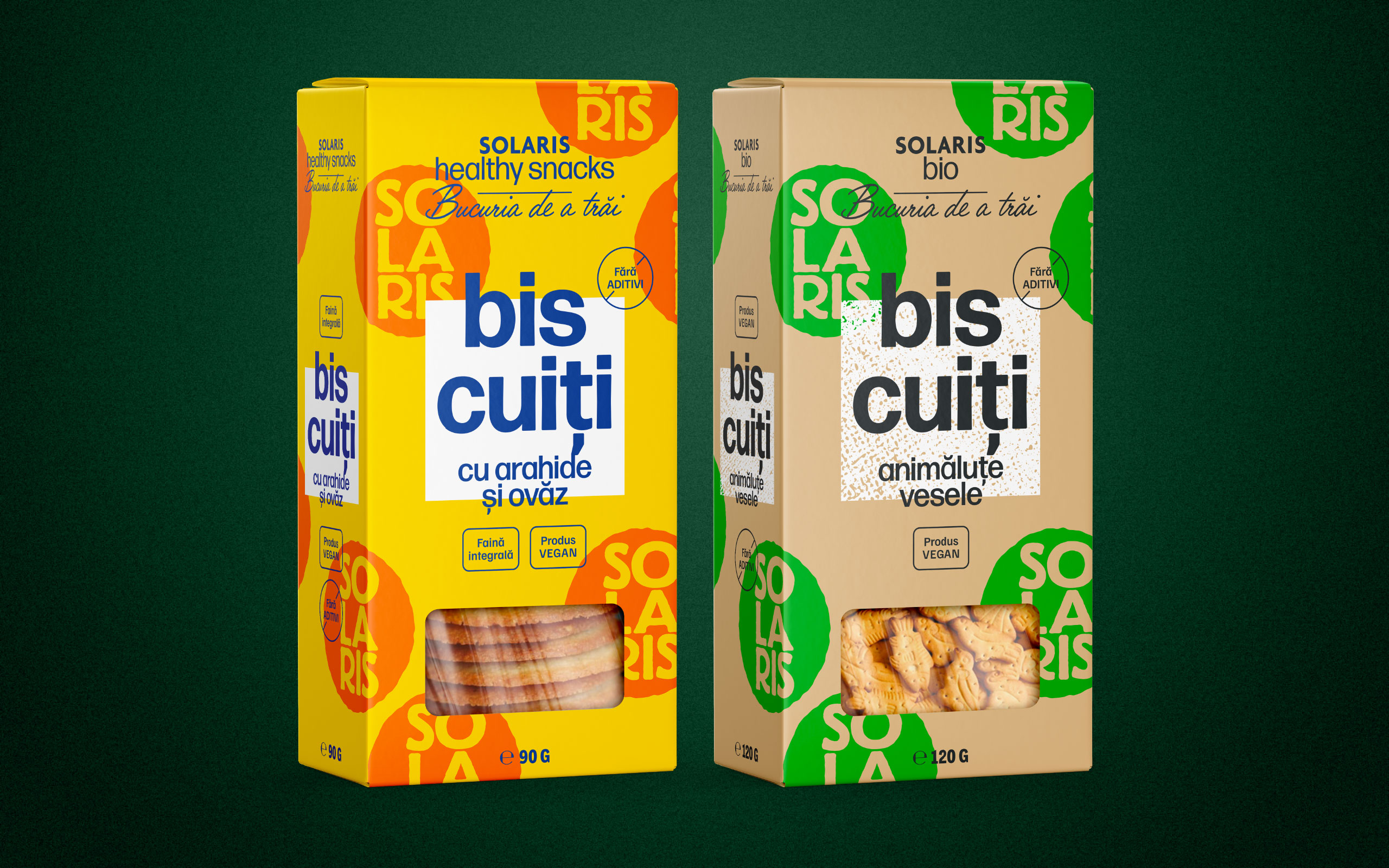
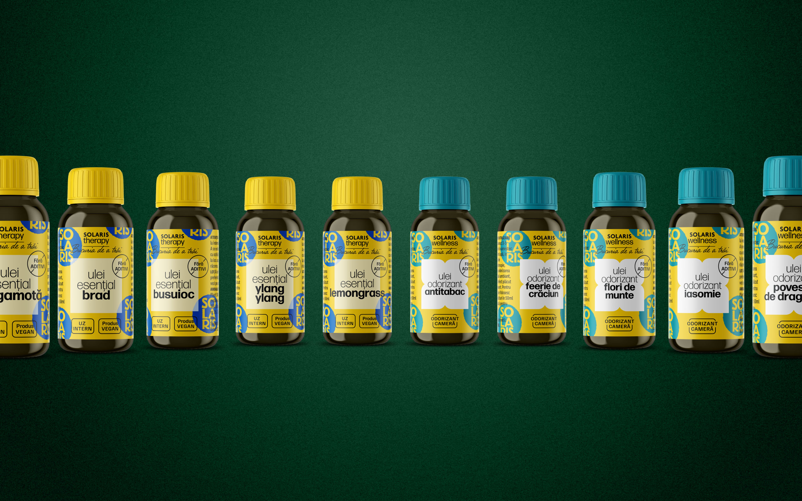
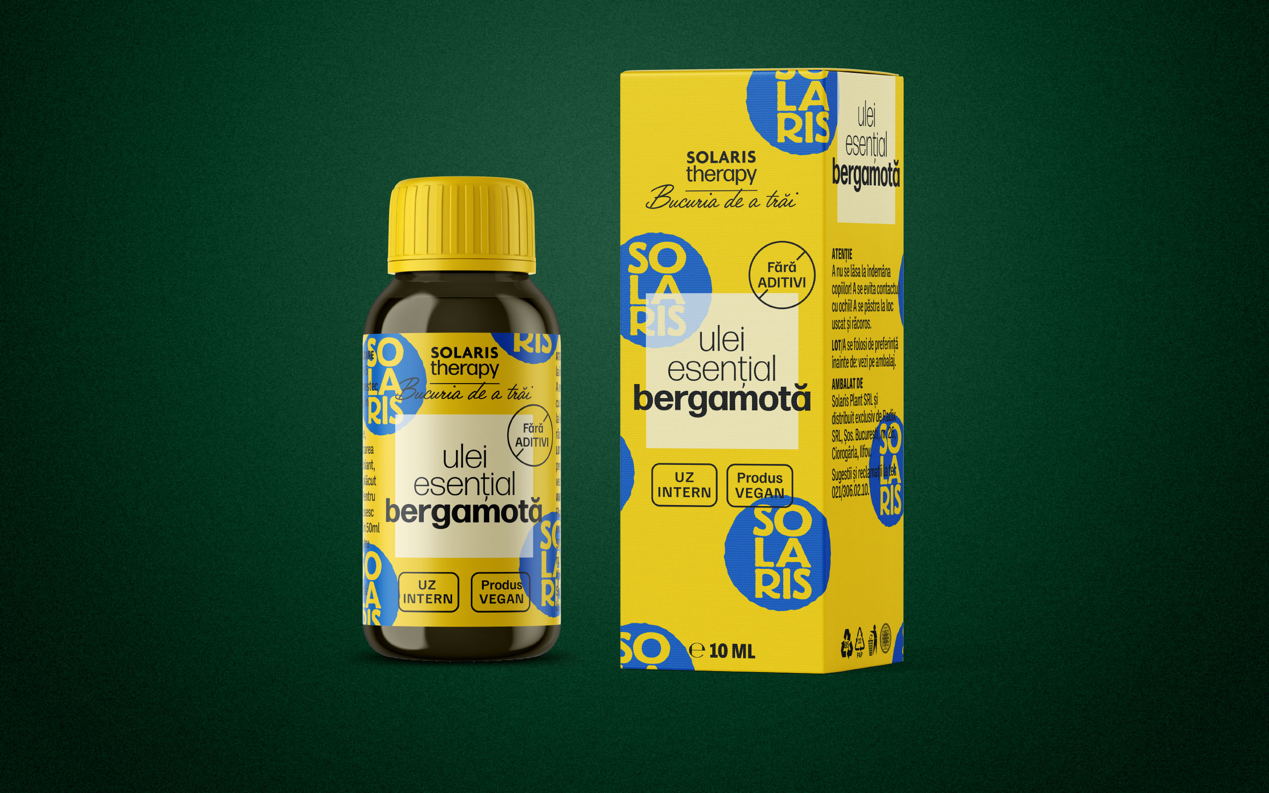
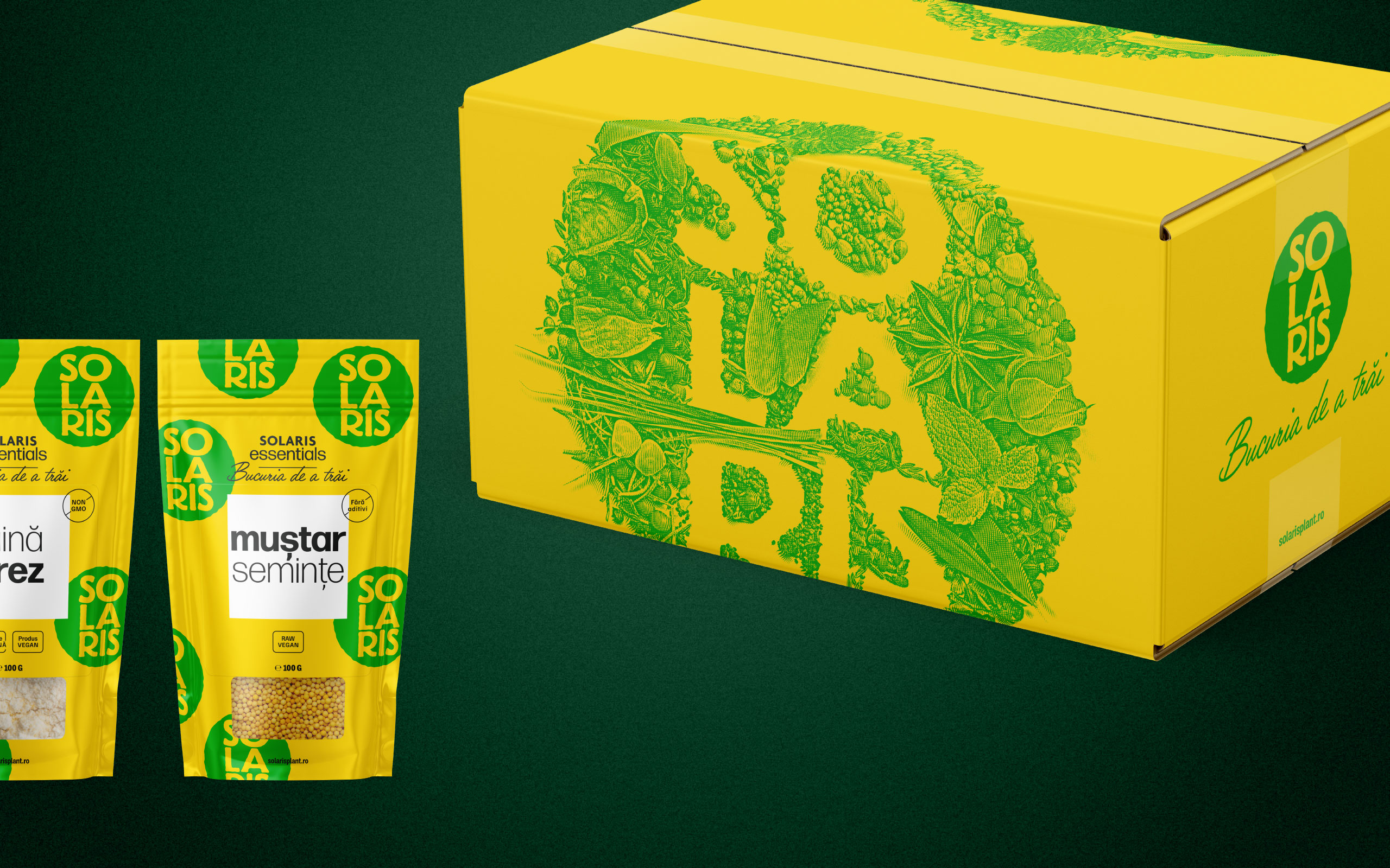
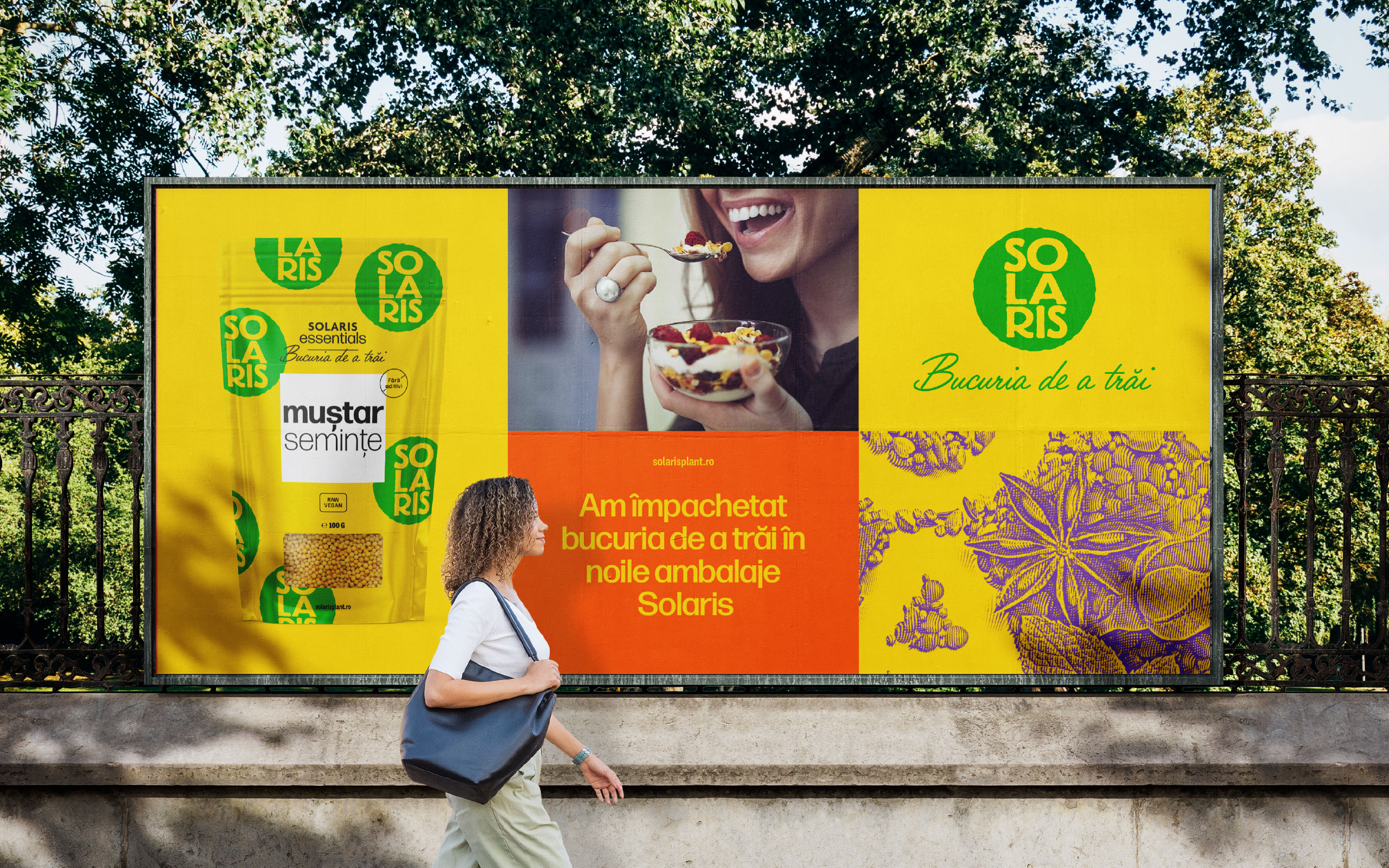
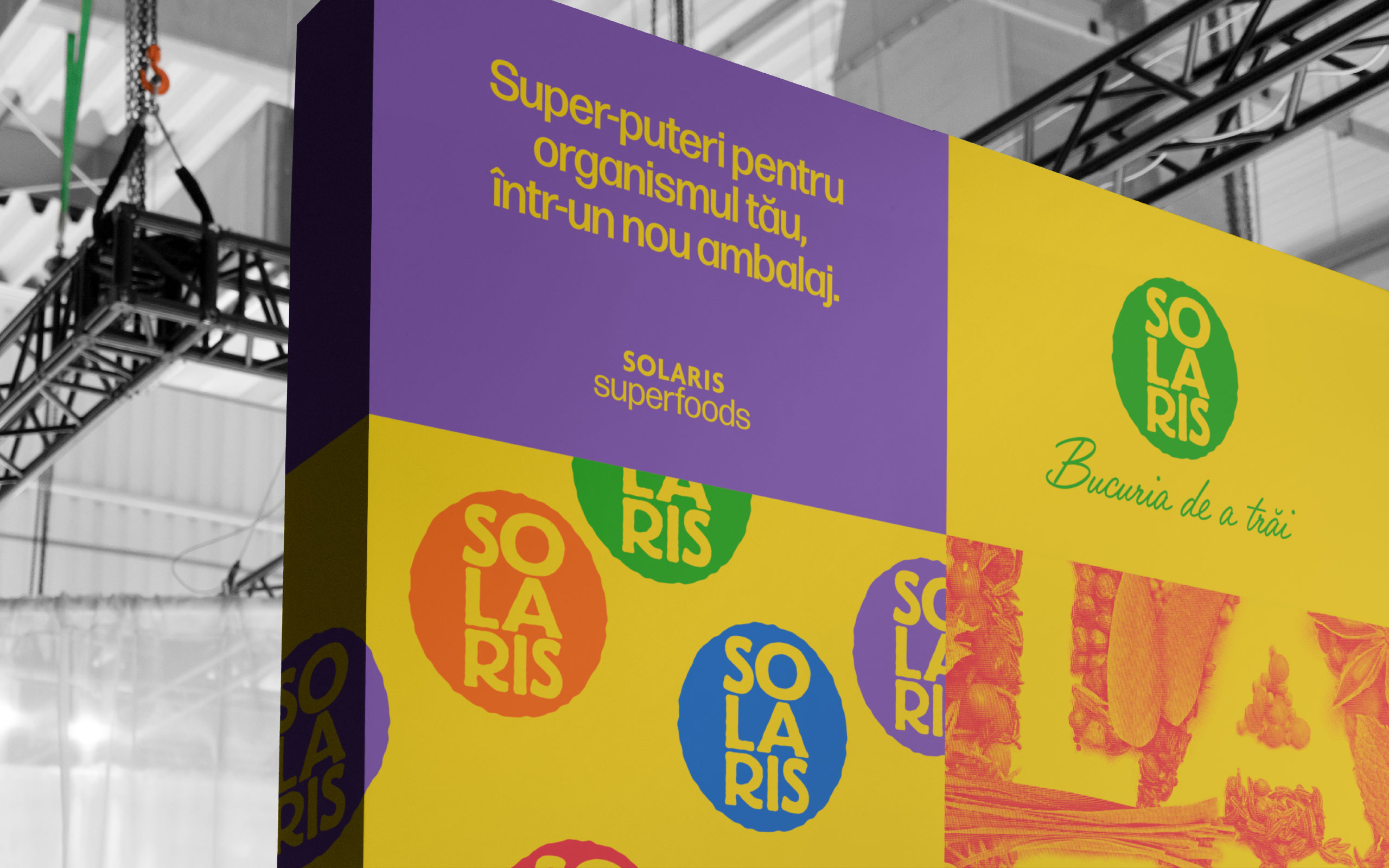
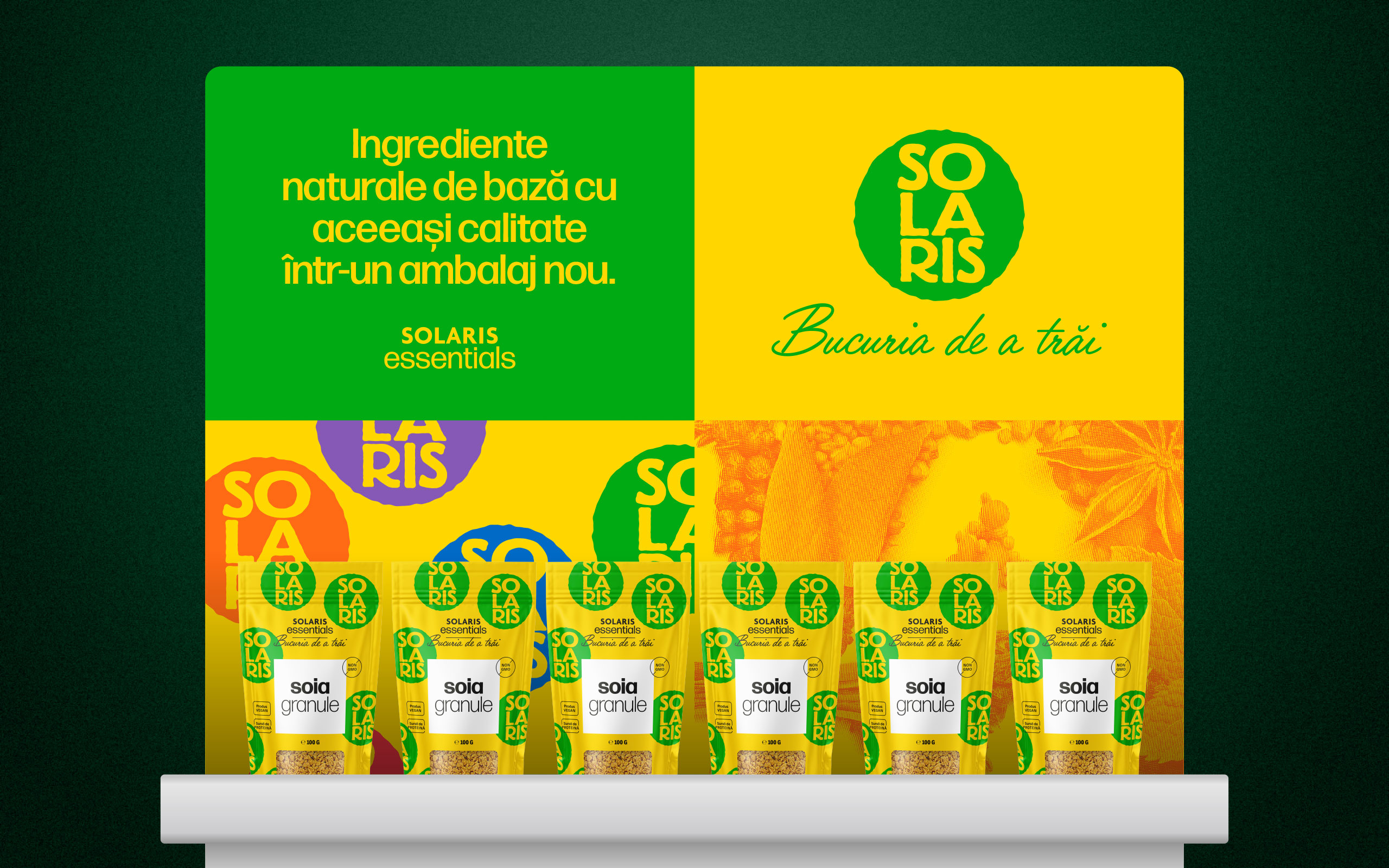
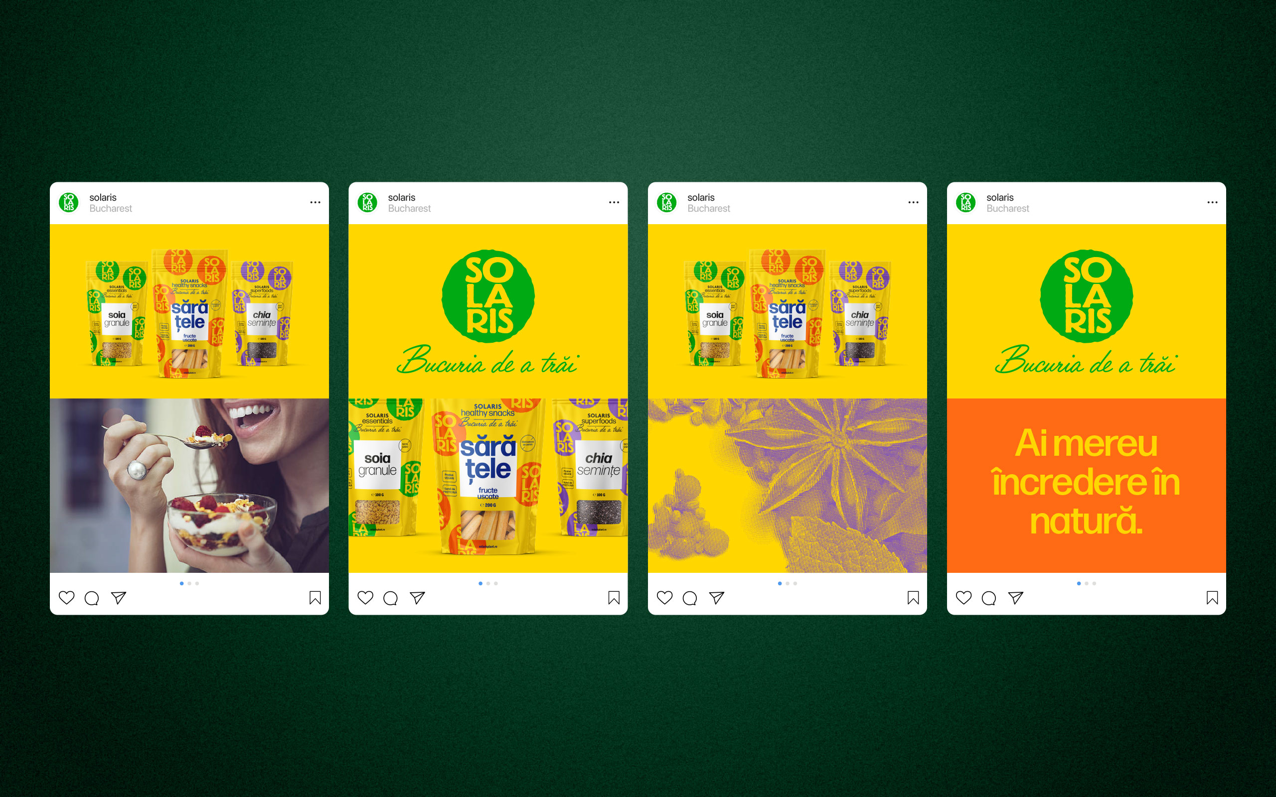
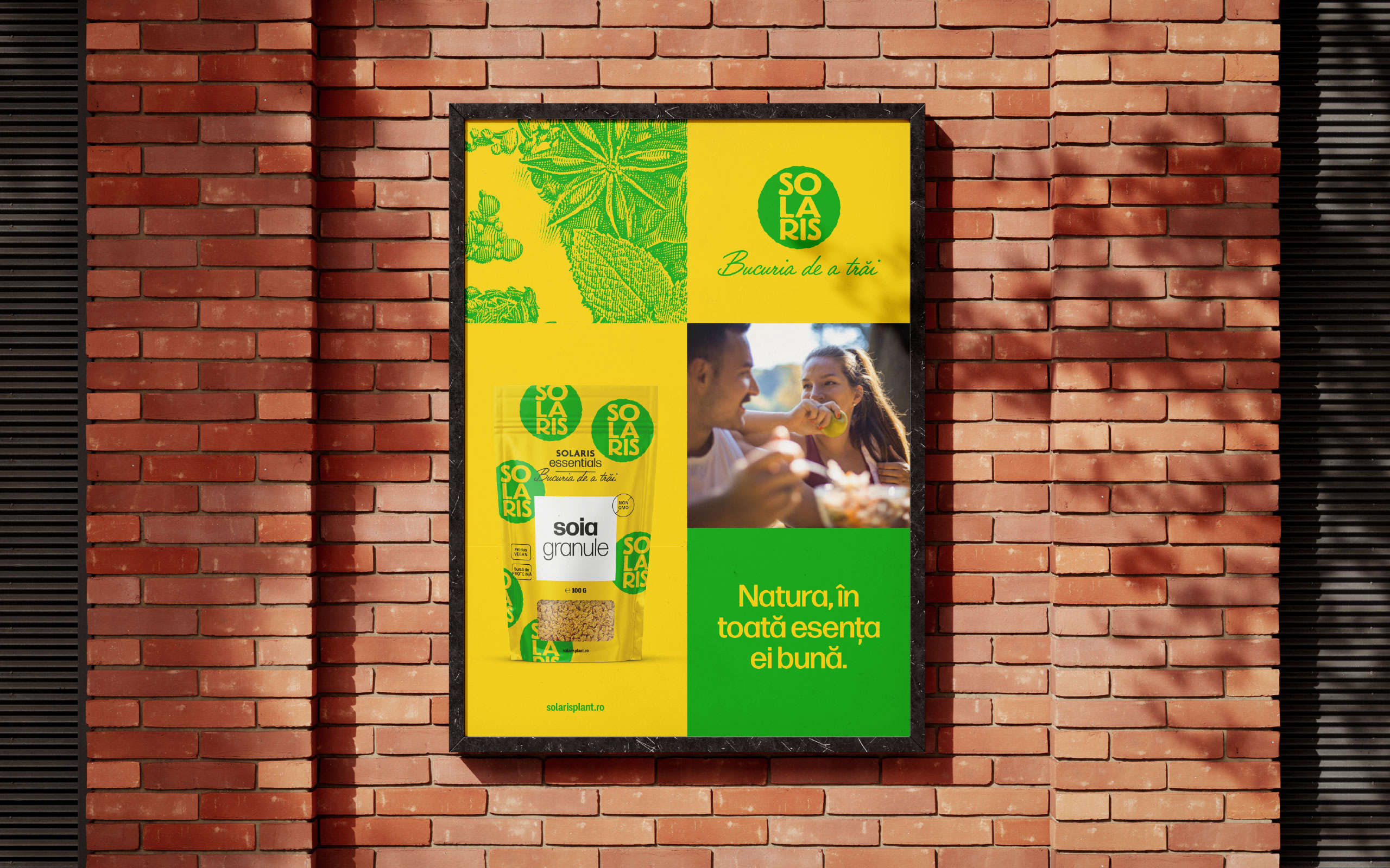
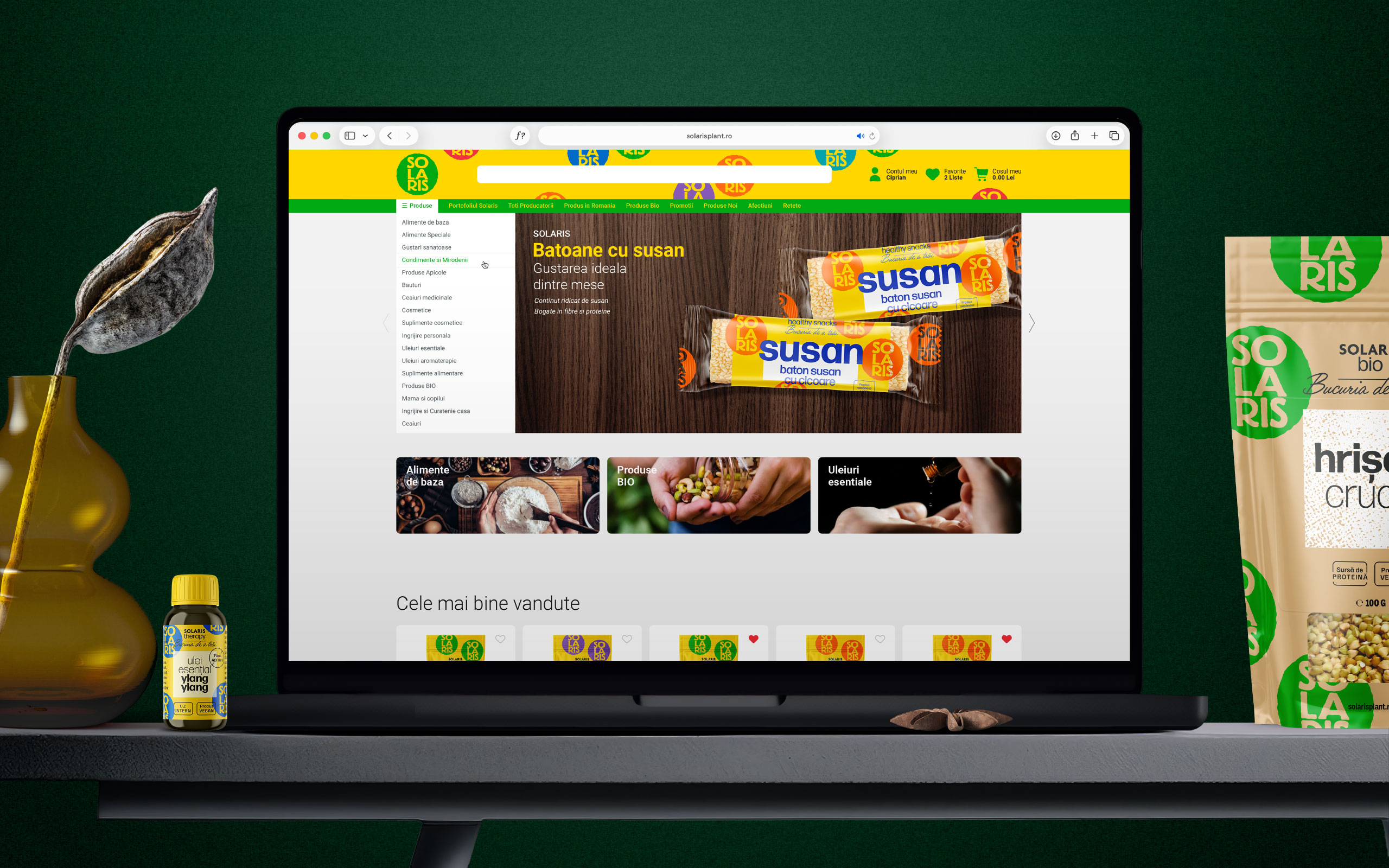
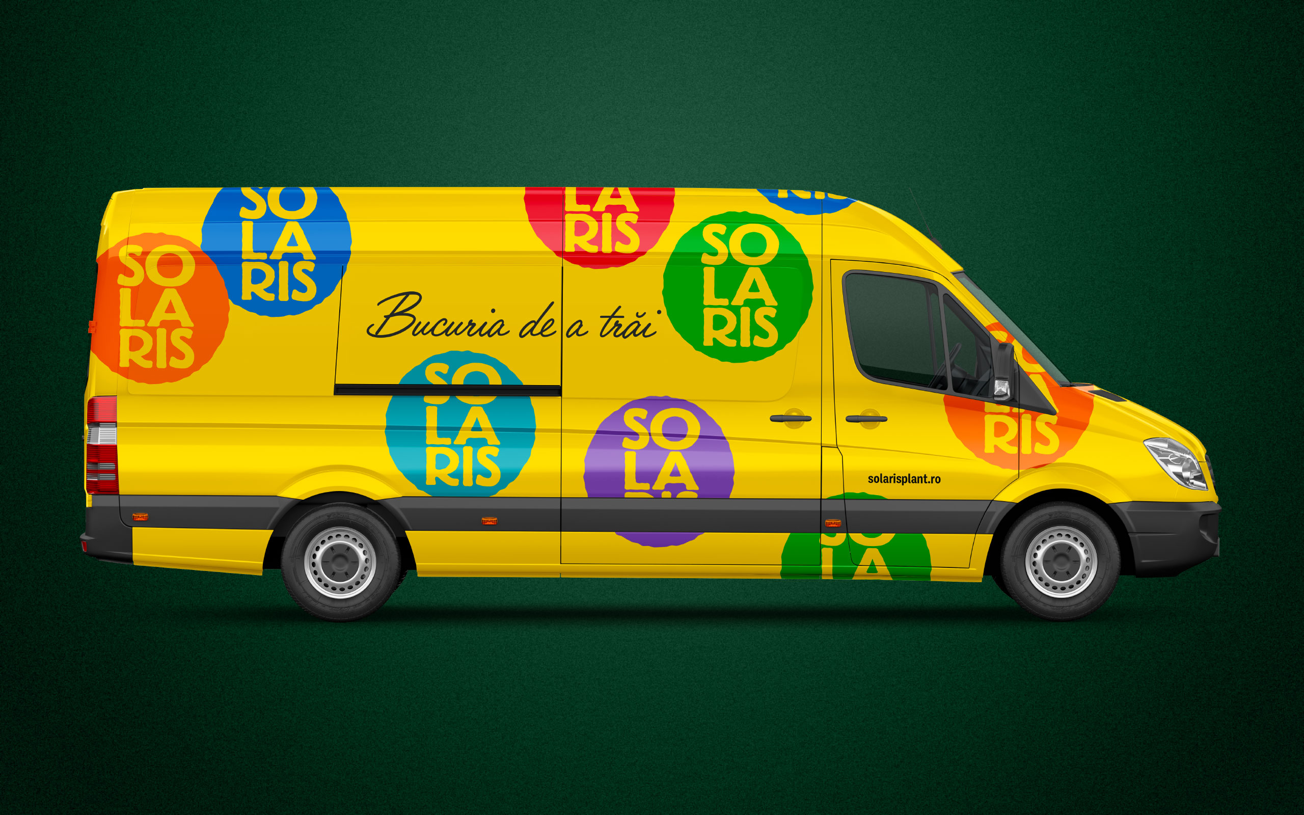
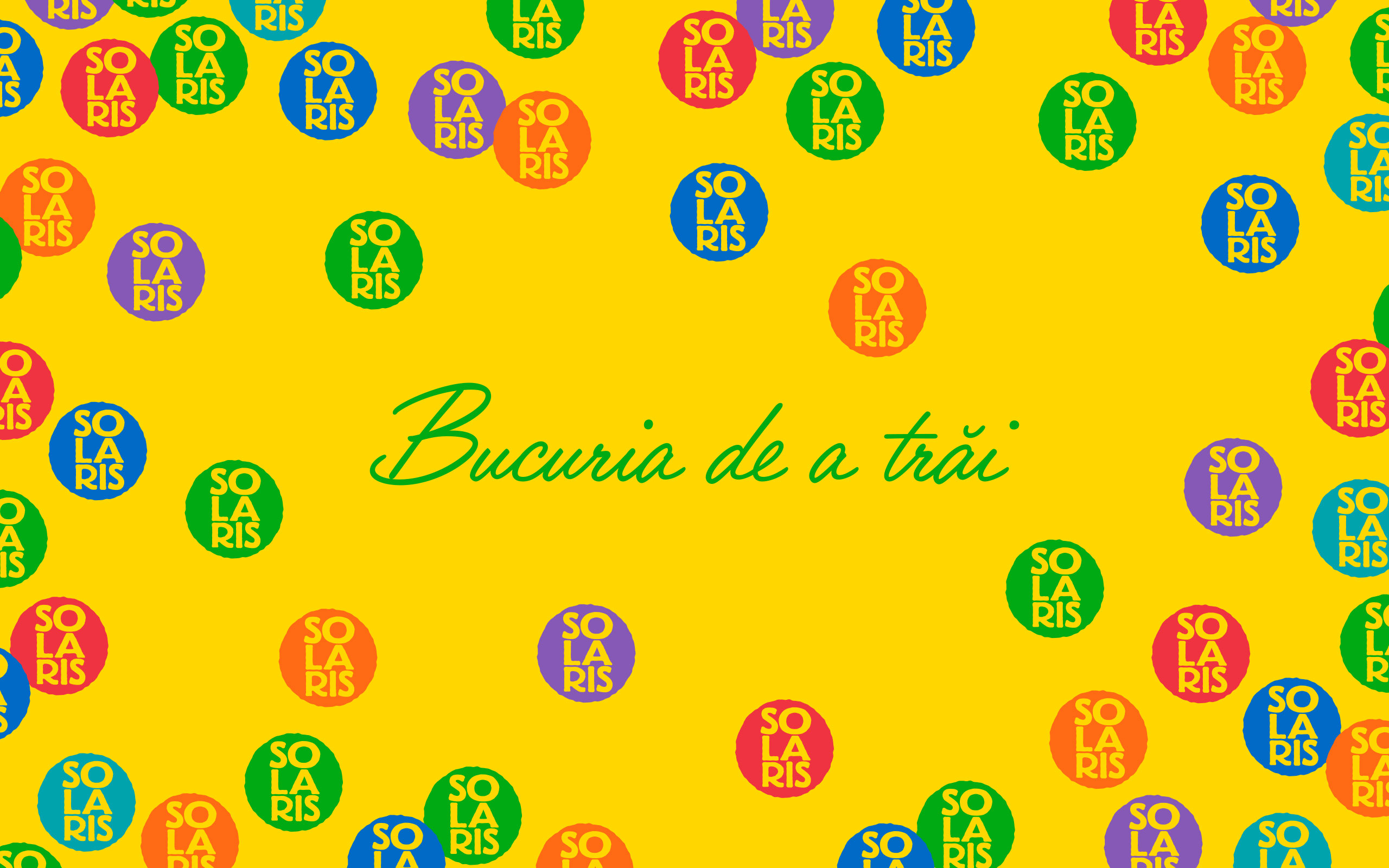
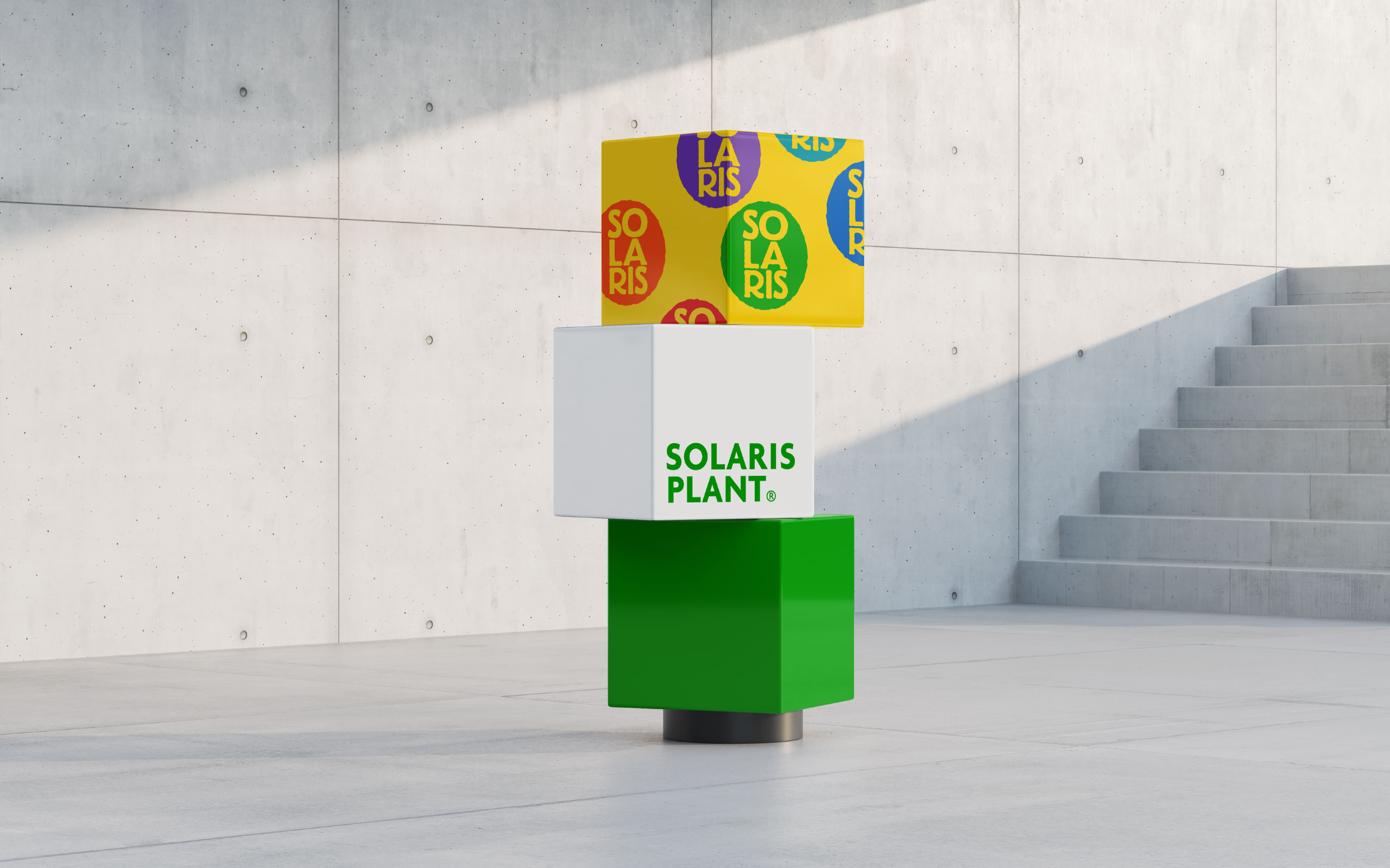
The new logo is not new. In fact, this has been the visual signature used by the Solaris Plant corporate brand until today. What is new, however, is the chromatic approach and the way in which this brand signature is used in the design of the new master pack — namely, in the form of a pattern that populates the entire packaging and signs, although from an apparently secondary position, with a force and freshness of great impact, instantly increasing the brand's recognizability on the shelves.
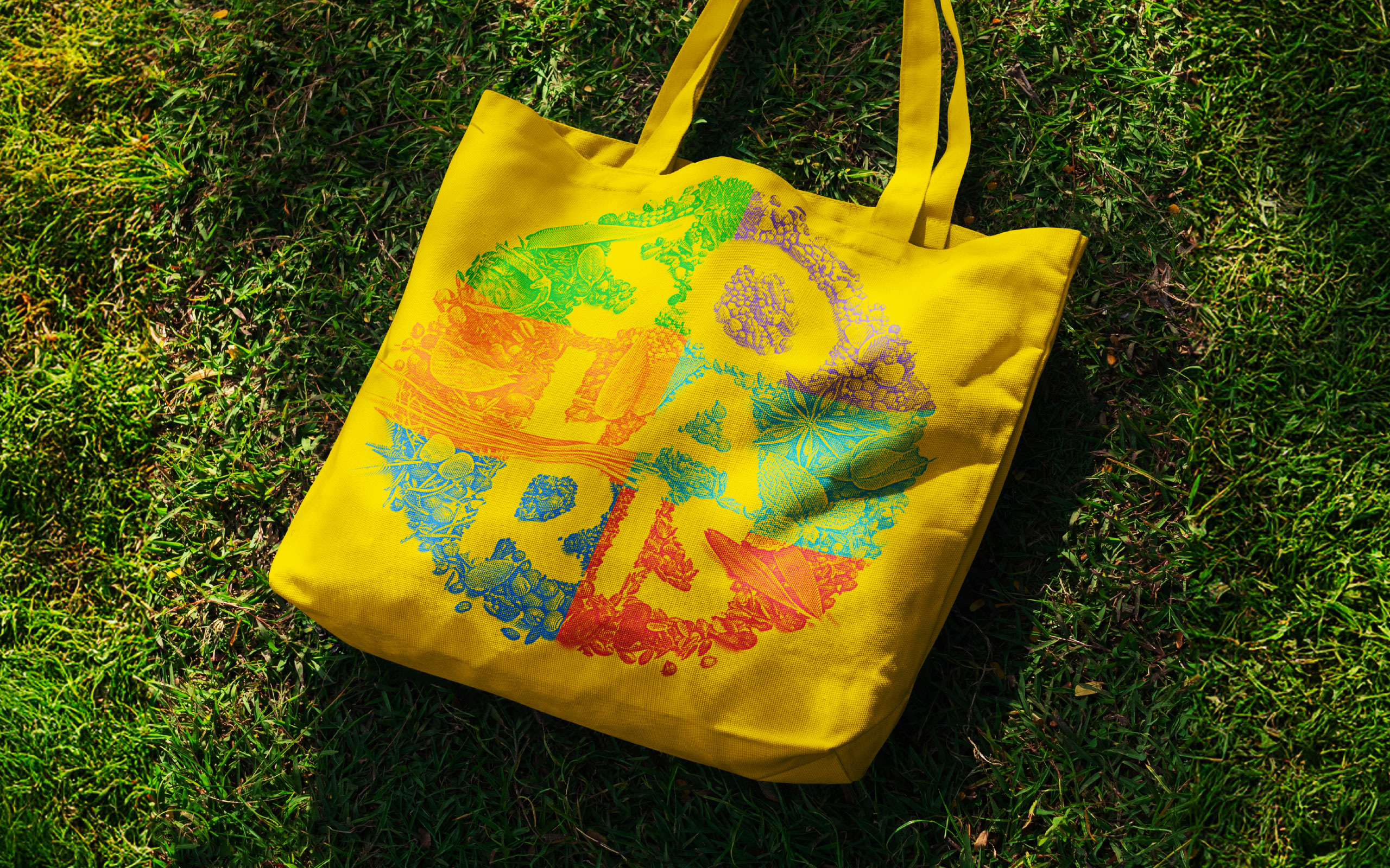
The multitude of colorful Solaris logos that form this pattern seems like a zoom-in on the photograph that represented the brand signature until now, which was created from hundreds of seeds, flowers, and spices of all colors.
With this pattern in the main role, the new master pack is able to accommodate seven product lines across a wide range of packaging types, sizes, and shapes.
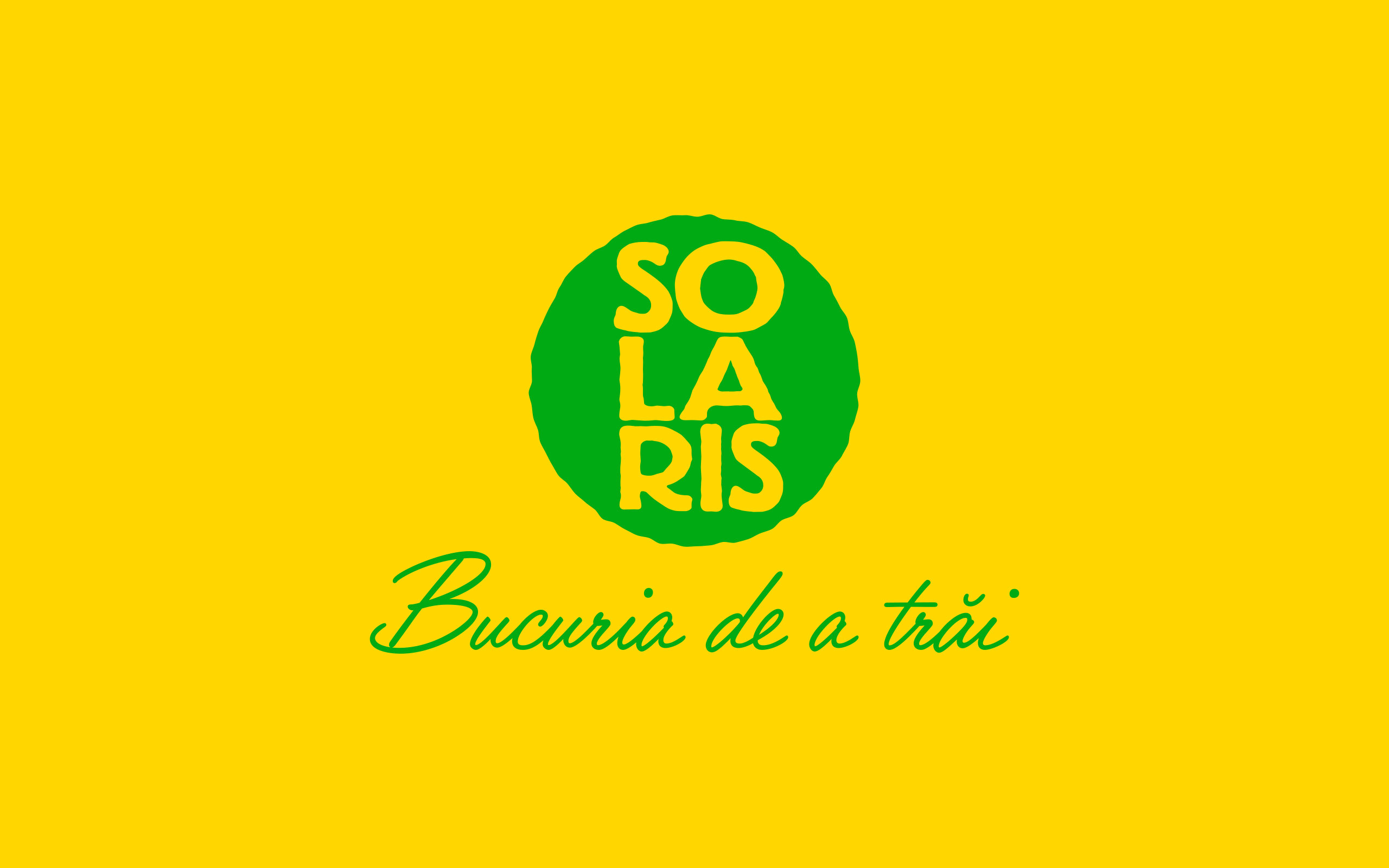
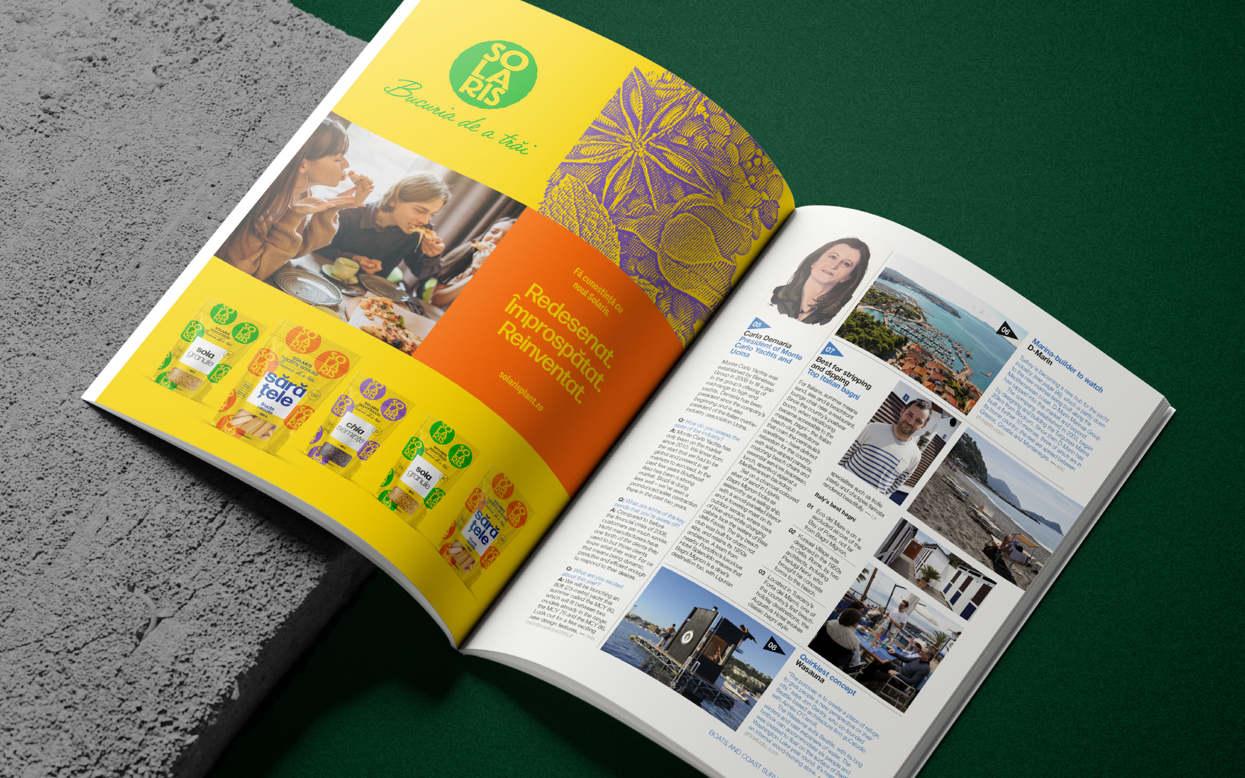
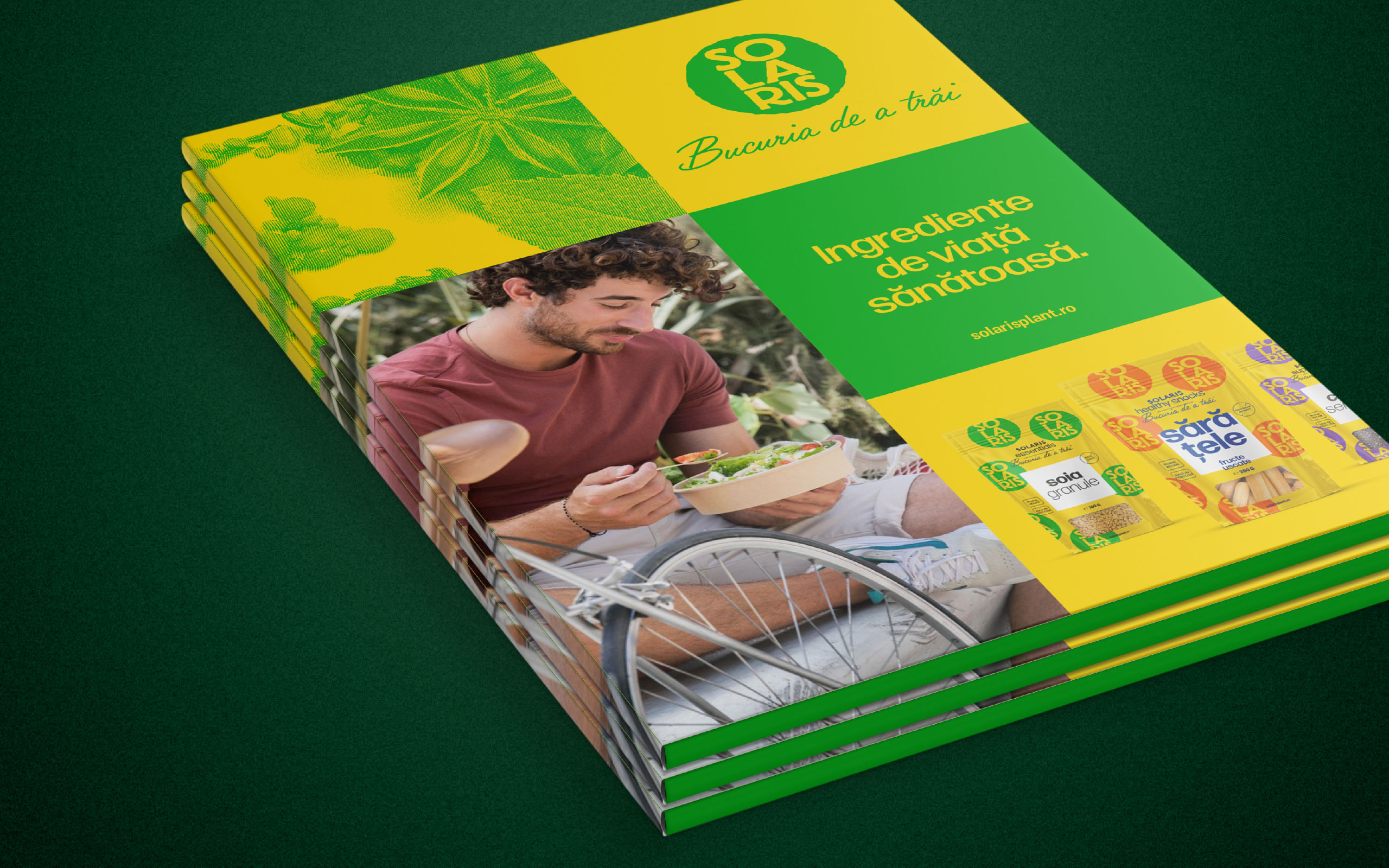
On the other hand, the old Solaris logo, which represented the main bridge of relationship with the brand's fans all these years, was not set aside, but reinvented and repurposed as a key visual in brand communication.
Therefore, without losing any of its established visuals, the brand enters a new stage of life, fresher and with a solid structure for controlled growth.
Solaris is the leading Romanian brand when it comes to picking a healthy alternative to modern food — a brand focused on the joy of healthy, conscious living.
After almost 15 years of constant growth from about 30 products to over 600 today, Solaris Plant decided it was time to clarify its brand and portfolio architecture through a fresh visual approach and a "swiss-army-knife" master-pack designed to promote and support it for the years to come.
What is very interesting to observe in this case is how much a brand can transform itself using the already existing visual identity and graphic territory.
The new logo is not new. In fact, this has been the visual signature used by the Solaris Plant corporate brand until today. What is new, however, is the chromatic approach and the way in which this brand signature is used in the design of the new master pack — namely, in the form of a pattern that populates the entire packaging and signs, although from an apparently secondary position, with a force and freshness of great impact, instantly increasing the brand's recognizability on the shelves.
The multitude of colorful Solaris logos that form this pattern seems like a zoom-in on the photograph that represented the brand signature until now, which was created from hundreds of seeds, flowers, and spices of all colors.
With this pattern in the main role, the new master pack is able to accommodate seven product lines across a wide range of packaging types, sizes, and shapes.
On the other hand, the old Solaris logo, which represented the main bridge of relationship with the brand's fans all these years, was not set aside, but reinvented and repurposed as a key visual in brand communication.
Therefore, without losing any of its established visuals, the brand enters a new stage of life, fresher and with a solid structure for controlled growth.
Solaris is the leading Romanian brand when it comes to picking a healthy alternative to modern food — a brand focused on the joy of healthy, conscious living.
After almost 15 years of constant growth from about 30 products to over 600 today, Solaris Plant decided it was time to clarify its brand and portfolio architecture through a fresh visual approach and a "swiss-army-knife" master-pack designed to promote and support it for the years to come.
What is very interesting to observe in this case is how much a brand can transform itself using the already existing visual identity and graphic territory.
The new logo is not new. In fact, this has been the visual signature used by the Solaris Plant corporate brand until today. What is new, however, is the chromatic approach and the way in which this brand signature is used in the design of the new master pack — namely, in the form of a pattern that populates the entire packaging and signs, although from an apparently secondary position, with a force and freshness of great impact, instantly increasing the brand's recognizability on the shelves.
The multitude of colorful Solaris logos that form this pattern seems like a zoom-in on the photograph that represented the brand signature until now, which was created from hundreds of seeds, flowers, and spices of all colors.
With this pattern in the main role, the new master pack is able to accommodate seven product lines across a wide range of packaging types, sizes, and shapes.
On the other hand, the old Solaris logo, which represented the main bridge of relationship with the brand's fans all these years, was not set aside, but reinvented and repurposed as a key visual in brand communication.
Therefore, without losing any of its established visuals, the brand enters a new stage of life, fresher and with a solid structure for controlled growth.
Solaris is the leading Romanian brand when it comes to picking a healthy alternative to modern food — a brand focused on the joy of healthy, conscious living.
After almost 15 years of constant growth from about 30 products to over 600 today, Solaris Plant decided it was time to clarify its brand and portfolio architecture through a fresh visual approach and a "swiss-army-knife" master-pack designed to promote and support it for the years to come.
What is very interesting to observe in this case is how much a brand can transform itself using the already existing visual identity and graphic territory.
The new logo is not new. In fact, this has been the visual signature used by the Solaris Plant corporate brand until today. What is new, however, is the chromatic approach and the way in which this brand signature is used in the design of the new master pack — namely, in the form of a pattern that populates the entire packaging and signs, although from an apparently secondary position, with a force and freshness of great impact, instantly increasing the brand's recognizability on the shelves.
The multitude of colorful Solaris logos that form this pattern seems like a zoom-in on the photograph that represented the brand signature until now, which was created from hundreds of seeds, flowers, and spices of all colors.
With this pattern in the main role, the new master pack is able to accommodate seven product lines across a wide range of packaging types, sizes, and shapes.
On the other hand, the old Solaris logo, which represented the main bridge of relationship with the brand's fans all these years, was not set aside, but reinvented and repurposed as a key visual in brand communication.
Therefore, without losing any of its established visuals, the brand enters a new stage of life, fresher and with a solid structure for controlled growth.
Solaris is the leading Romanian brand when it comes to picking a healthy alternative to modern food — a brand focused on the joy of healthy, conscious living.
After almost 15 years of constant growth from about 30 products to over 600 today, Solaris Plant decided it was time to clarify its brand and portfolio architecture through a fresh visual approach and a "swiss-army-knife" master-pack designed to promote and support it for the years to come.
What is very interesting to observe in this case is how much a brand can transform itself using the already existing visual identity and graphic territory.
The new logo is not new. In fact, this has been the visual signature used by the Solaris Plant corporate brand until today. What is new, however, is the chromatic approach and the way in which this brand signature is used in the design of the new master pack — namely, in the form of a pattern that populates the entire packaging and signs, although from an apparently secondary position, with a force and freshness of great impact, instantly increasing the brand's recognizability on the shelves.
The multitude of colorful Solaris logos that form this pattern seems like a zoom-in on the photograph that represented the brand signature until now, which was created from hundreds of seeds, flowers, and spices of all colors.
With this pattern in the main role, the new master pack is able to accommodate seven product lines across a wide range of packaging types, sizes, and shapes.
On the other hand, the old Solaris logo, which represented the main bridge of relationship with the brand's fans all these years, was not set aside, but reinvented and repurposed as a key visual in brand communication.
Therefore, without losing any of its established visuals, the brand enters a new stage of life, fresher and with a solid structure for controlled growth.
CLIENT
Solaris Plant
YEAR
2025
SERVICES
Packaging design, Rebranding
CREDITS
I designed these items while working full time at Brandient.
Images/photos and details are presented courtesy of Brandient.
Logo design: Cristian Kit Paul, 2011
Solaris Plant corporate brand refresh
Solaris Plant corporate brand refresh
Solaris Plant corporate brand refresh
Solaris Plant corporate brand refresh
Solaris Plant corporate brand refresh
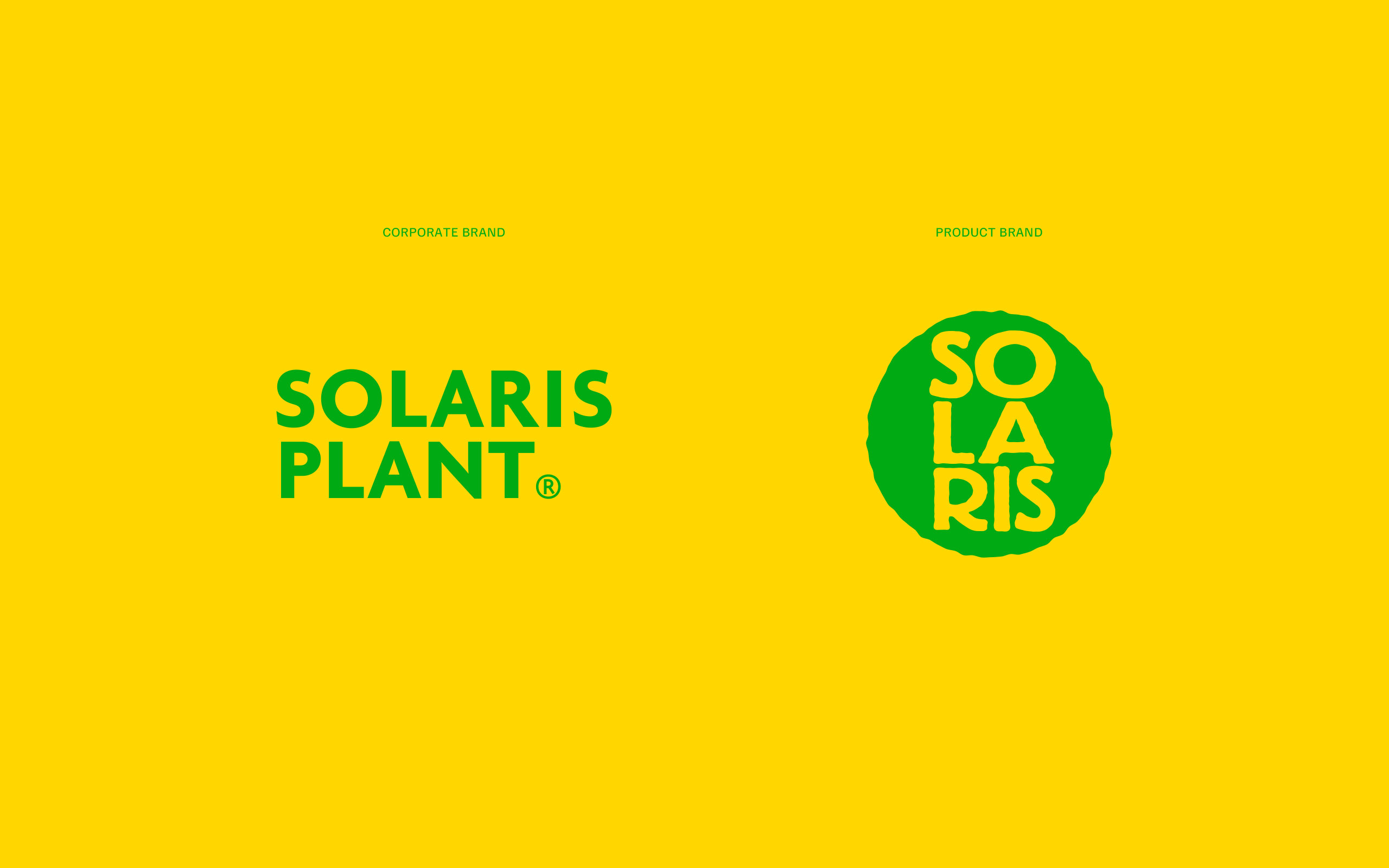
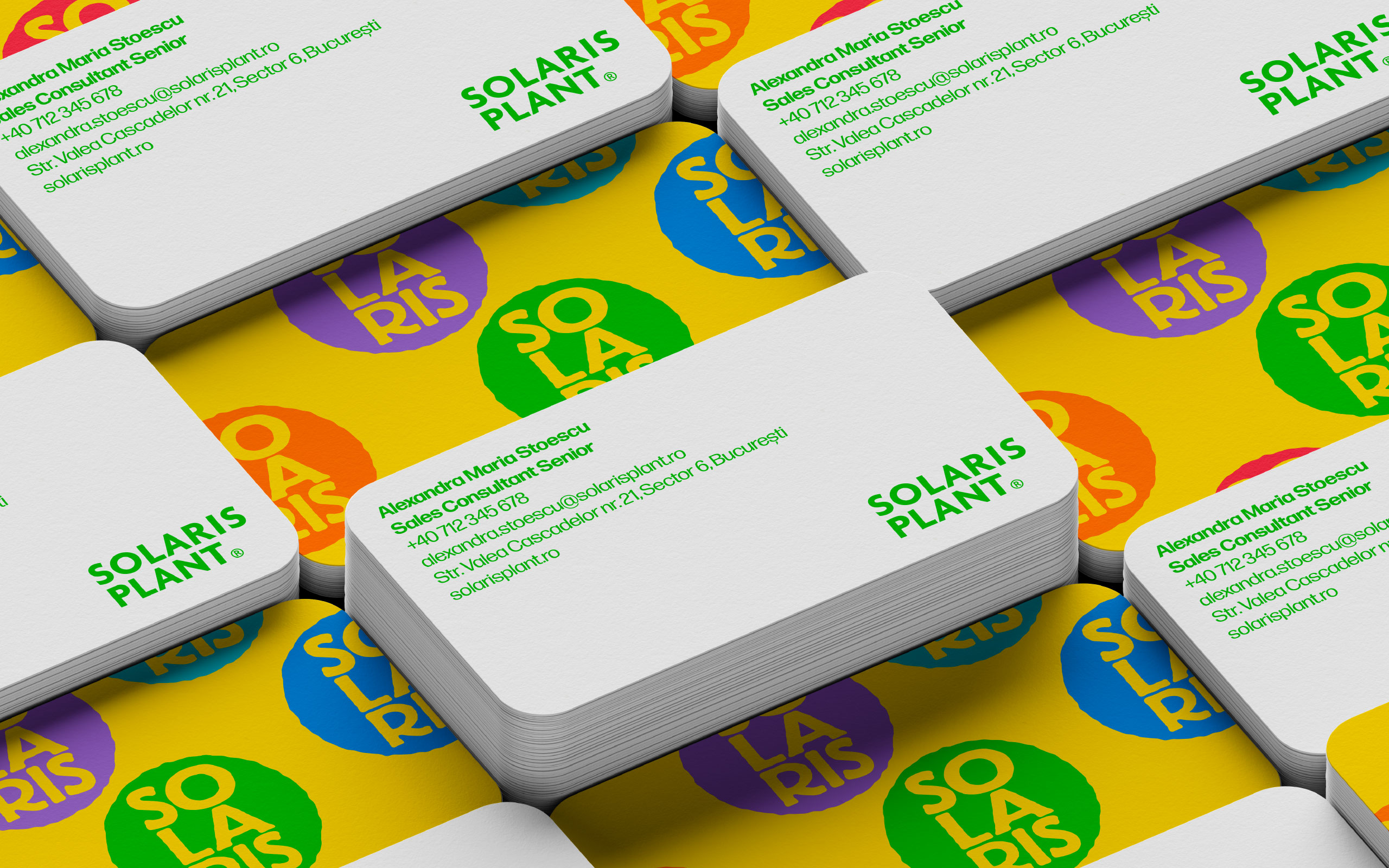
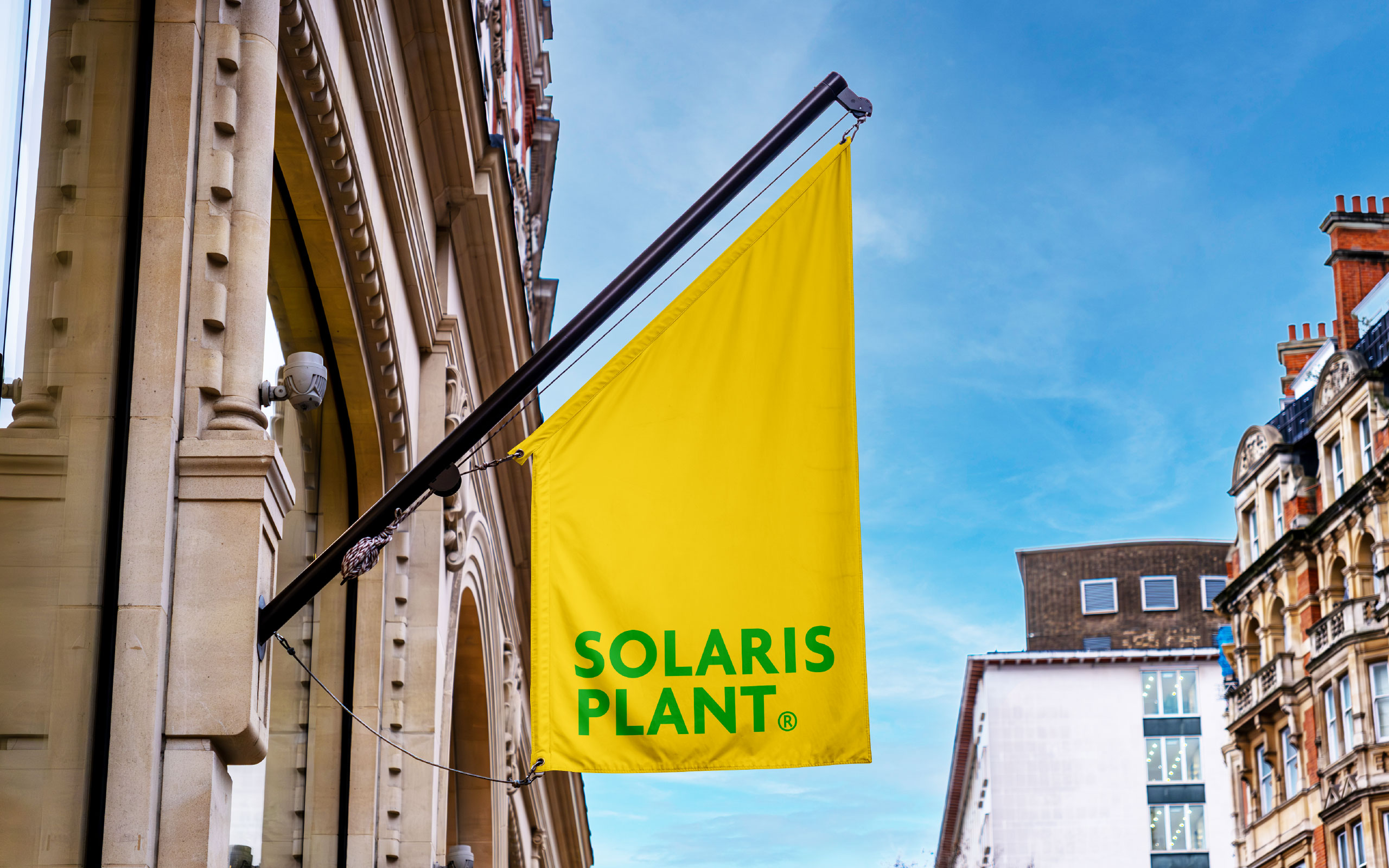
The Solaris Plant corporate brand has also gone through a refresh process. The new logo, simplified to a wordmark, brings clarity in today's brand architecture and lets the product brand enjoy the attention it deserves.
The Solaris Plant corporate brand has also gone through a refresh process. The new logo, simplified to a wordmark, brings clarity in today's brand architecture and lets the product brand enjoy the attention it deserves.
The Solaris Plant corporate brand has also gone through a refresh process. The new logo, simplified to a wordmark, brings clarity in today's brand architecture and lets the product brand enjoy the attention it deserves.
The Solaris Plant corporate brand has also gone through a refresh process. The new logo, simplified to a wordmark, brings clarity in today's brand architecture and lets the product brand enjoy the attention it deserves.
The Solaris Plant corporate brand has also gone through a refresh process. The new logo, simplified to a wordmark, brings clarity in today's brand architecture and lets the product brand enjoy the attention it deserves.


Copyright © Ciprian Bădălan & Brandient | All rights reserved. No content of this website may be reproduced in any form without written permission from its author. All trademarks belong to their respective owners.