


Poliana.
By Regina Maria Health Network.
Poliana.
By Regina Maria Health Network.
Poliana.
By Regina Maria Health Network.
Poliana.
By Regina Maria Health Network.
Poliana.
By Regina Maria Health Network.
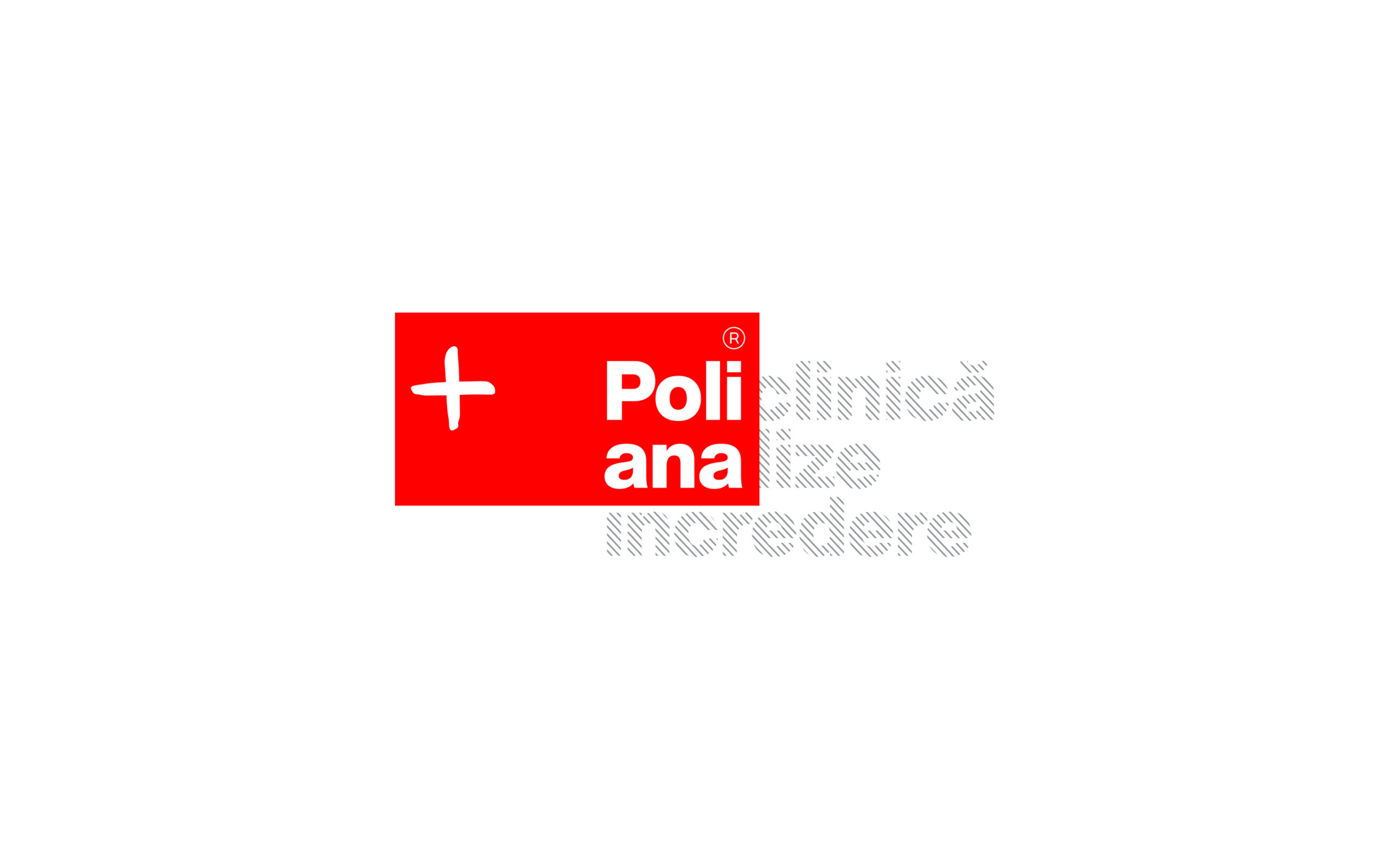
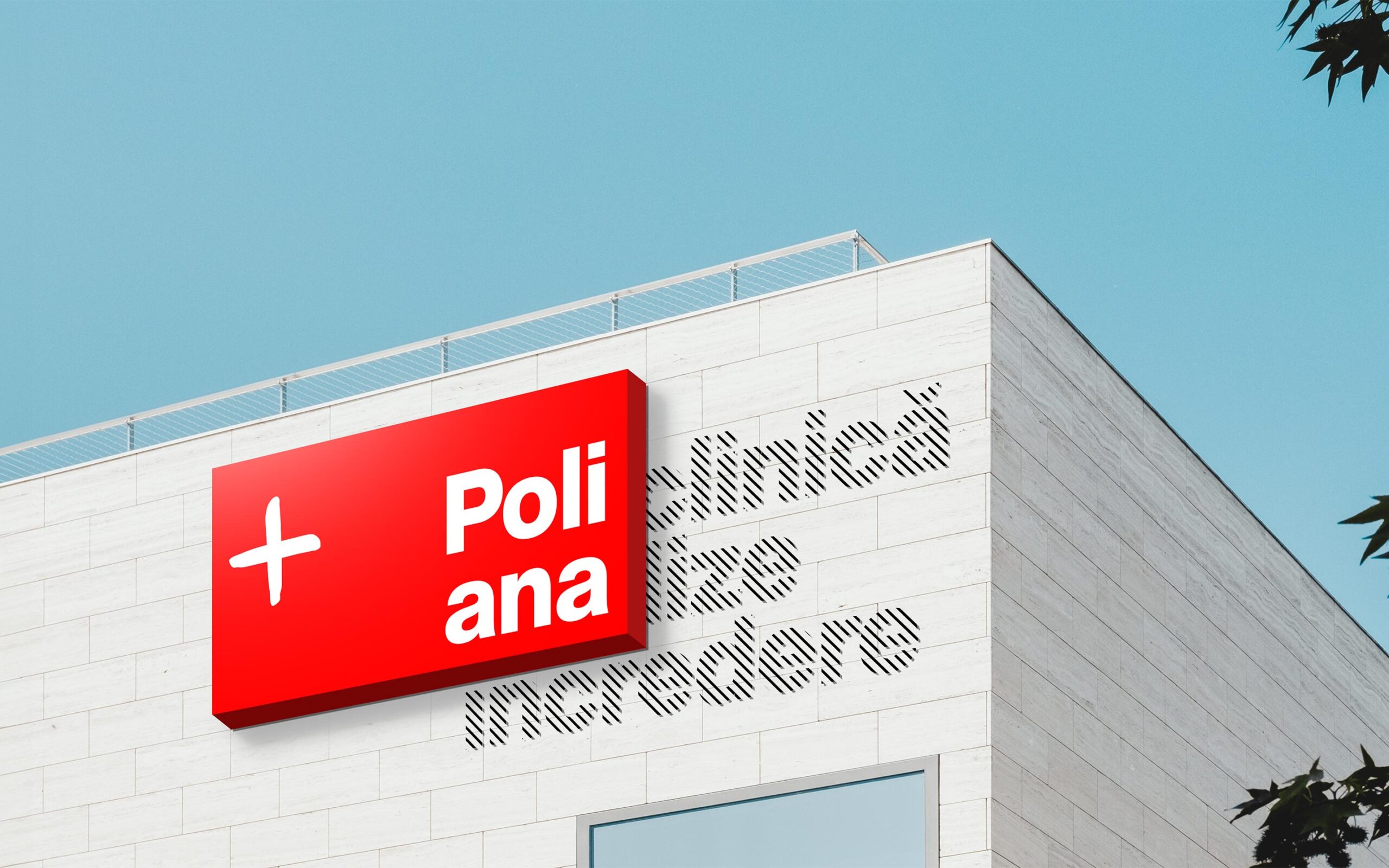
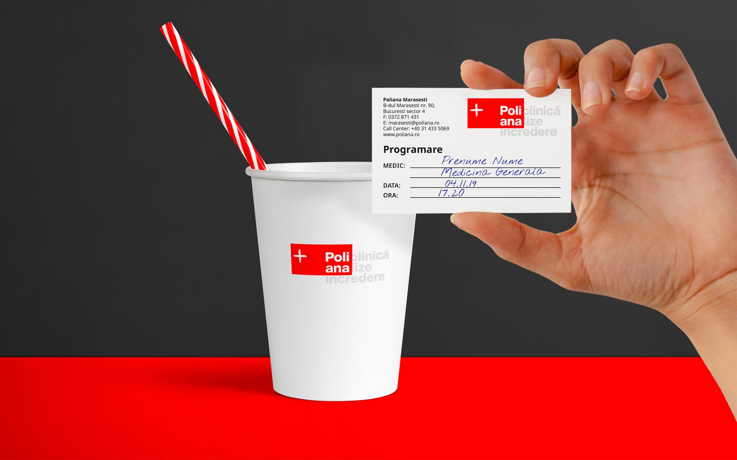
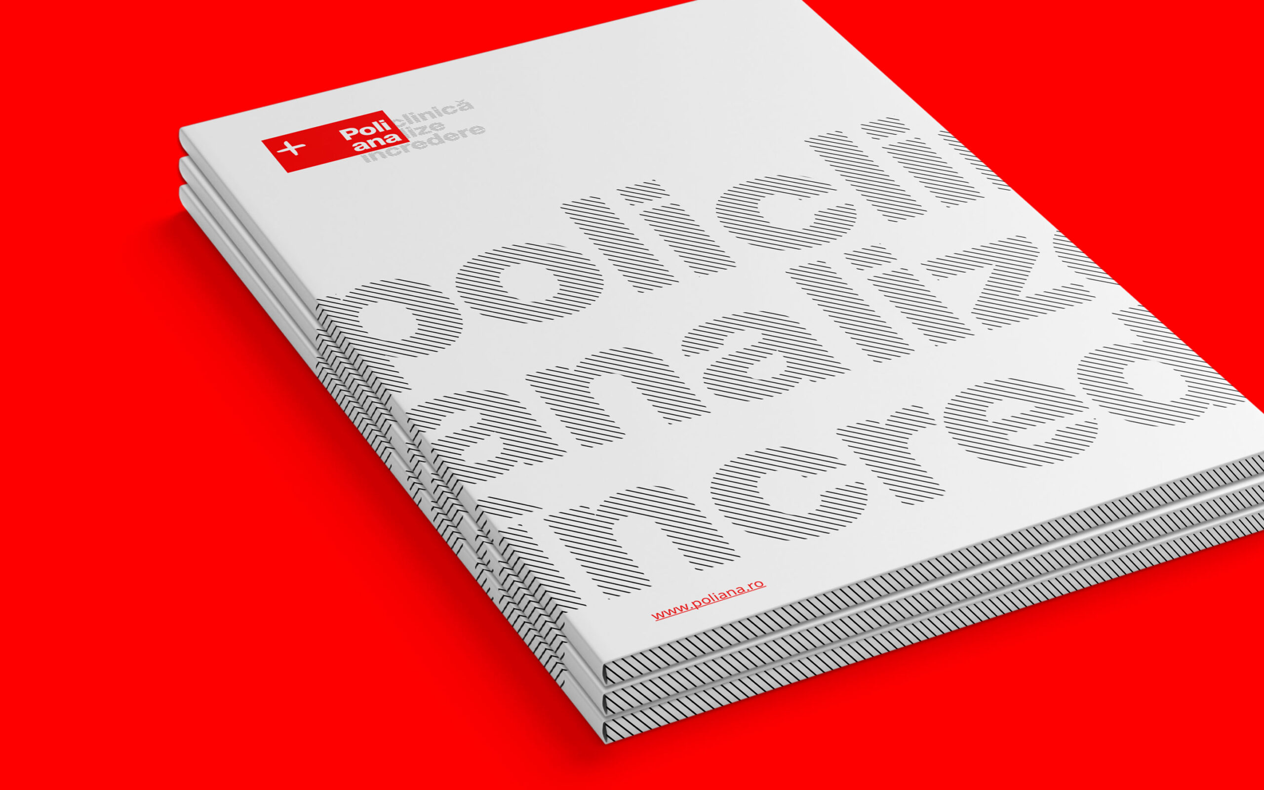
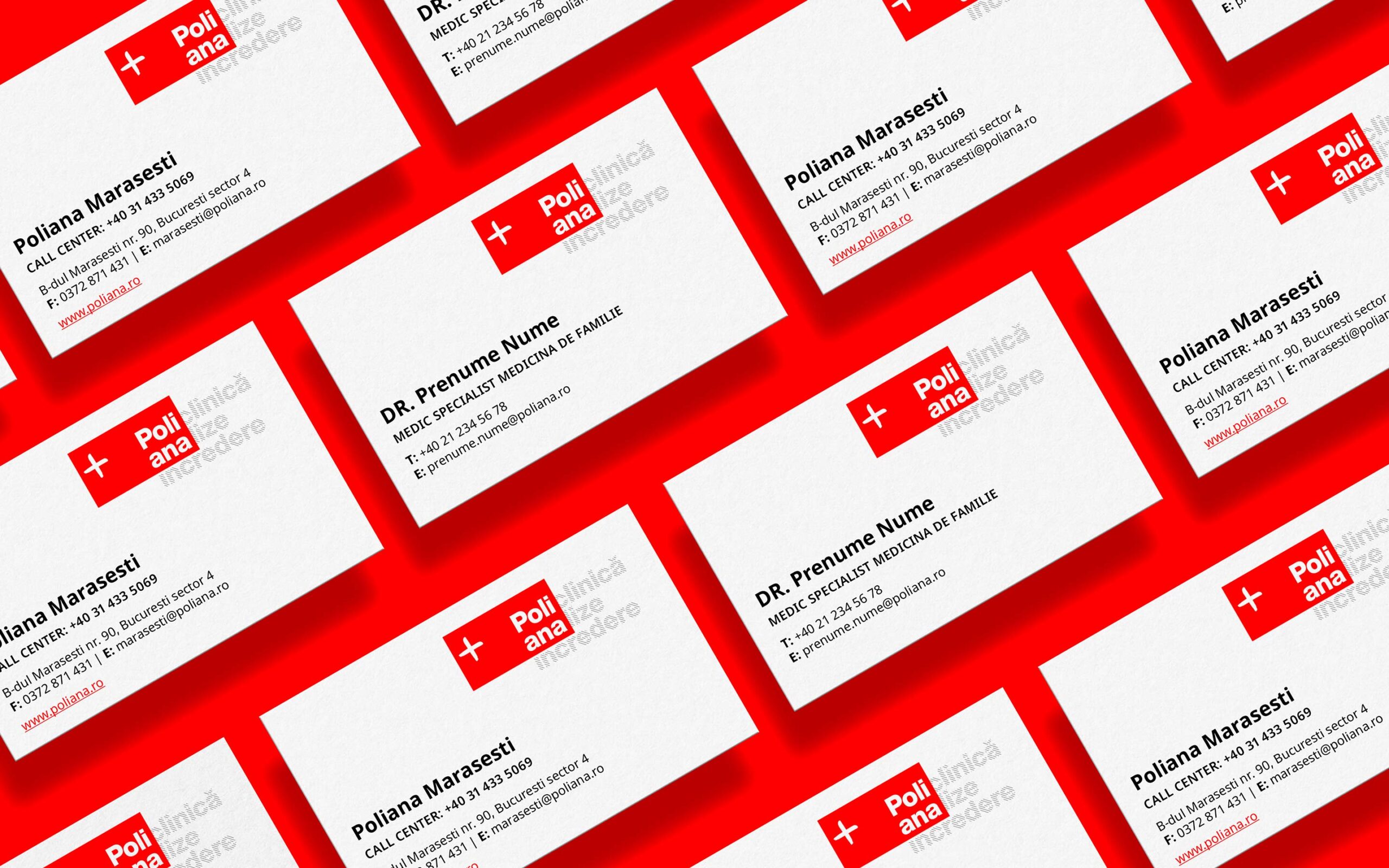
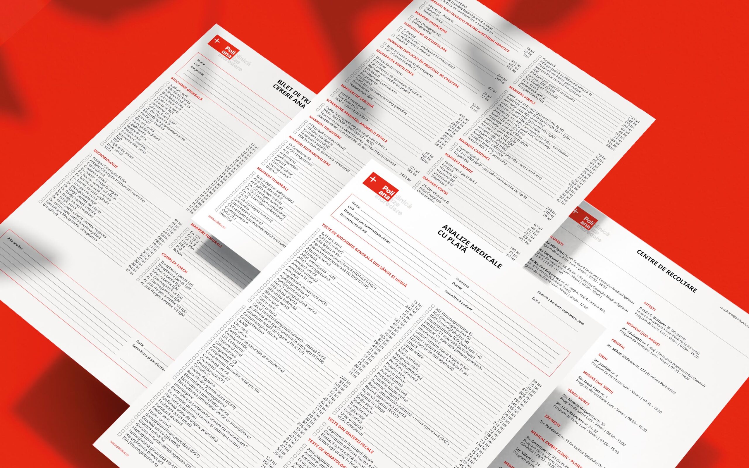
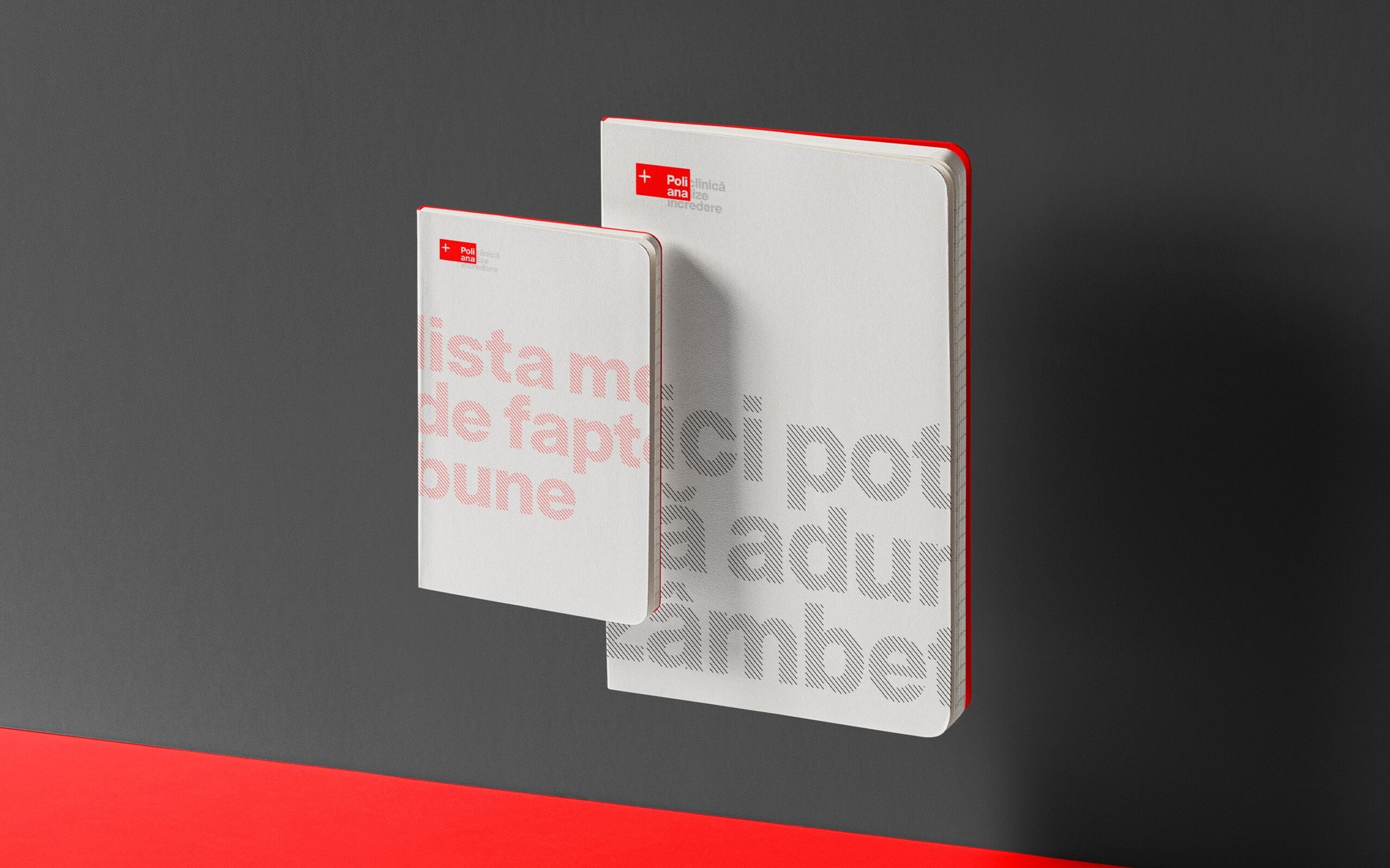
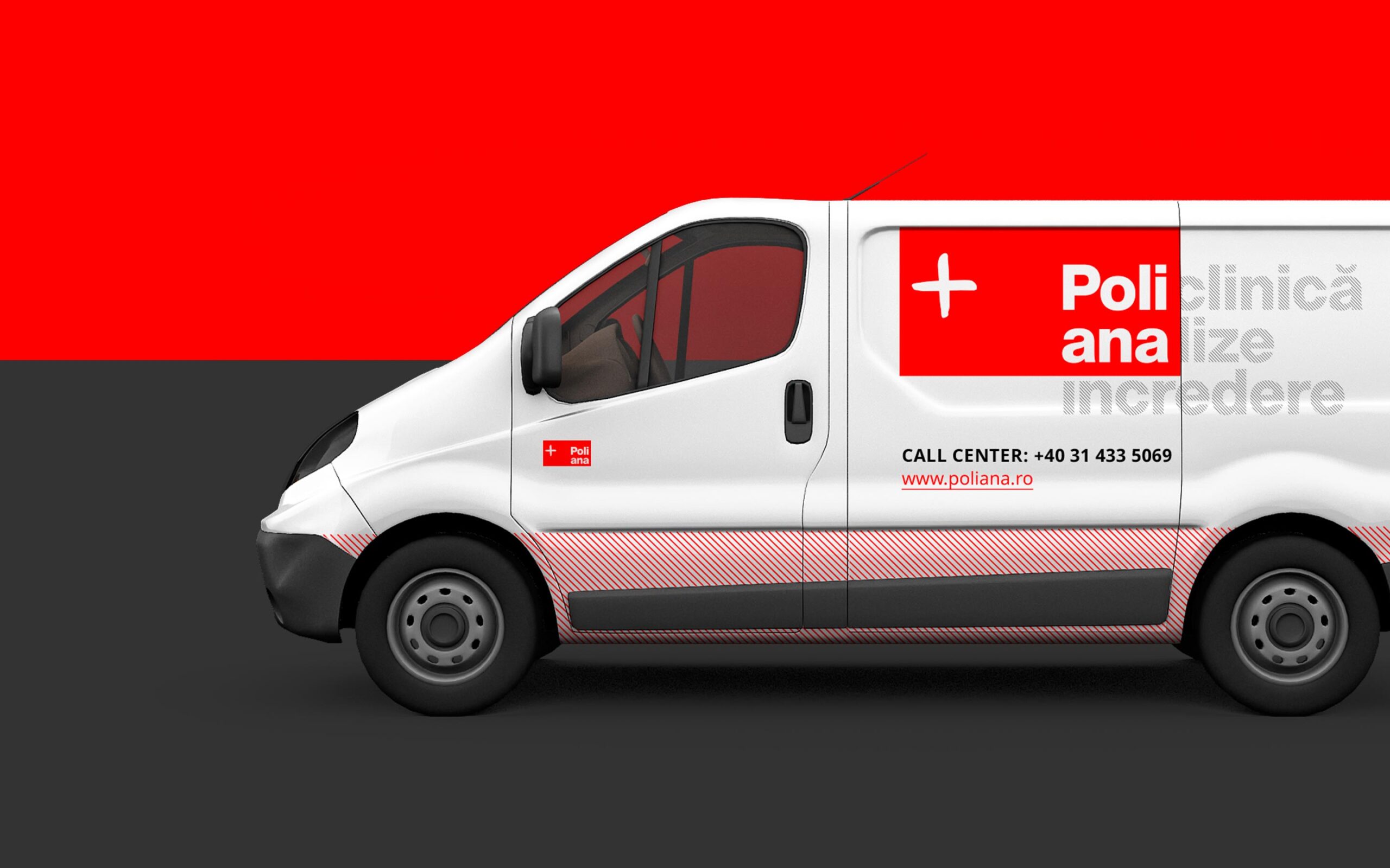
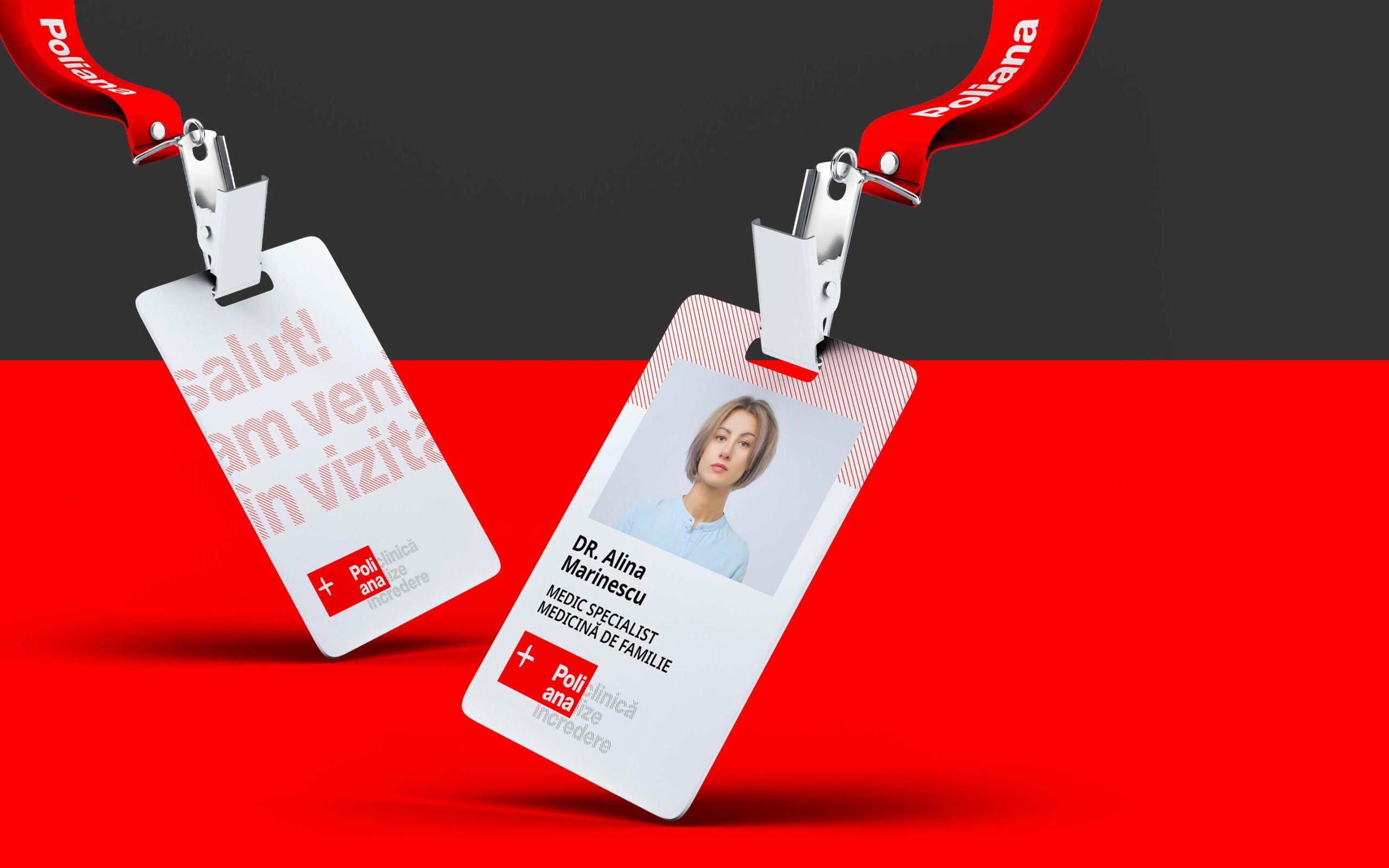
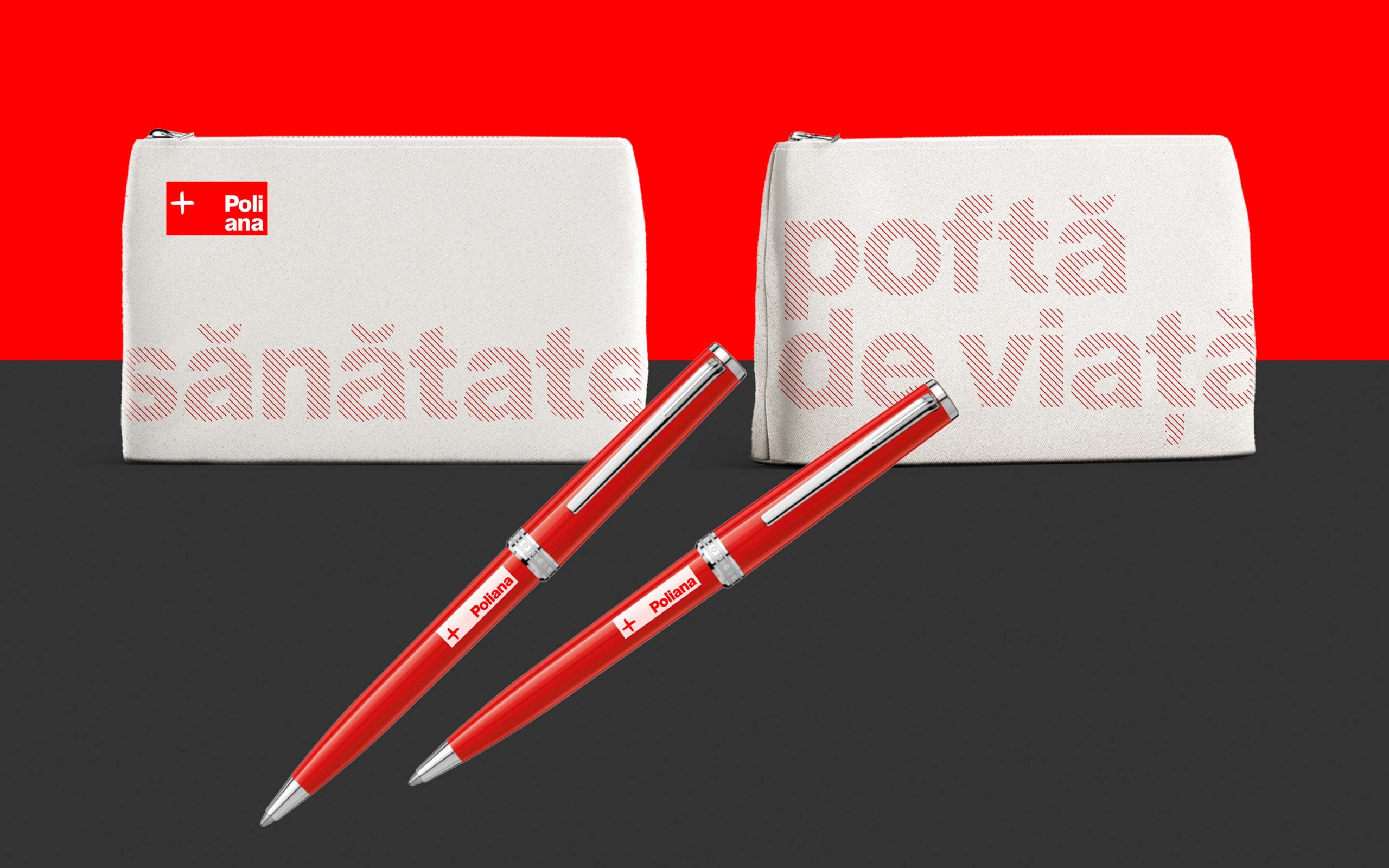
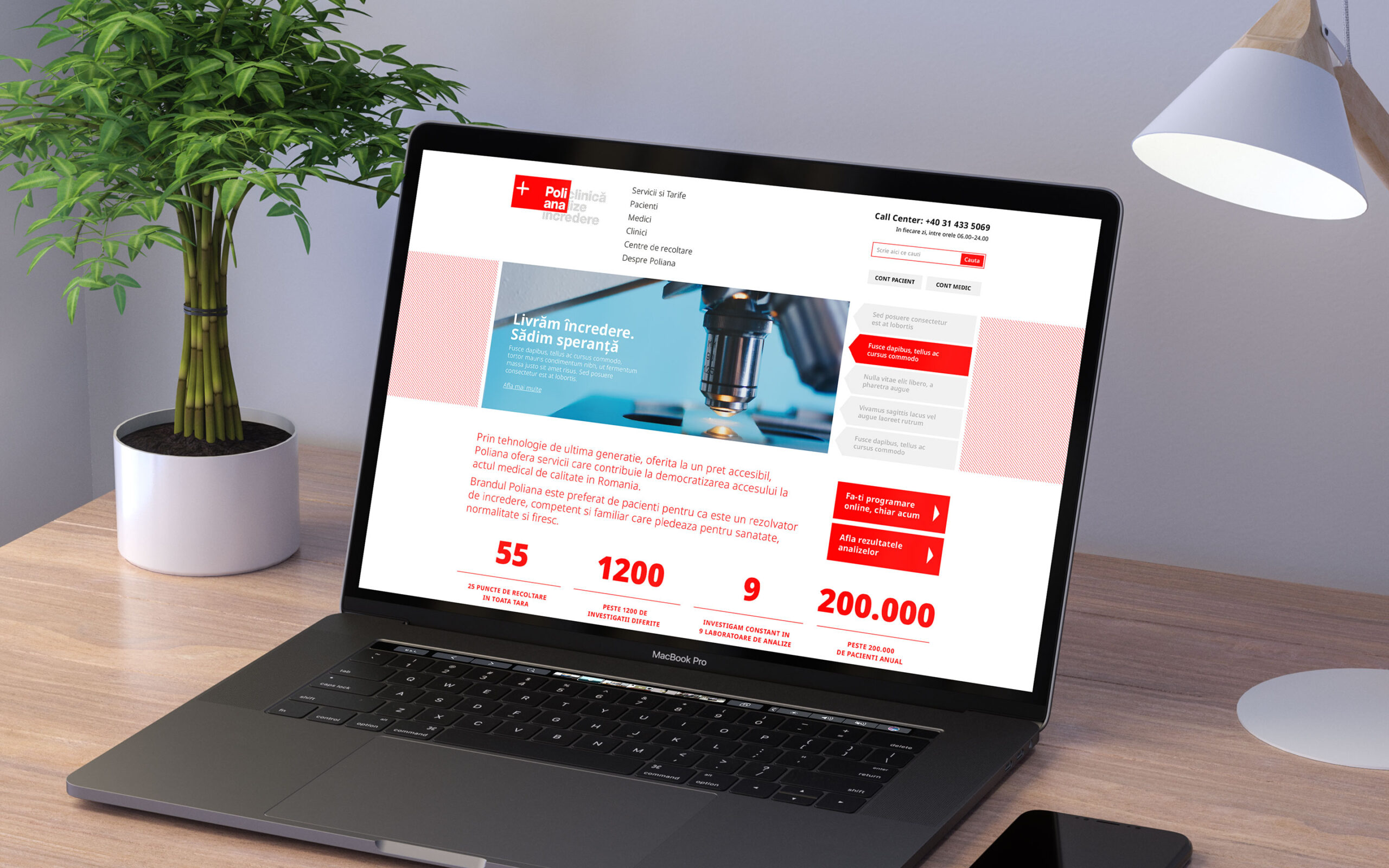
Poliana, part of Regina Maria Health Network, is currently one of the largest and most trusted national networks of analysis laboratories in Romania, created with the clear mission of democratizing access to quality health services.
The design solution consists of an honest and efficient approach aimed at focusing on the truly important things, namely the analysis results. At the level of the brand signature, this focus is observed at the intersection of the brand name and the slogan, an original creative solution that also introduces the opportunity to work with a flexible slogan, a living communication system placed directly in the logo.
At the same time, the main key visual was also introduced into the brand signature — the slogan was treated in a pattern of oblique thin lines that speaks of precision and dynamism in a calm voice. In addition, when composed with the logo, the slogan acts as a contrasting graphic element and helps deliver the visual metaphor in its full form: correctness and clarity in the processing of analyses.
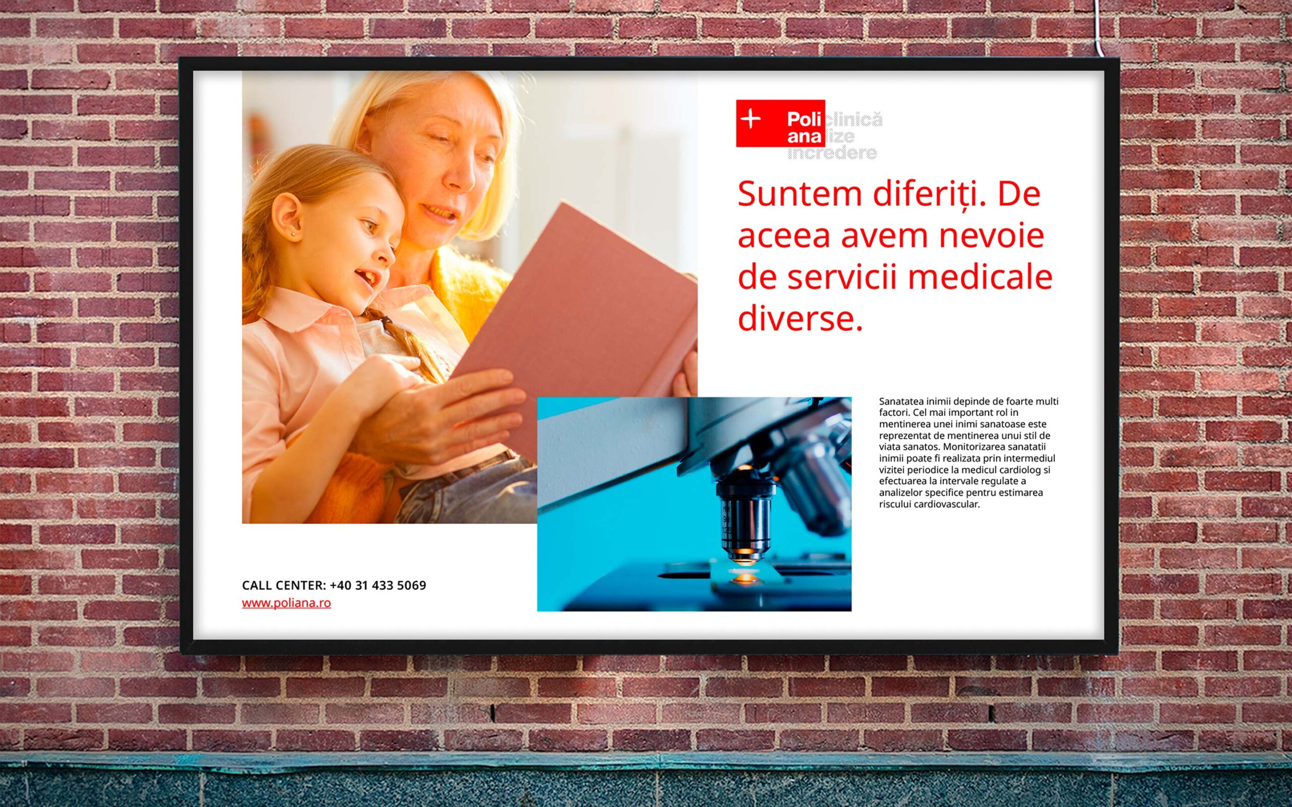
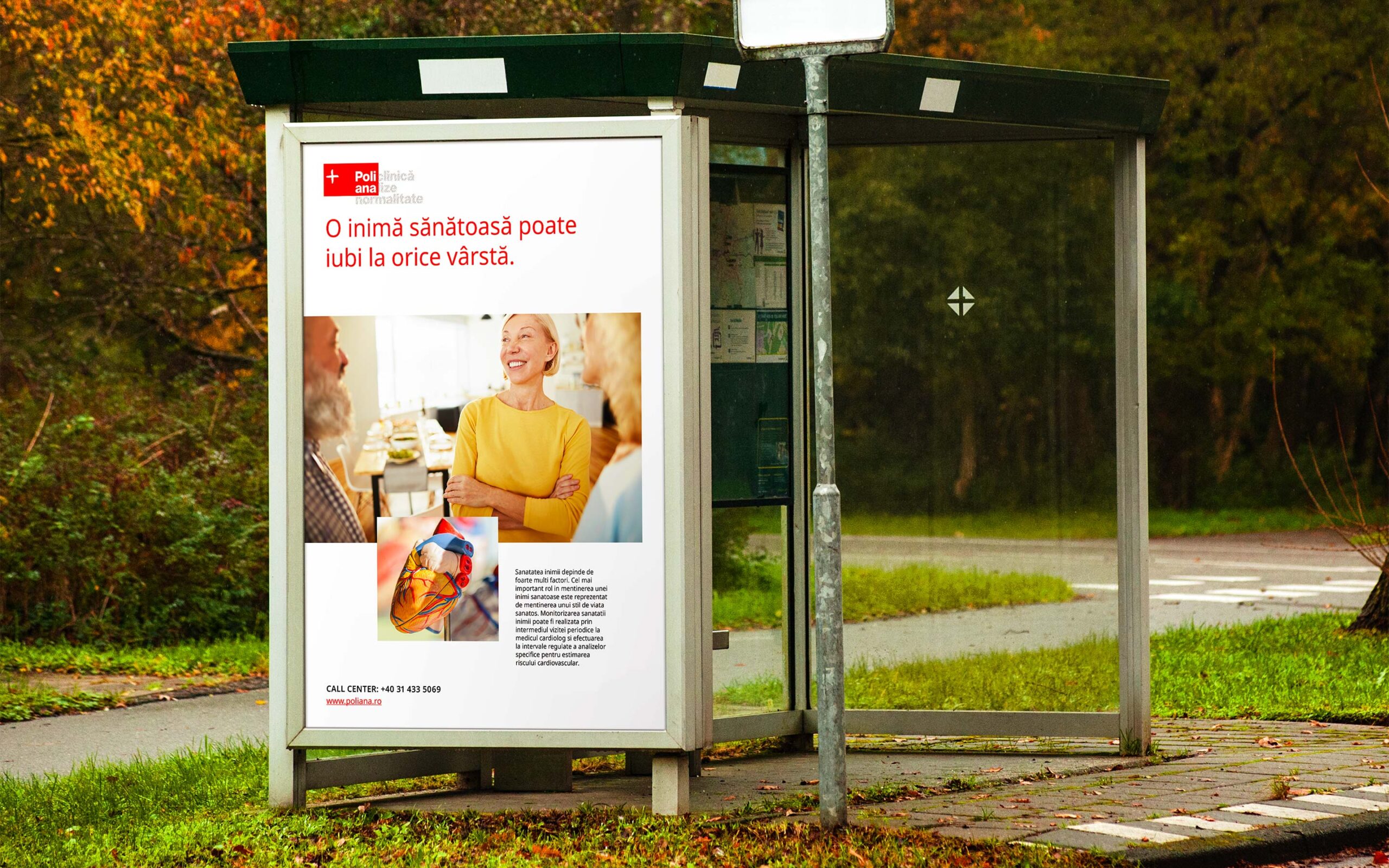
In the same practical spirit of the brand, the communication layout comes with another very simple and efficient solution: each part of the message is illustrated by a clear image, without metaphors or subtleties. Thus, the composition usually contains a mix of two overlapping images that illustrate, separately, the campaign promise and the solution. A simple and easy-to-use system, but of maximum efficiency, in agreement with the way the brand promises to help its patients.
Poliana, part of Regina Maria Health Network, is currently one of the largest and most trusted national networks of analysis laboratories in Romania, created with the clear mission of democratizing access to quality health services.
The design solution consists of an honest and efficient approach aimed at focusing on the truly important things, namely the analysis results. At the level of the brand signature, this focus is observed at the intersection of the brand name and the slogan, an original creative solution that also introduces the opportunity to work with a flexible slogan, a living communication system placed directly in the logo.
At the same time, the main key visual was also introduced into the brand signature — the slogan was treated in a pattern of oblique thin lines that speaks of precision and dynamism in a calm voice. In addition, when composed with the logo, the slogan acts as a contrasting graphic element and helps deliver the visual metaphor in its full form: correctness and clarity in the processing of analyses.
In the same practical spirit of the brand, the communication layout comes with another very simple and efficient solution: each part of the message is illustrated by a clear image, without metaphors or subtleties. Thus, the composition usually contains a mix of two overlapping images that illustrate, separately, the campaign promise and the solution. A simple and easy-to-use system, but of maximum efficiency, in agreement with the way the brand promises to help its patients.
CLIENT
Regina Maria Health Network
YEAR
2020
SERVICES
Visual Identity, Retail Design, Website UI, Communication Design, Brand Guidelines
CREDITS
I designed these items while working full time at Brandient.
Images/photos and details are presented courtesy of Brandient.


Copyright © Ciprian Bădălan & Brandient | All rights reserved. No content of this website may be reproduced in any form without written permission from its author. All trademarks belong to their respective owners.