


Promateris.
Future Materialized.
Promateris.
Future Materialized.
Promateris.
Future Materialized.
Promateris.
Future Materialized.
Promateris.
Future Materialized.
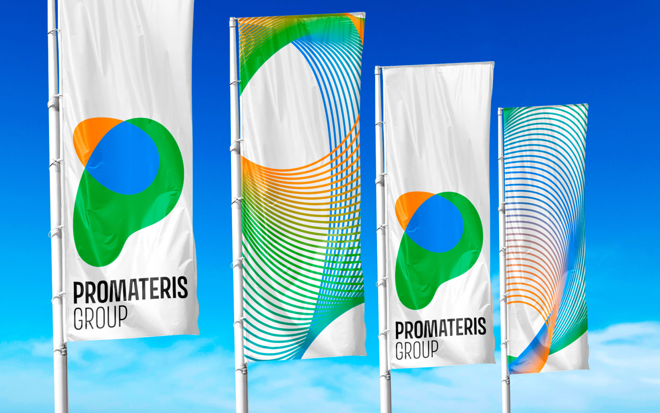
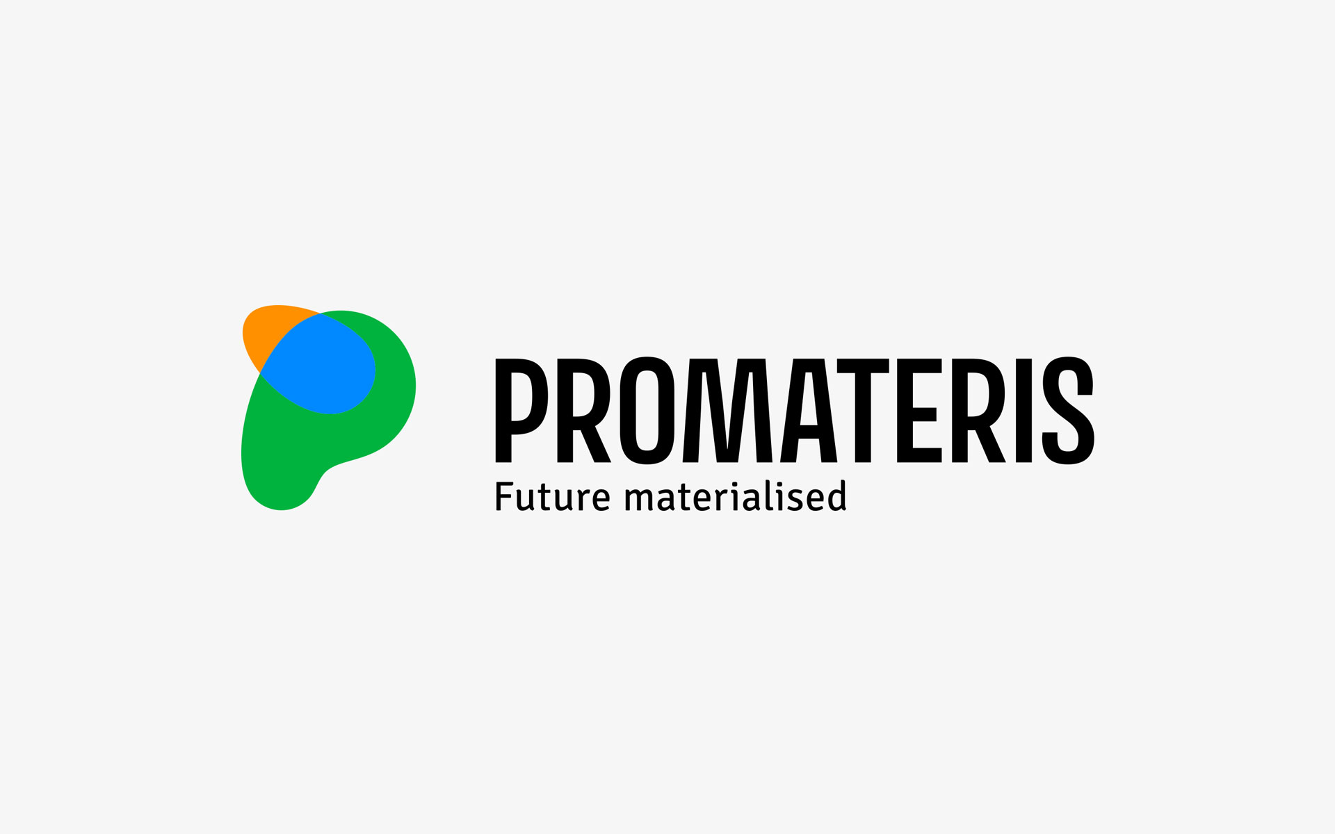
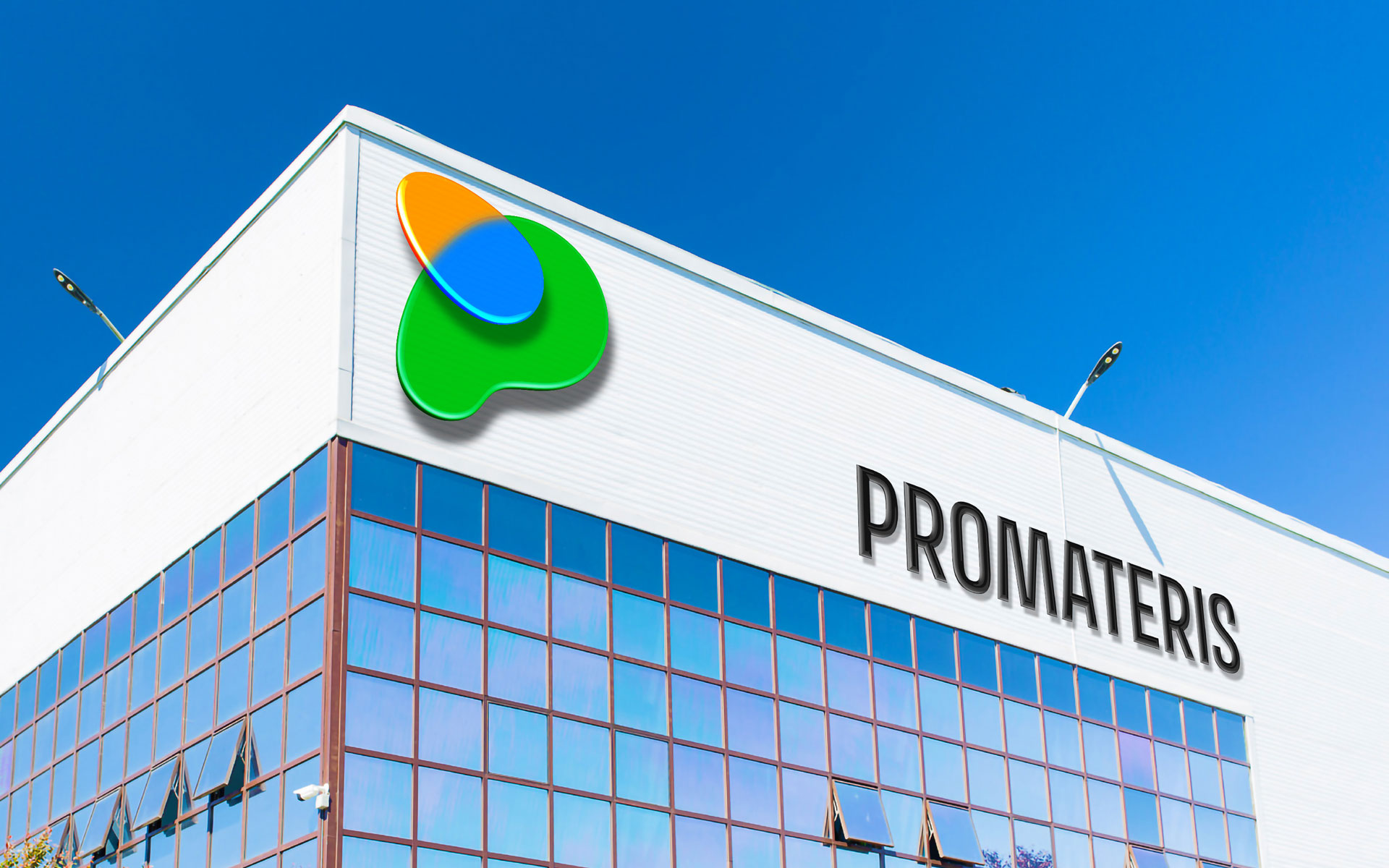
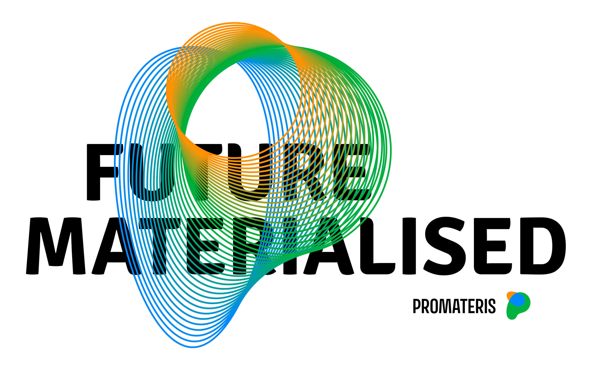
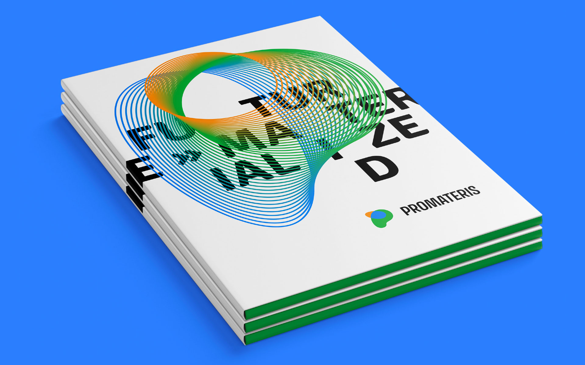
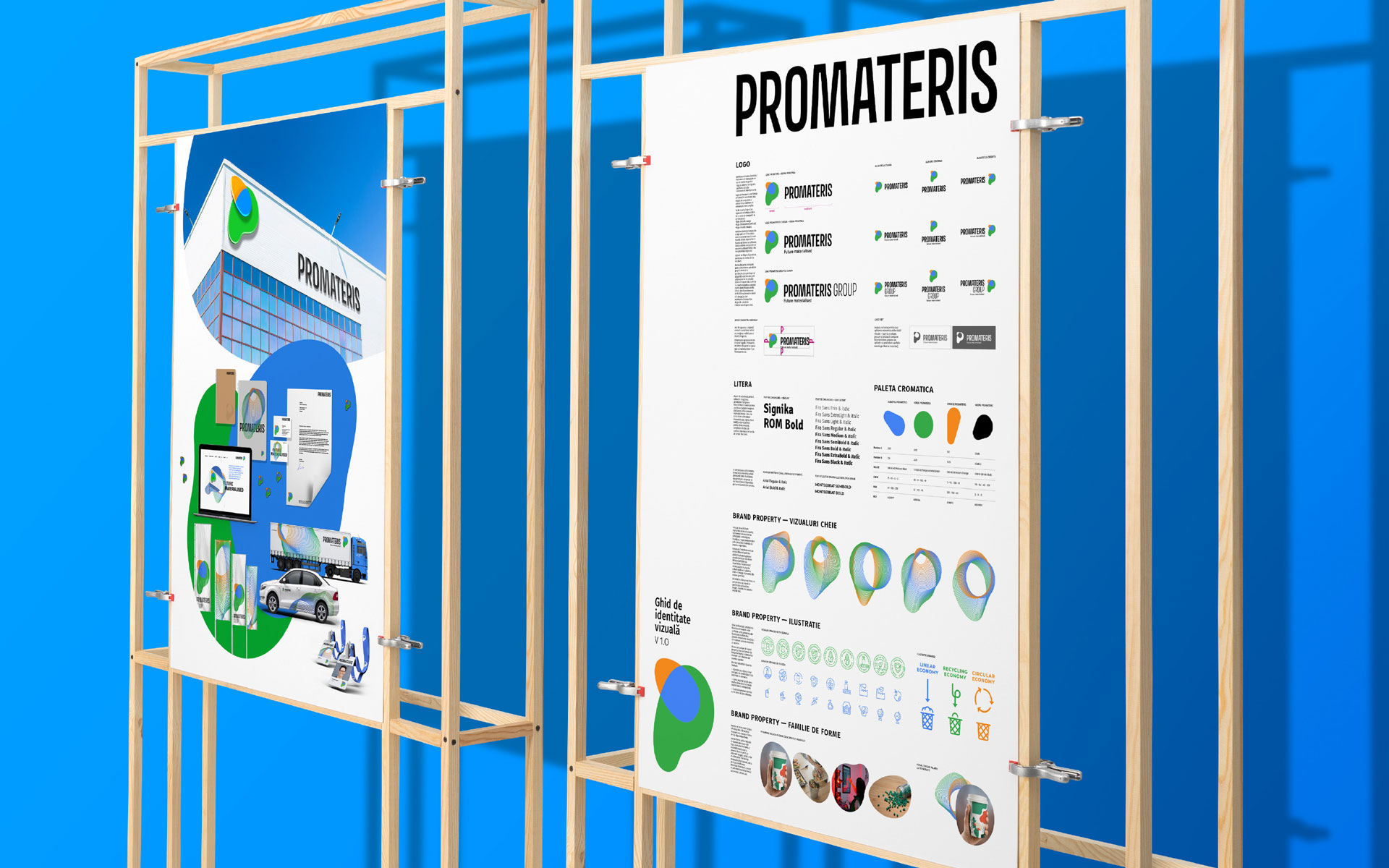
Promateris is a leading European manufacturer of sustainable products and solutions for the circular economy. The rebranding project went beyond a visual refresh — it was a strategic realignment of the brand architecture, reflecting the company’s commitment to innovation and sustainability.
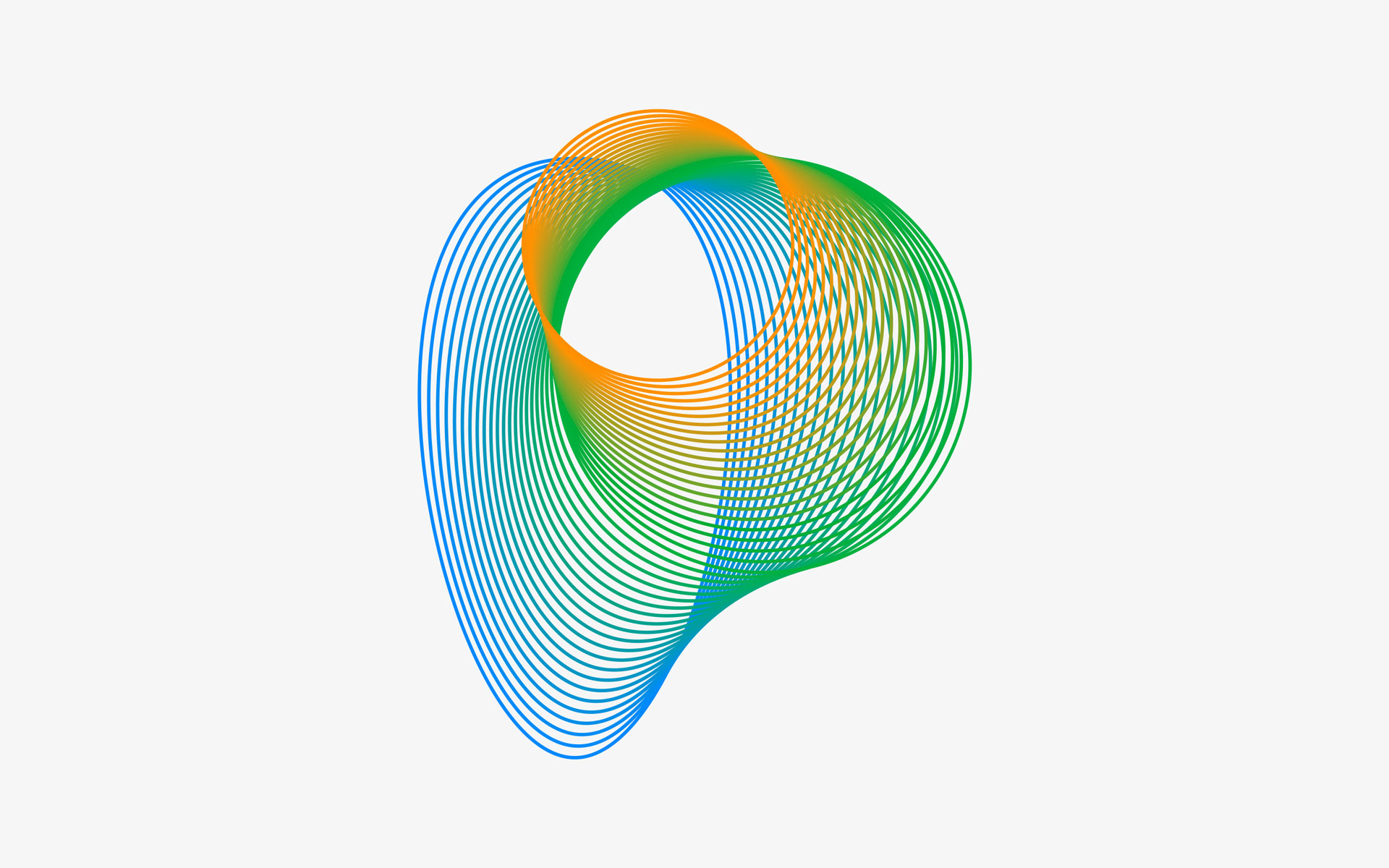
The new identity embraces morphism and versatility, encouraging reinvention, transformation, and a fresh perspective on how we create and consume products.
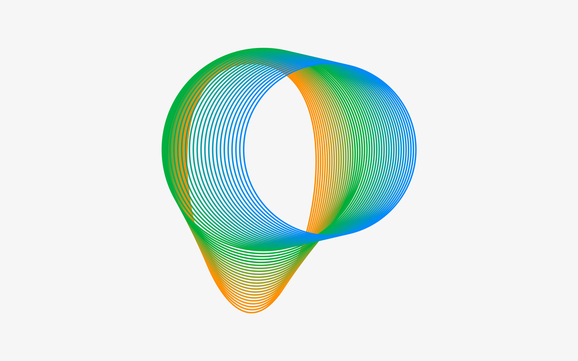
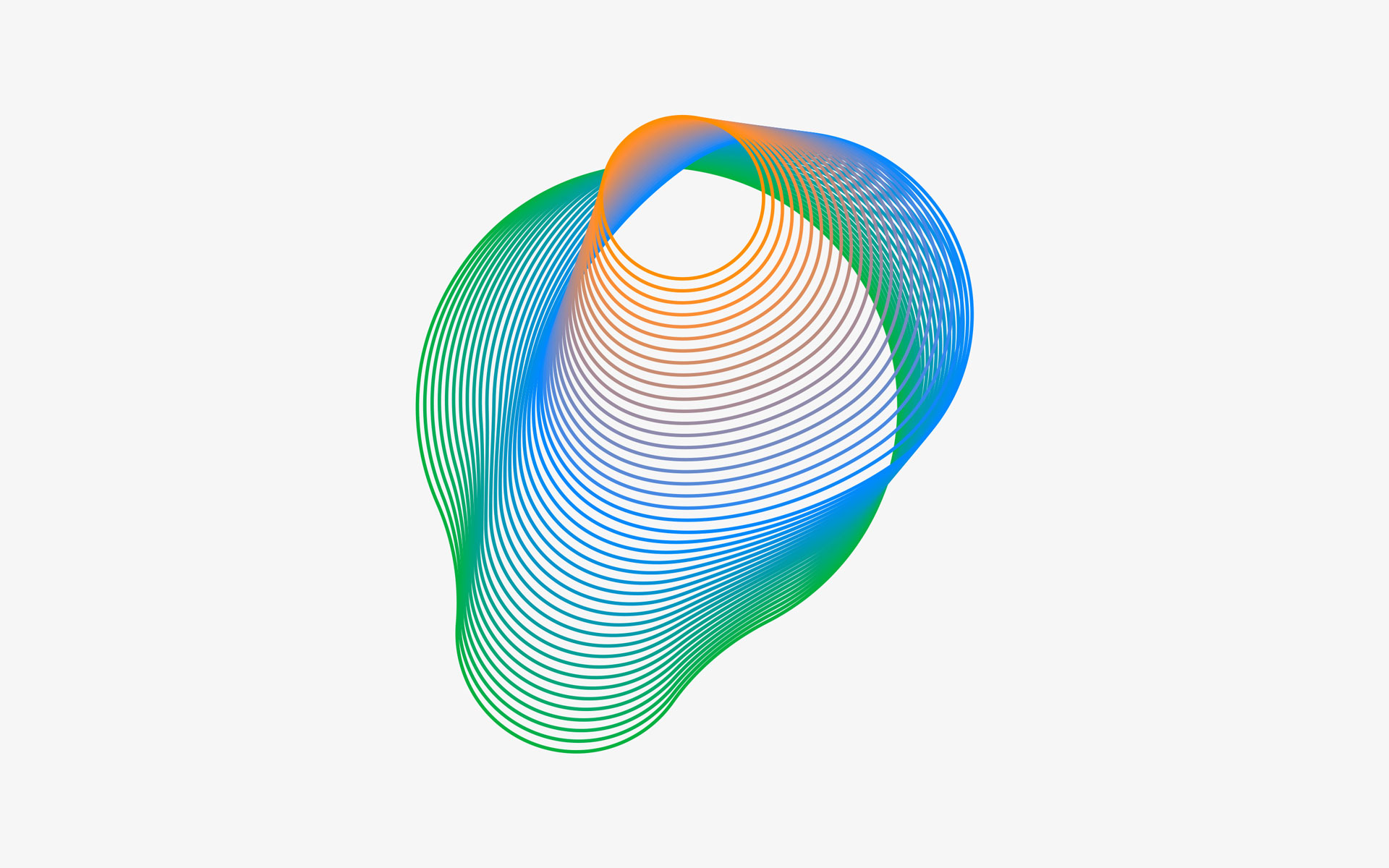
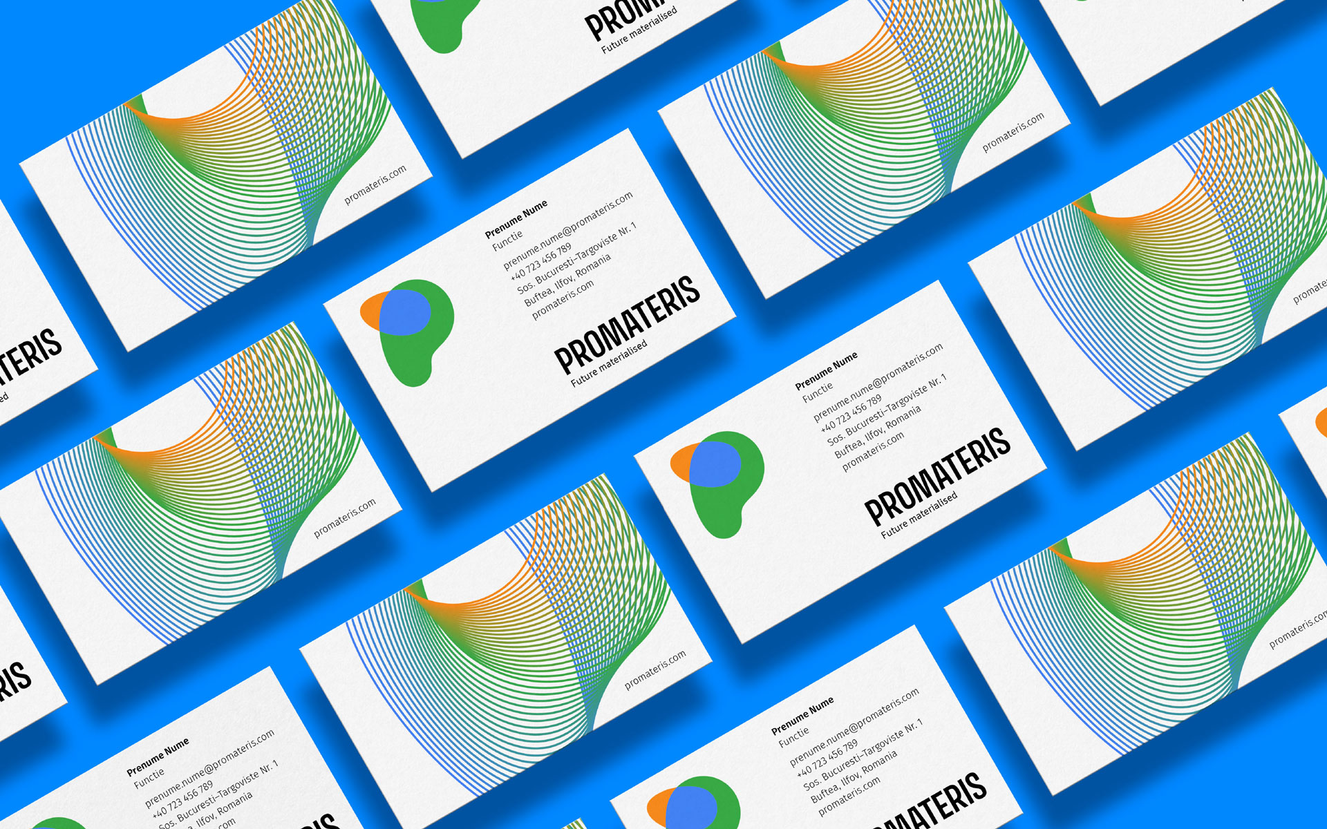
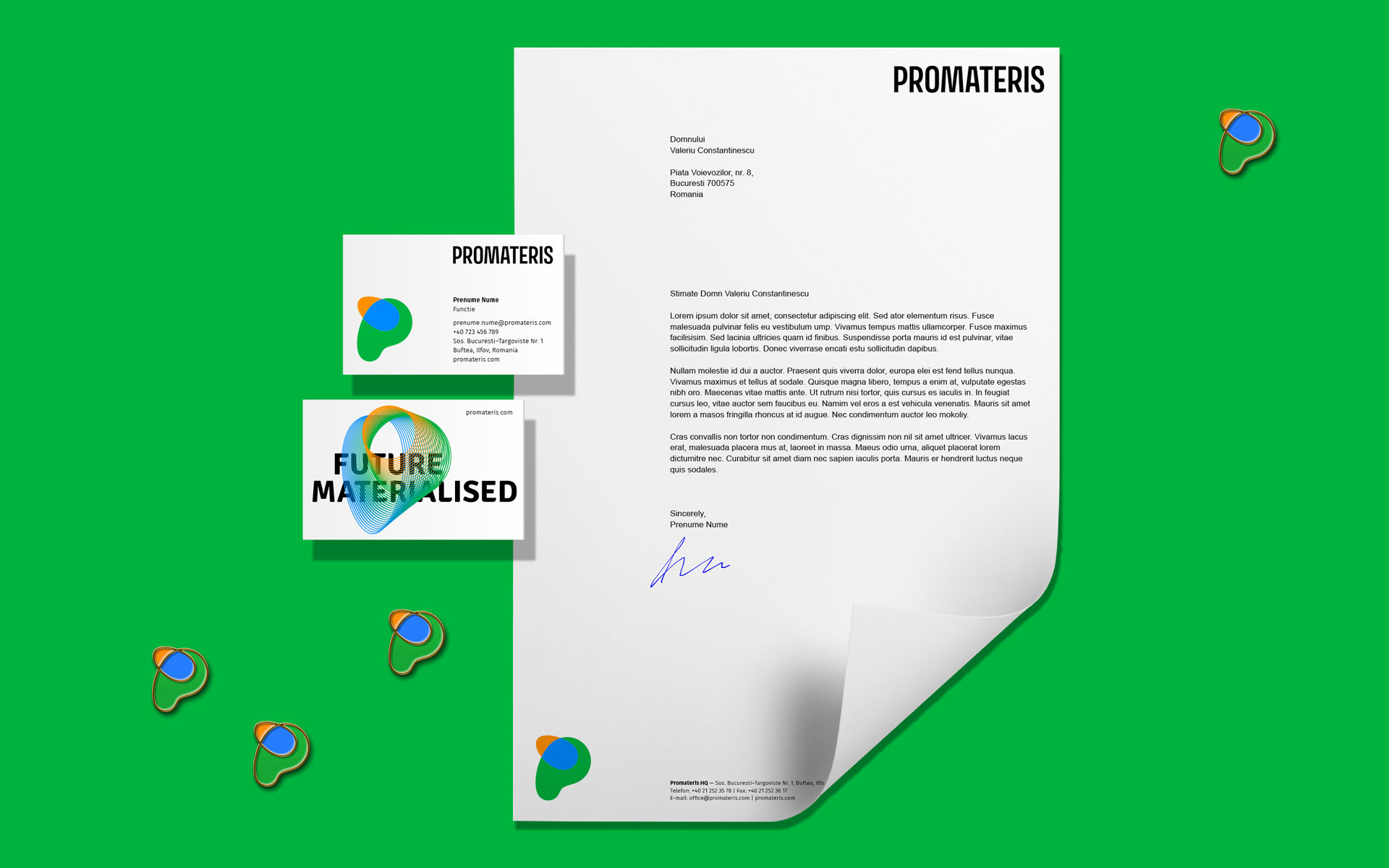
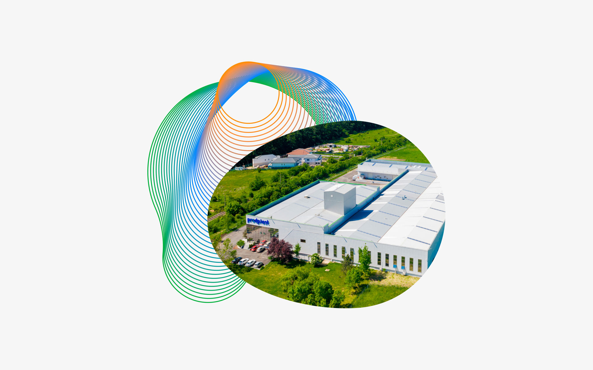
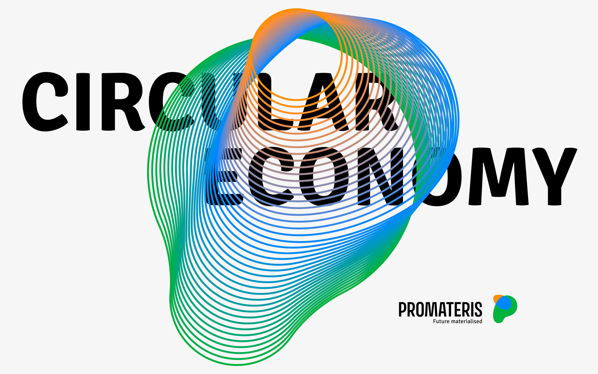
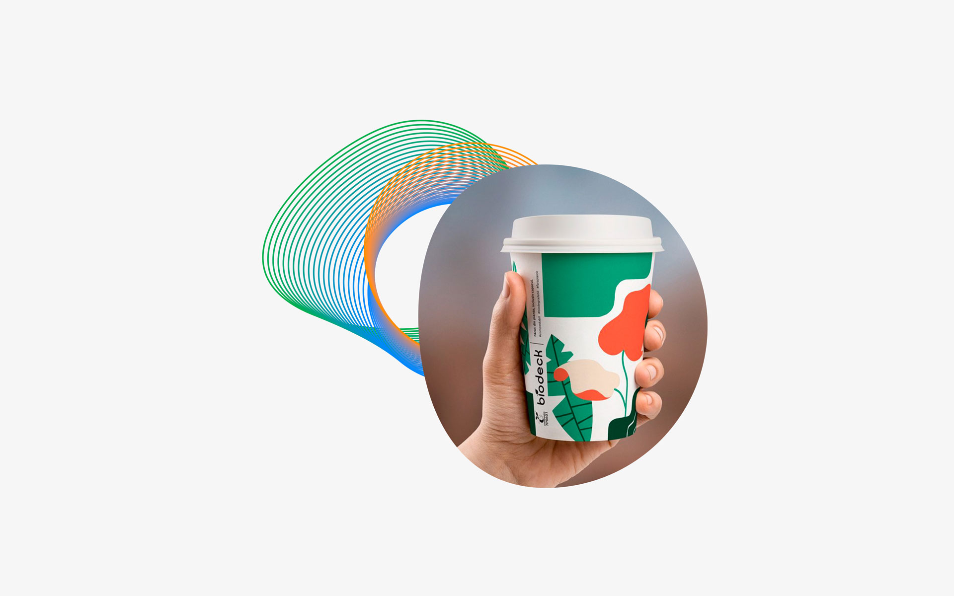
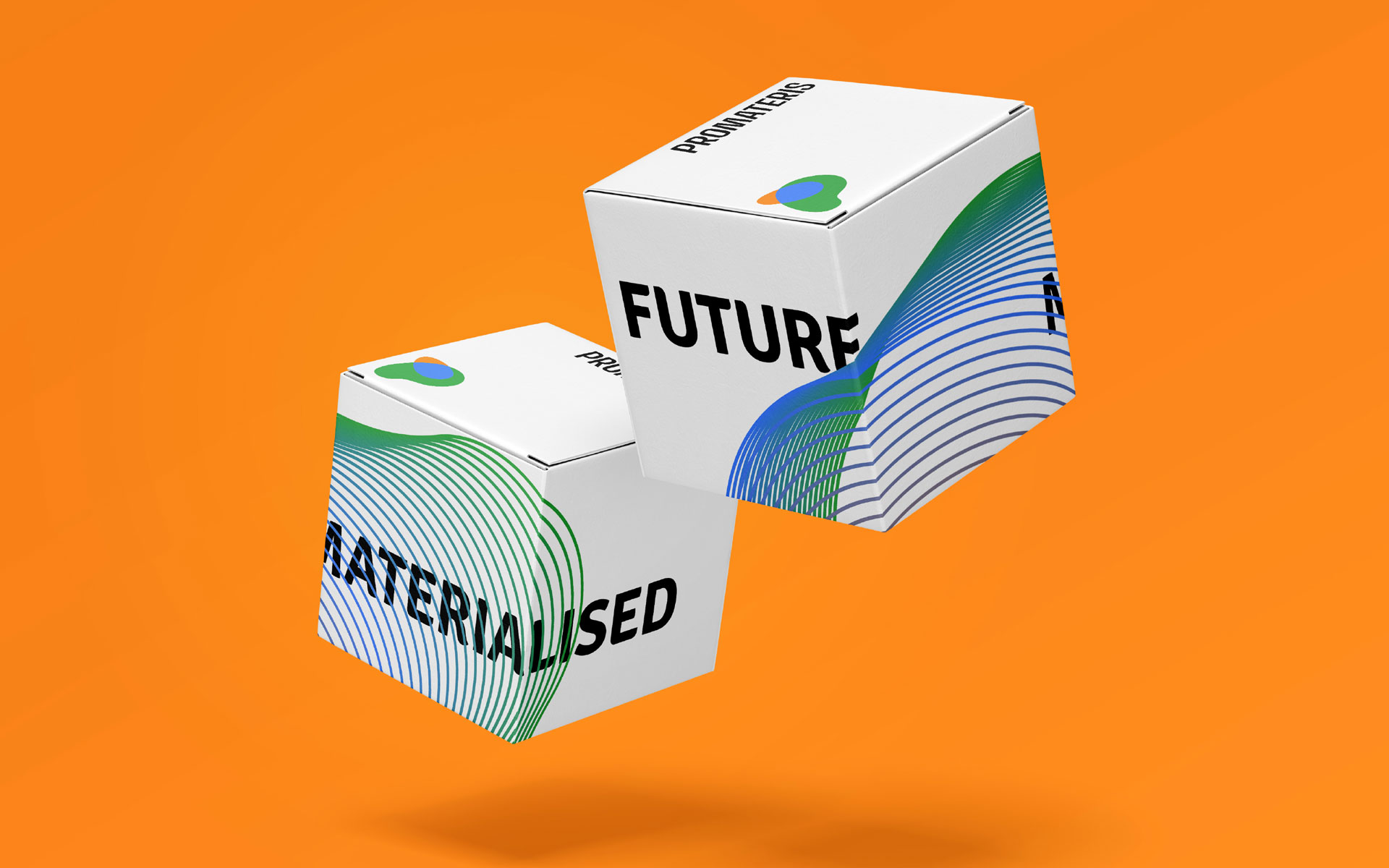
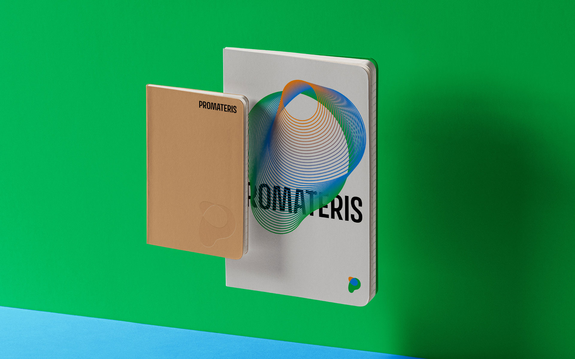
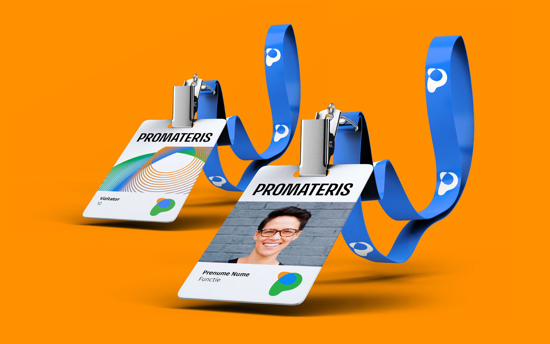
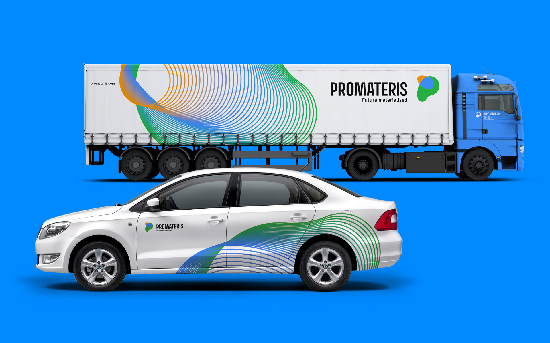
At the heart of the system is a fluid, transparent, and vibrant monogram — a symbol designed to continuously reinvent itself. The key visuals extend this principle, transforming the logo into a playground for graphic experimentation in morphism, where each composition becomes a unique visual expression, full of personality, while strengthening brand equity.
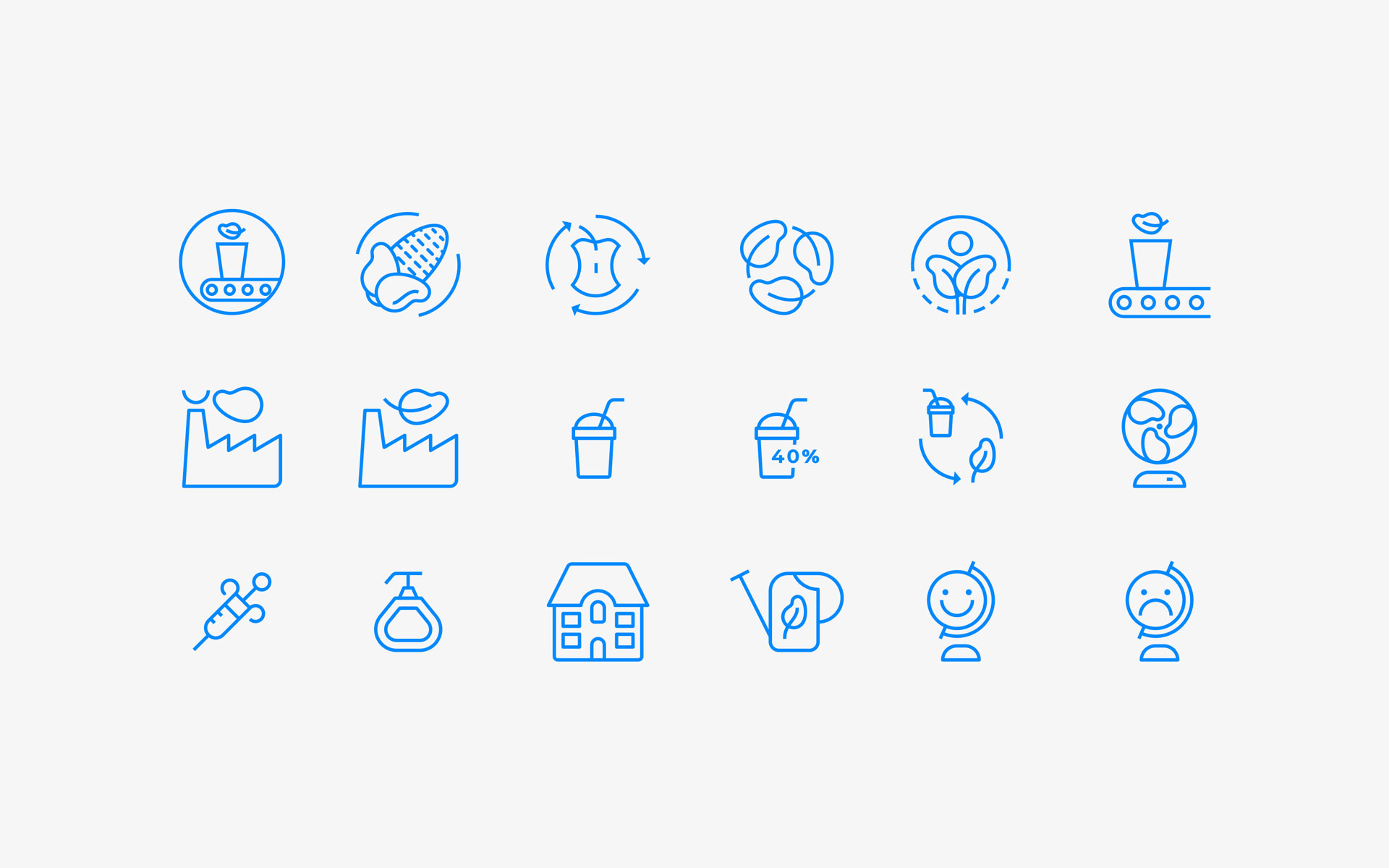
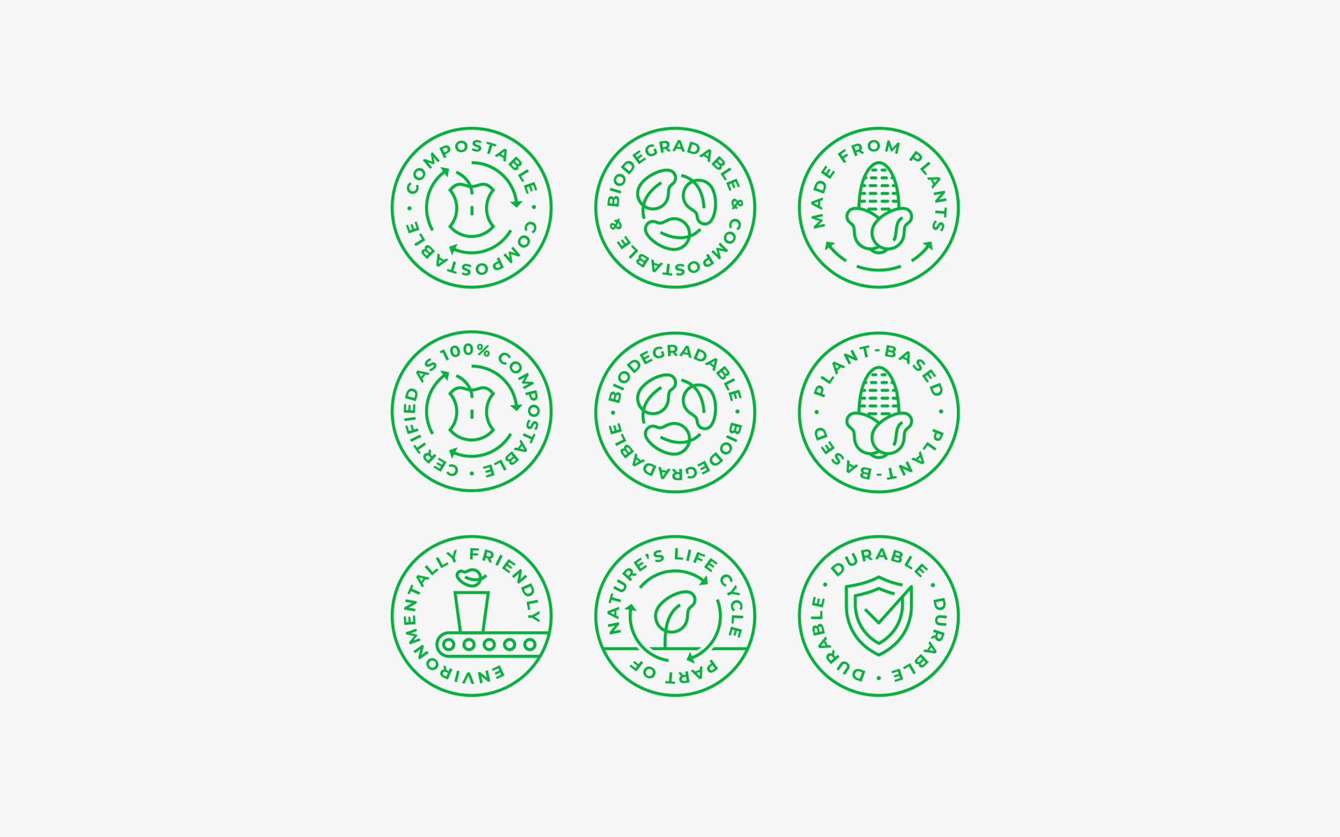
To complete the visual ecosystem, a custom set of icons was developed, serving both a certification function and a practical role in technical illustrations, bridging the gap between brand storytelling and functional communication.
The result is a flexible, forward-thinking identity that reflects Promateris’ innovative spirit and its role in shaping a circular, sustainable future.
Promateris is a leading European manufacturer of sustainable products and solutions for the circular economy. The rebranding project went beyond a visual refresh — it was a strategic realignment of the brand architecture, reflecting the company’s commitment to innovation and sustainability.
The new identity embraces morphism and versatility, encouraging reinvention, transformation, and a fresh perspective on how we create and consume products.
At the heart of the system is a fluid, transparent, and vibrant monogram — a symbol designed to continuously reinvent itself. The key visuals extend this principle, transforming the logo into a playground for graphic experimentation in morphism, where each composition becomes a unique visual expression, full of personality, while strengthening brand equity.
To complete the visual ecosystem, a custom set of icons was developed, serving both a certification function and a practical role in technical illustrations, bridging the gap between brand storytelling and functional communication.
The result is a flexible, forward-thinking identity that reflects Promateris’ innovative spirit and its role in shaping a circular, sustainable future.
CLIENT
Promateris
YEAR
2020
SERVICES
Visual Identity, Stationery Design, Web Design, Signage Design, Packaging Design, Iconography, Communication Design, Brand Guidelines
CREDITS
I designed these items while working full time at Brandient.
Images/photos and details are presented courtesy of Brandient.


Copyright © Ciprian Bădălan & Brandient | All rights reserved. No content of this website may be reproduced in any form without written permission from its author. All trademarks belong to their respective owners.