


Tinmar Group.
Perspectives of the future energy.
Tinmar Group.
Perspectives of the future energy.
Tinmar Group.
Perspectives of the future energy.
Tinmar Group.
Perspectives of the future energy.
Tinmar Group.
Perspectives of the future energy.
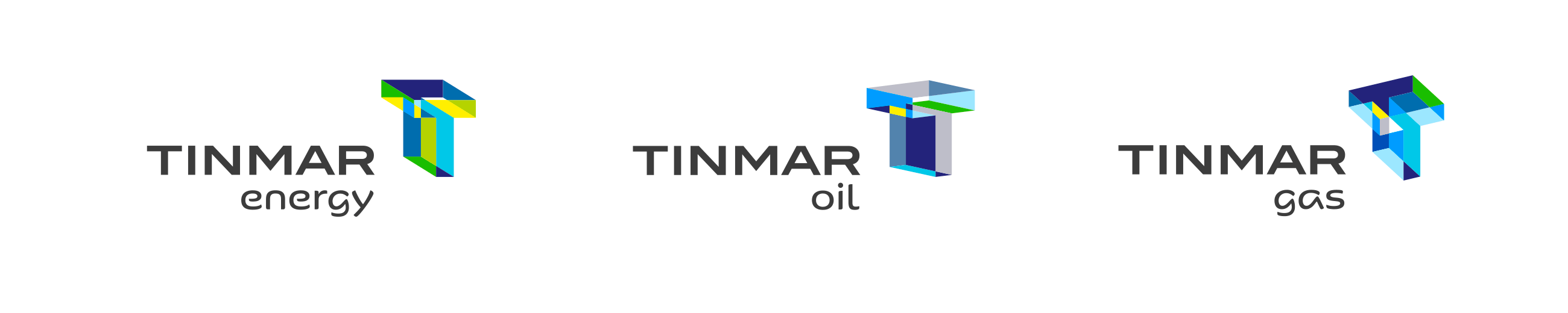
Tinmar is the largest private energy supplier in Romania, but with an extensive activity on over 20 European markets. Following the democratization of the energy market, Tinmar decides to go through a rebranding process as a result of which it will successfully establish itself on the market as a new reliable energy supplier for household consumers and to better project the performance and real stature of the business, as well as its future ambitions.
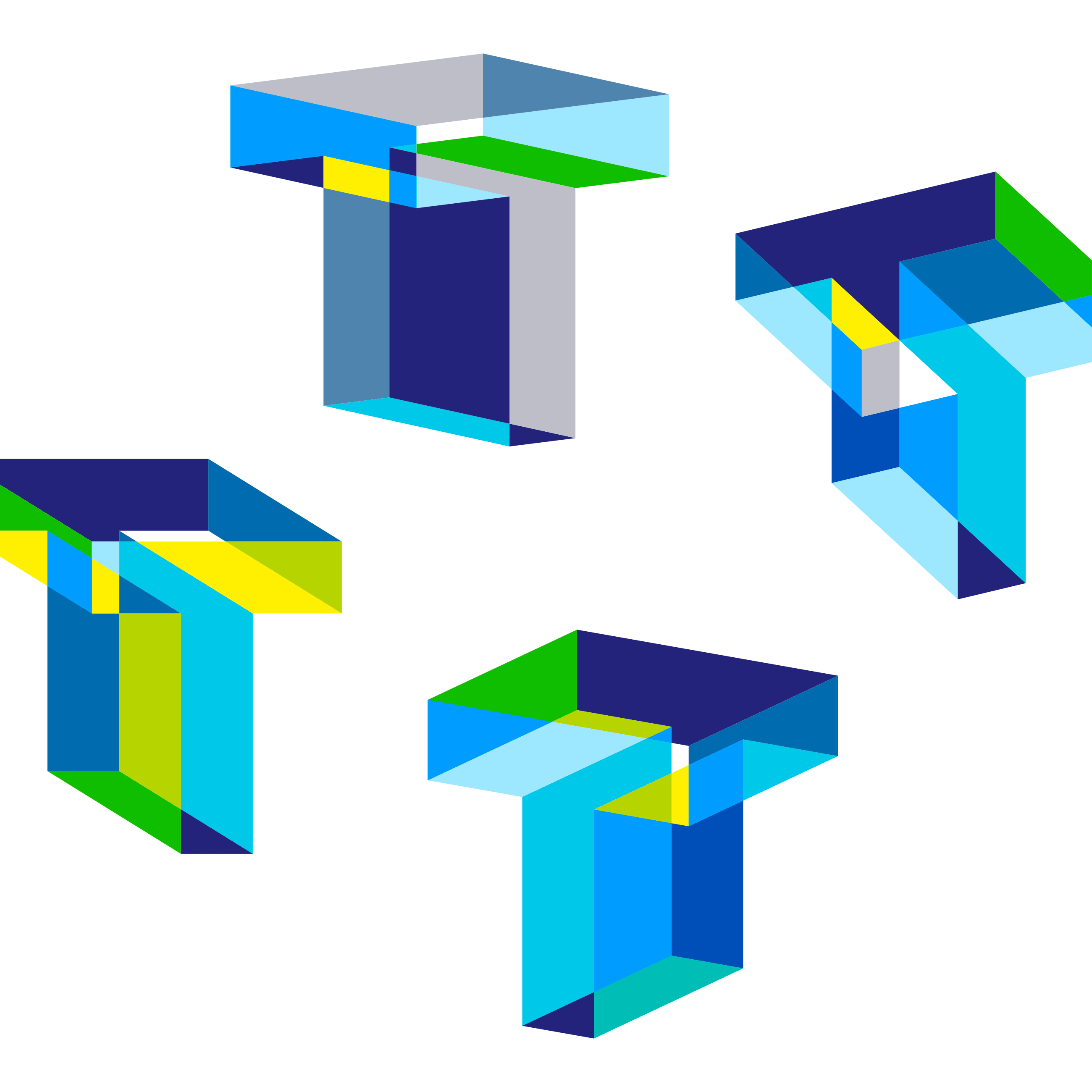
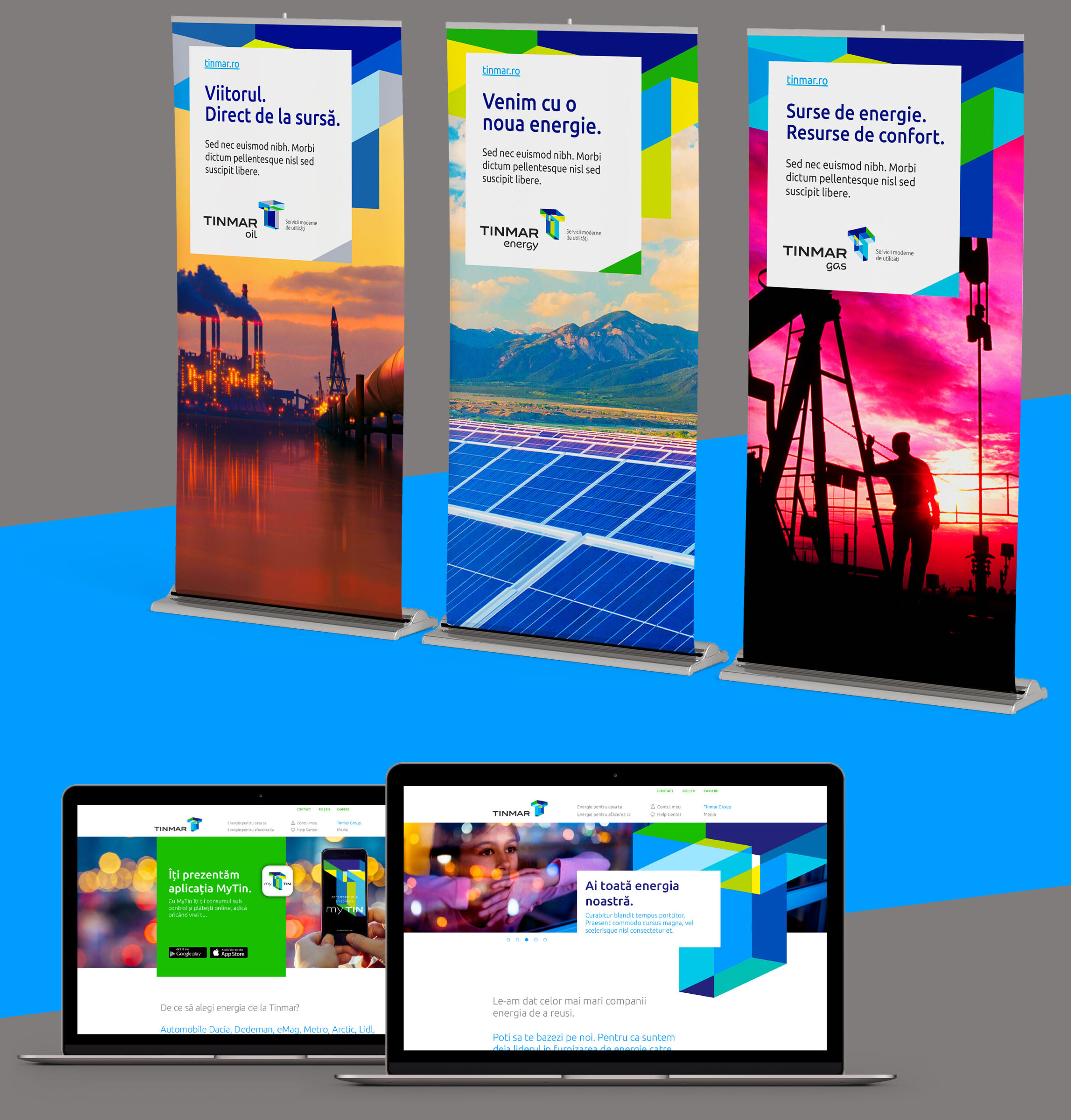
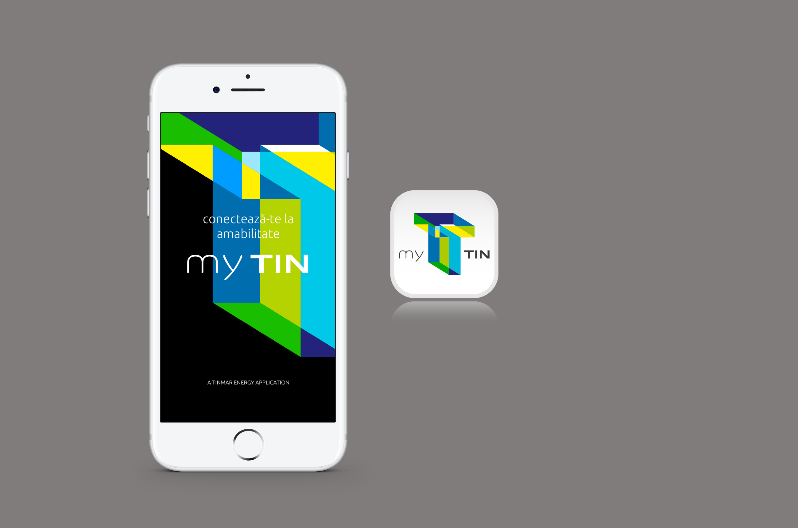
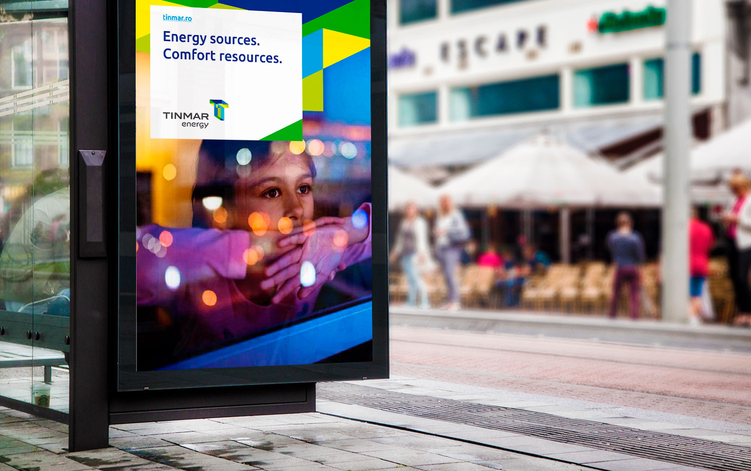
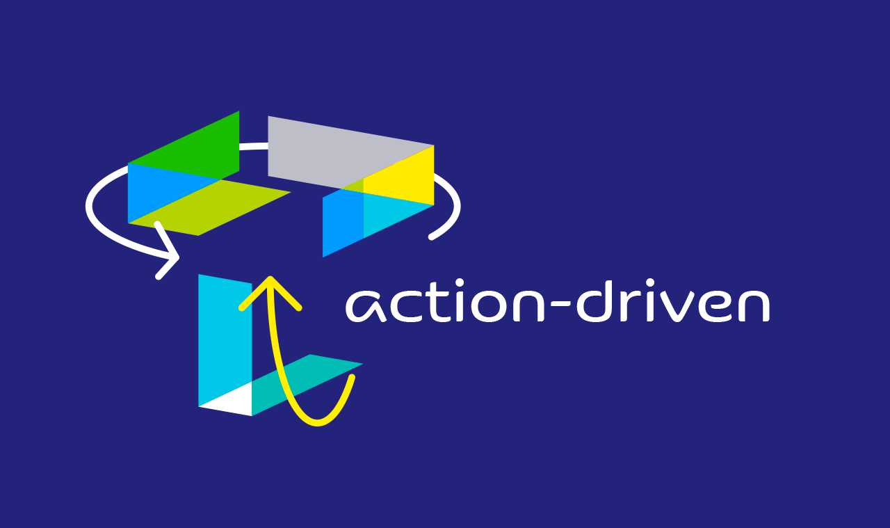
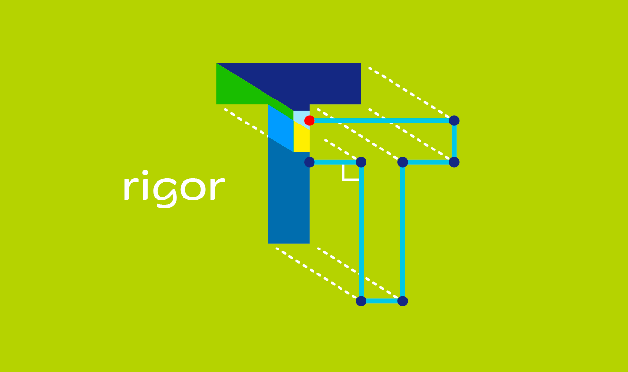
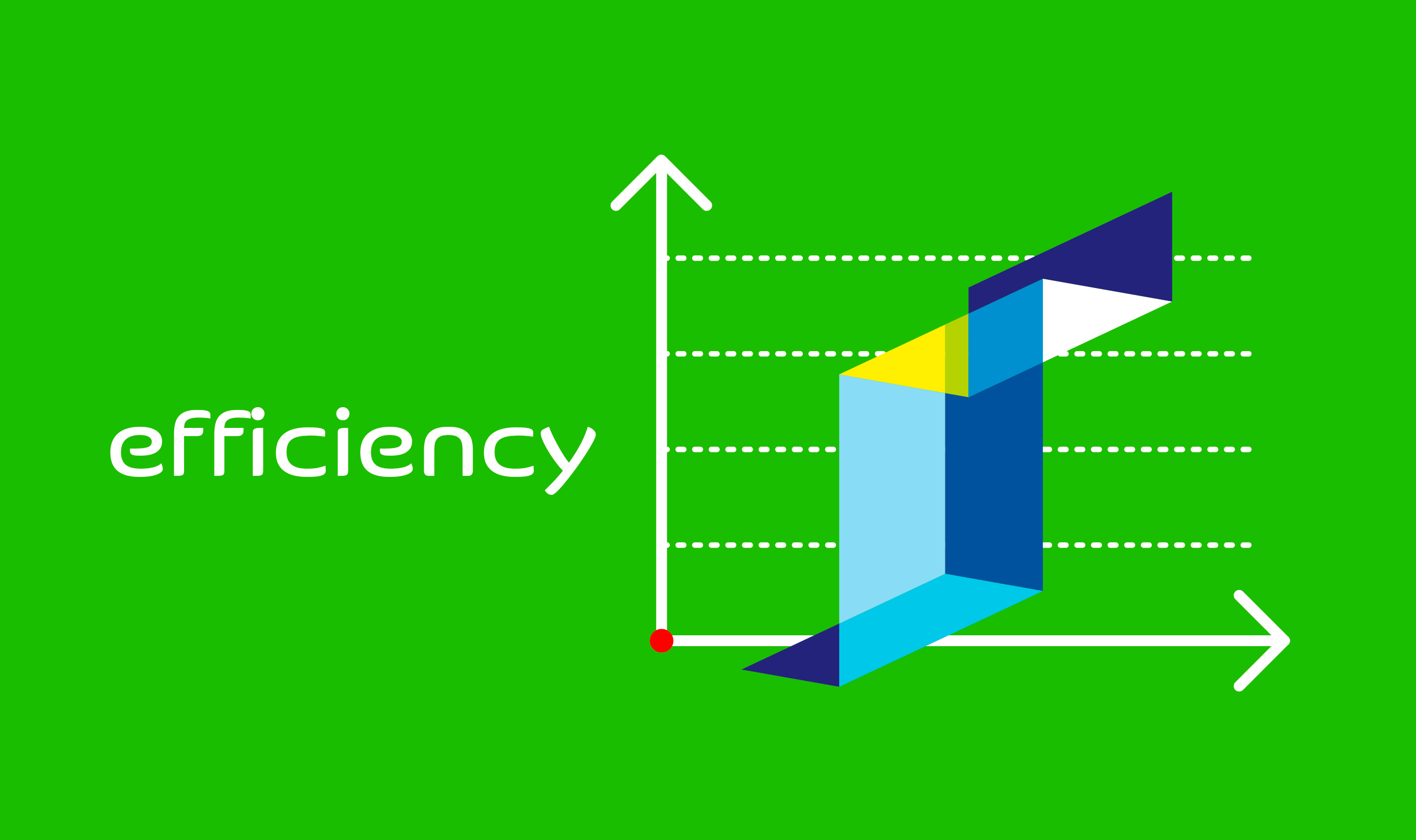
The creative solution comes through a three-dimensional T monogram — multifaceted, transparent and brightly colored, drawn from multiple angles, it's a symbol full of energy, capable of uniting under a single visual style all three business lines of Tinmar Group: Tinmar Energy, Tinmar Oil and Tinmar Gas. One symbol, shown from four different perspectives. One visual identity expressed through four distinct representations. All for one and one for all.
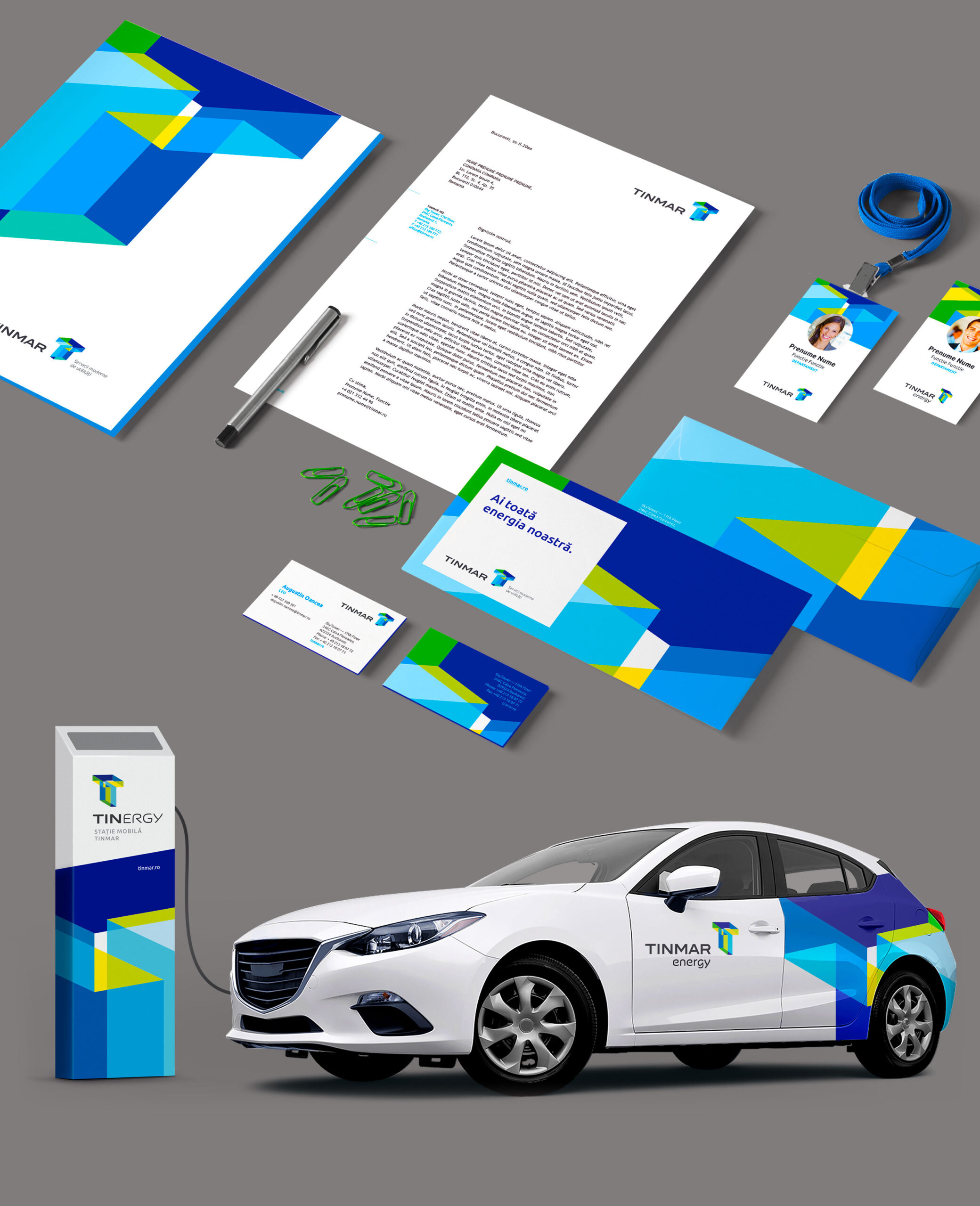
The new symbols, applied oversized, also function as visual brand properties in communication layouts, ensuring strong brand recognition even in the absence of the logo.
The ingenuity of the design solution was rewarded in the United States with the highest Graphis distinction, the Platinum Award.
Tinmar is the largest private energy supplier in Romania, but with an extensive activity on over 20 European markets. Following the democratization of the energy market, Tinmar decides to go through a rebranding process as a result of which it will successfully establish itself on the market as a new reliable energy supplier for household consumers and to better project the performance and real stature of the business, as well as its future ambitions.
The creative solution comes through a three-dimensional T monogram — multifaceted, transparent and brightly colored, drawn from multiple angles, it's a symbol full of energy, capable of uniting under a single visual style all three business lines of Tinmar Group: Tinmar Energy, Tinmar Oil and Tinmar Gas. One symbol, shown from four different perspectives. One visual identity expressed through four distinct representations. All for one and one for all.
The new symbols, applied oversized, also function as visual brand properties in communication layouts, ensuring strong brand recognition even in the absence of the logo.
The ingenuity of the design solution was rewarded in the United States with the highest Graphis distinction, the Platinum Award.
CLIENT
Tinmar
YEAR
2016
SERVICES
Visual identity, Brand architecture, Communication design, Web design, Retail design, Internal communication design
AWARDS
→ Graphis Platinum Award, Logo Design 9, 2016
BOOKS & MAGAZINES
→ Graphis Logo Design 9 & Letterhead 8, 2017
CREDITS
I designed these items while working full time at Brandient.
Images/photos and details are presented courtesy of Brandient.


Copyright © Ciprian Bădălan & Brandient | All rights reserved. No content of this website may be reproduced in any form without written permission from its author. All trademarks belong to their respective owners.