


Bitdefender
Enterprise
Bitdefender
Enterprise
Bitdefender
Enterprise
Bitdefender
Enterprise
Bitdefender
Enterprise
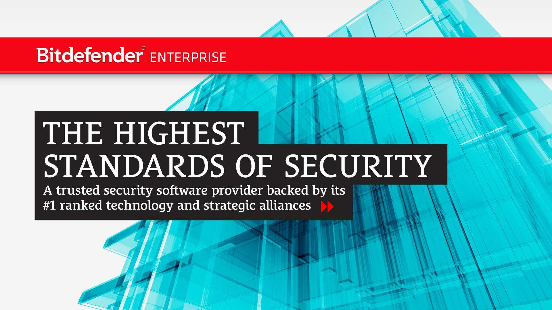
Bitdefender is a global leader in digital security. In 2012, Bitdefender’s B2B division decided to communicate under the name Bitdefender Enterprise and adopt an image distinct from the rest of the company, aligning with the growing shift toward cloud-based solutions and virtualization in the enterprise market.
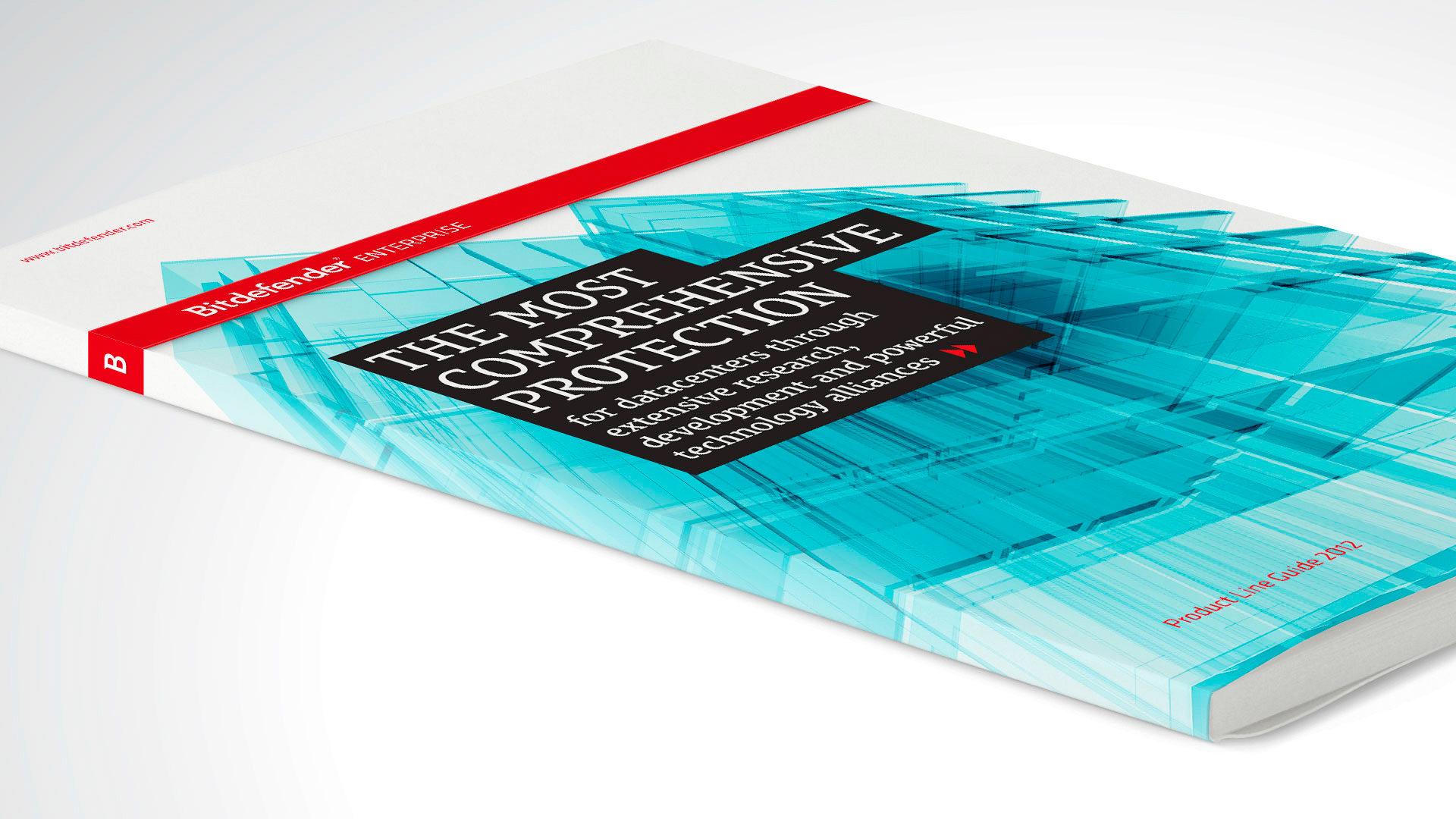
For brand communication, the visual approach centered on a visual metaphor, the “Glass City,” represented as a fully digital urban landscape—a concept designed to reflect both the division’s new strategic focus and Bitdefender’s ability to analyze massive volumes of corporate data to detect potential threats.
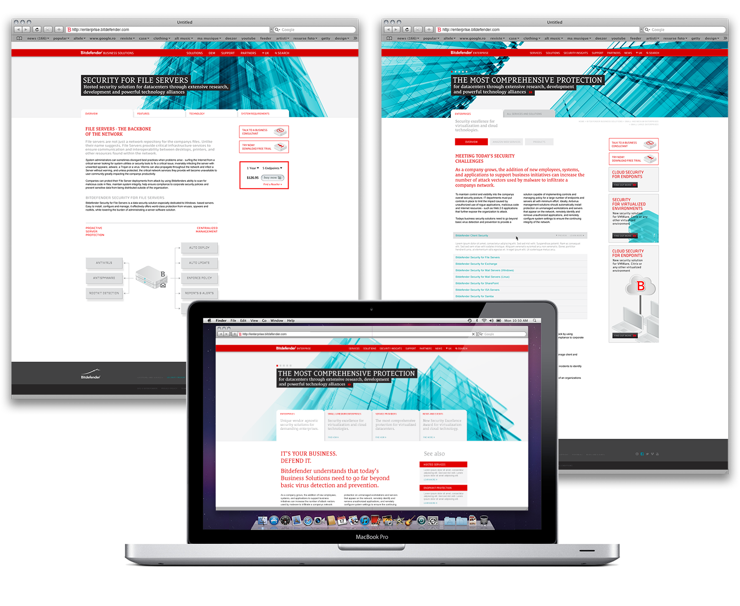
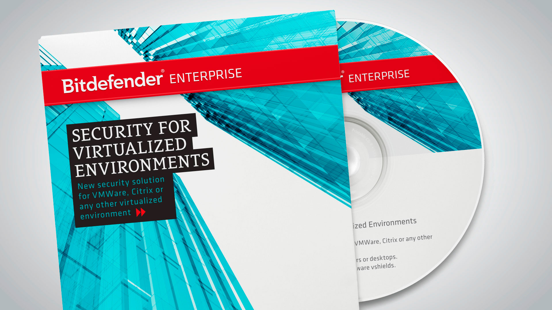
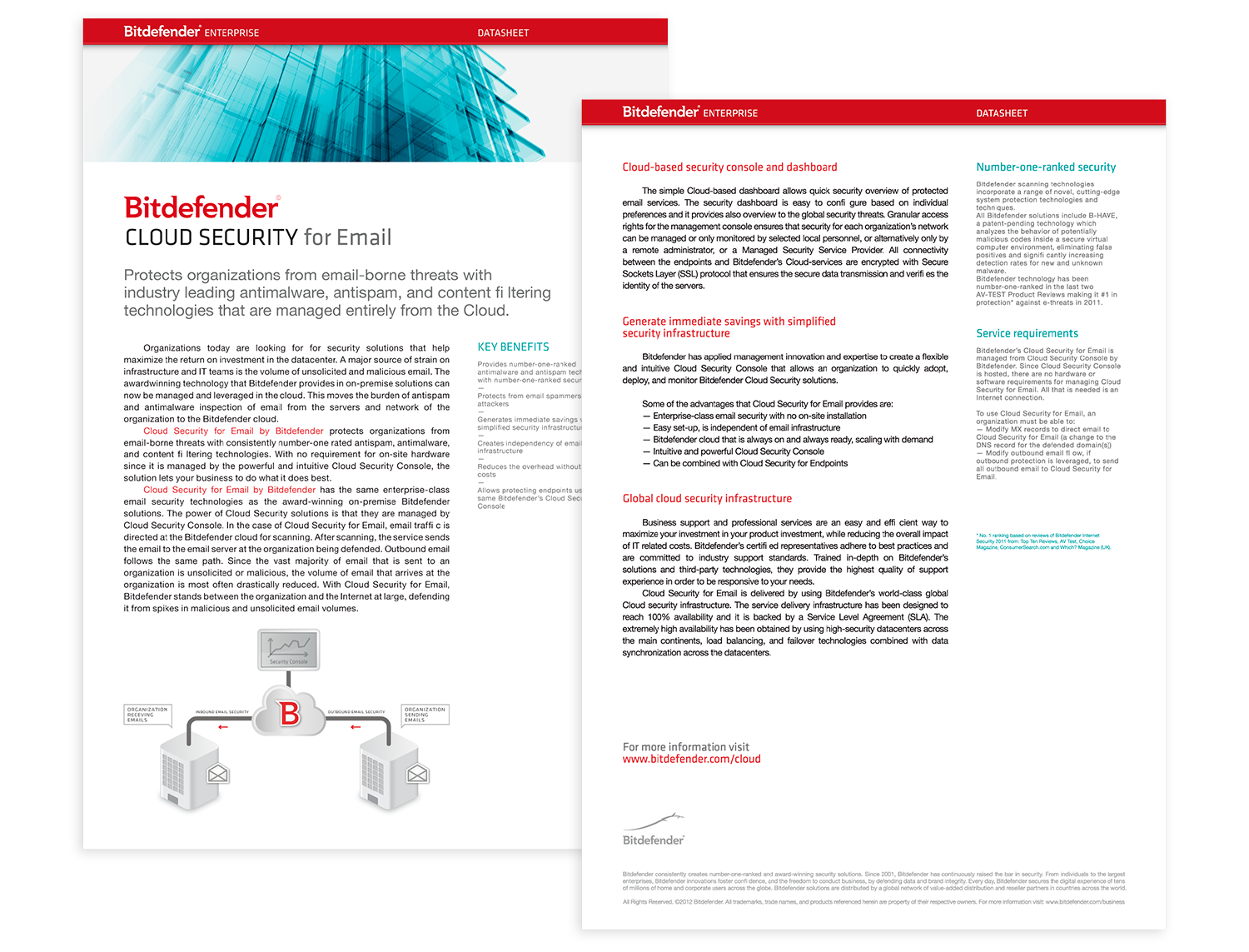
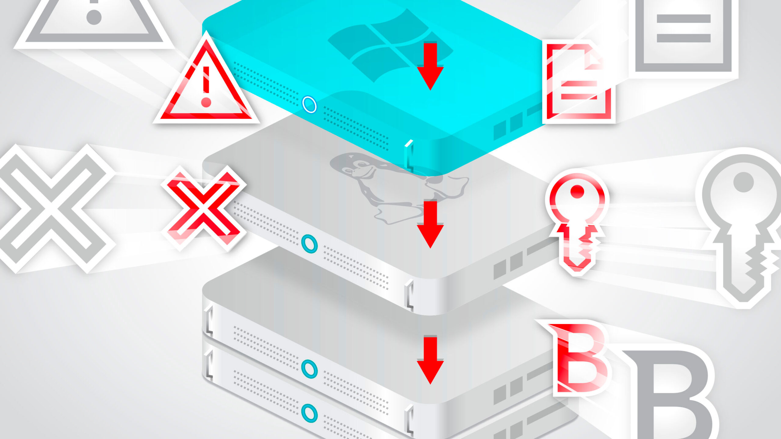
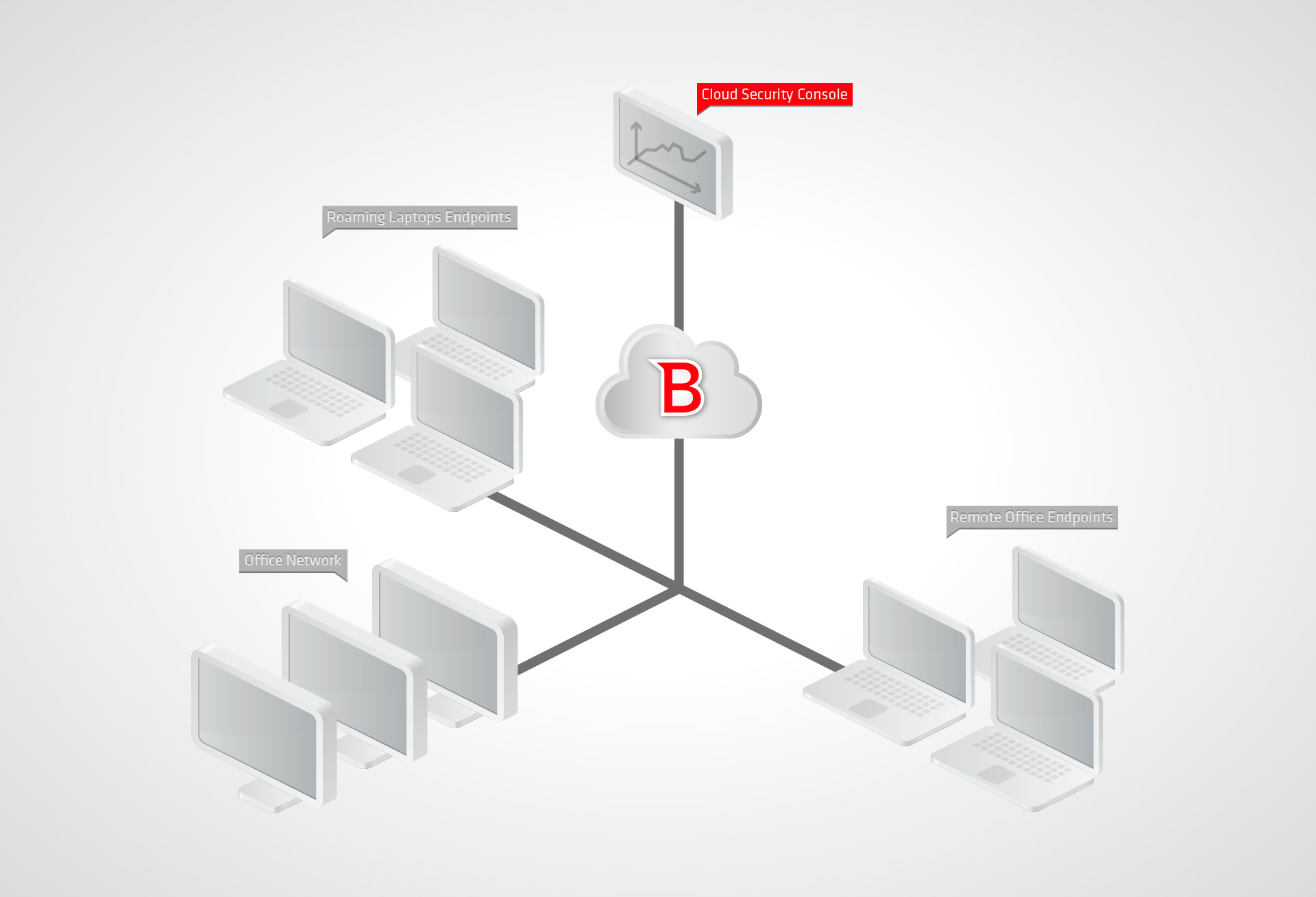
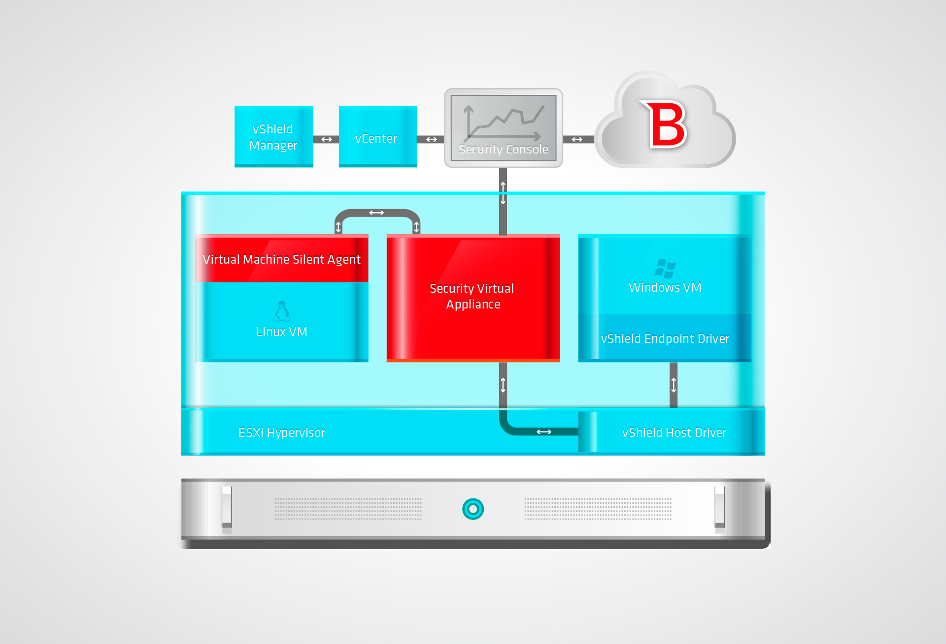
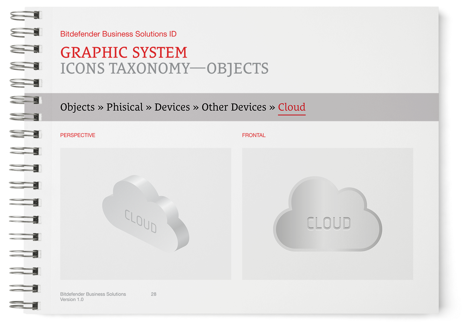
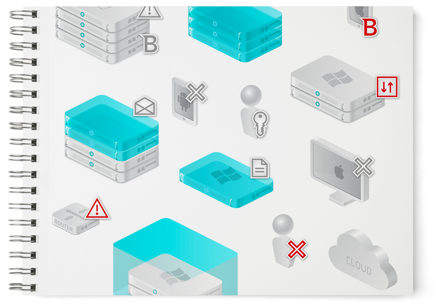
To present all of the division’s strategies, products, and solutions in a branded and cohesive manner, a logical taxonomy system was designed. Covering all types of components, functions, and physical or virtual states—even for scenarios yet to be conceived—the system easily supports the creation of complex product diagrams. Additionally, although the Bitdefender Enterprise division chose to communicate with a visual identity different from the rest of the company, the brushed metal appearance used for the physical elements in the taxonomy system was inspired by the parent brand's avatar, preserving a clear visual connection to the company's overall brand image.
Bitdefender is a global leader in digital security. In 2012, Bitdefender’s B2B division decided to communicate under the name Bitdefender Enterprise and adopt an image distinct from the rest of the company, aligning with the growing shift toward cloud-based solutions and virtualization in the enterprise market.
For brand communication, the visual approach centered on a visual metaphor, the “Glass City,” represented as a fully digital urban landscape—a concept designed to reflect both the division’s new strategic focus and Bitdefender’s ability to analyze massive volumes of corporate data to detect potential threats.
To present all of the division’s strategies, products, and solutions in a branded and cohesive manner, a logical taxonomy system was designed. Covering all types of components, functions, and physical or virtual states—even for scenarios yet to be conceived—the system easily supports the creation of complex product diagrams. Additionally, although the Bitdefender Enterprise division chose to communicate with a visual identity different from the rest of the company, the brushed metal appearance used for the physical elements in the taxonomy system was inspired by the parent brand's avatar, preserving a clear visual connection to the company's overall brand image.
CLIENT
Bitdefender
YEAR
2012
SERVICES
Visual Identity, Brand Architecture, Product Taxonomy, Product Design, Communication Design, Web Design, Brand Guidelines
CREDITS
I designed these items while working full time at Brandient.
Images/photos and details are presented courtesy of Brandient.


Copyright © Ciprian Bădălan & Brandient | All rights reserved. No content of this website may be reproduced in any form without written permission from its author. All trademarks belong to their respective owners.